What could help with that is keeping each value profile to a different section of the image i.e. don't use highlights all over and don't draw with highlights.
Sorry if you didn't want any feedback, but if it helps, I drew over one of your thumbnails to help show what I mean! Contrast gives more attraction to the focal point and helps it read better (sorry if I misinterpreted it wrong!)
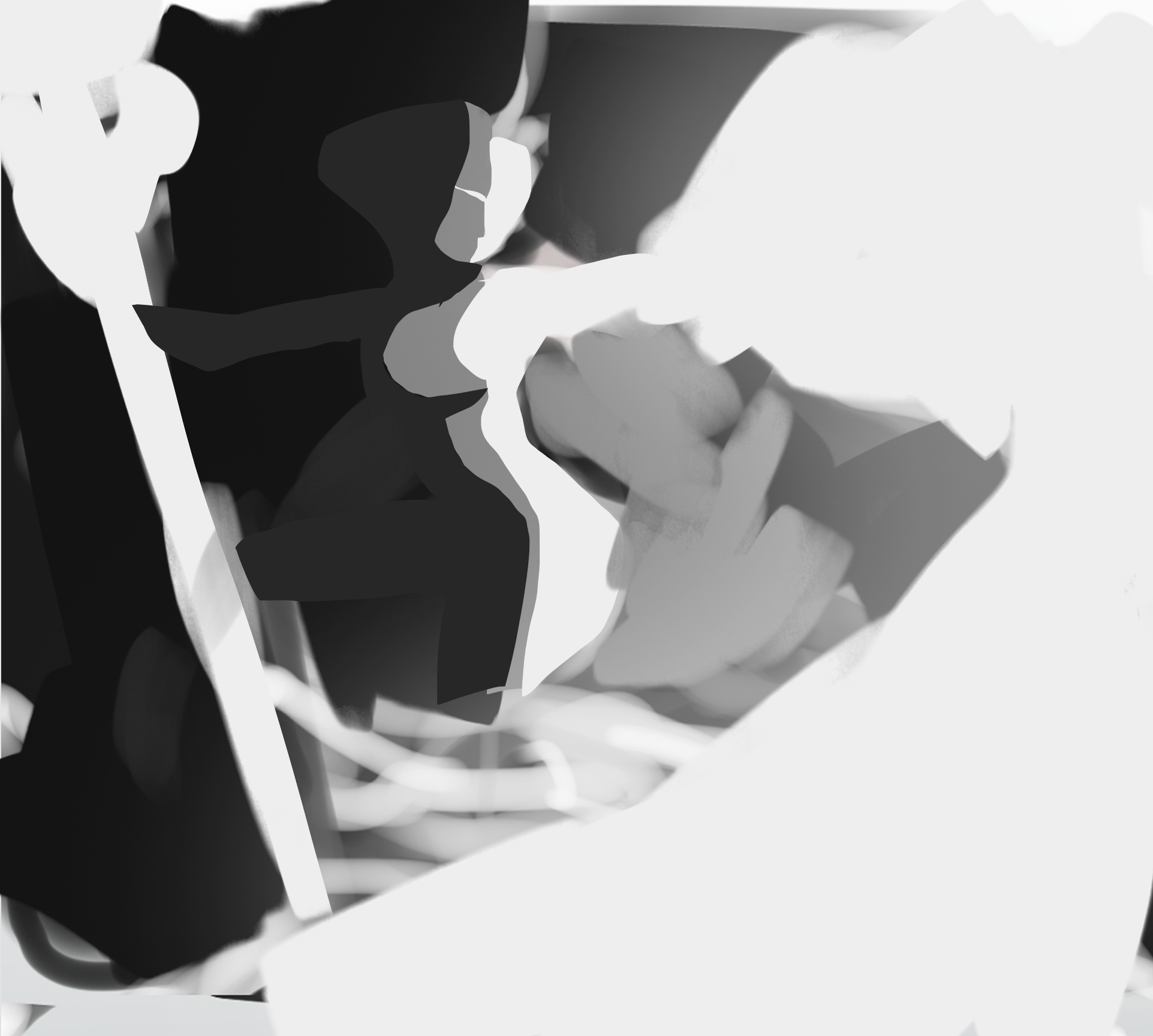
I actually don't know if I can offer help like this so if I'm in the wrong someone please tell me lol


