
@threees: thank you! I don't think I've ever learned how to work cleanly, more how to hide my mess haha
@serovero: Thank you! Nope Team Earth will own! muhaha
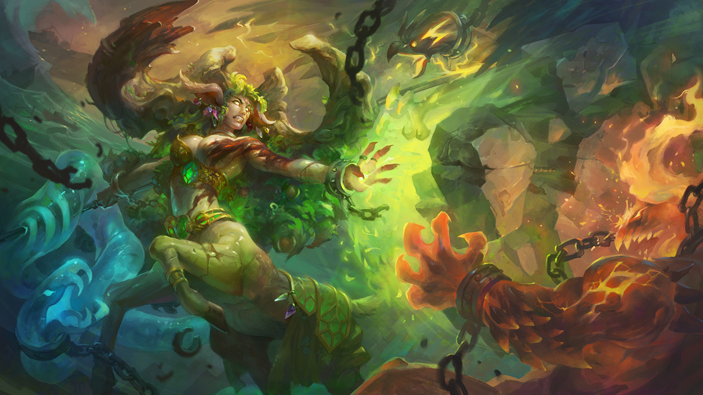
This is where I'm leaving this image till I can get back to my larger, actual work computer screen with a fresh pair of eyes. Thanks all who's been along for this short but crazy ride! Next update should be some time before deadline, hahaha

Really cool! Looking forward to the final updates!
Absolutely beautiful!  I love how all the colors blend.
Woah.. Great work! I really love the colors!
Daaaaaaaaang!
Amazing. Love the colour.
Wow really beautiful! Love the range of the color palette and that she is fighting all of the other elements! Also getting an awesome WoW Druid vibe
Whoa, thanks all for the outpouring of kindness :-o
I'm back to real life from the break, so please bear with some little 1-hour lunch updates that's gonna come up! Dislike how flat everything is, so I'm going to focus on value grouping now that I have a much larger screen to see the whole picture on.

Omg this is so amazing! I love everything about this!
This is some bloody phenomenal work, amazing stuff! Where can one find more of your work?
@Gil_Ascher: THank you so much!
@kriros: Thank you!
@captdiablo: Appreciate it! I'm active on facebook and artstation: https://www.artstation.com/graceliu
@phume10: Thank you!
Was polishing along this morning and suddenly I think I've figured out why the composition bugs me. 1. the scale of the fire dude and the earth elemental are too similar. 2. there is zero foreground in this picture :-o
Here's a fix-in-progress. I'll need to look at it later to see if I've ended up over-filling the image. I would guess I'll need quite a bit more value adjustments around the middle parts to get the value composition to work again, but I think the balance between the figures is much better. Also drew over the fire elemental to try to make his design less boring and flow better.

Oh you're at Airship Syndicate, well that explains everything. Thought the style looked very Darksiders-ish, now I know why
Ahh wow this looks amazing! So colourful and full of life. Personally I think it's difficult to tell immediately of the element considering the first hit I get is green, nature based but the used of the gradient from blue to green to red is really pleasing to the eye. Wish you the best of luck with your piece 
love it! great colors, very dynamic piece!
Thanks a lot! I kept tweaking the composition and colors. Hoping to find some time to polish more before finalizing, it needs some sharp edges still and too many things are still too noodly, haha.
awesome grace !! as usual ^^