Master of flame and sword, this warrior is one of the three royal guards. Leaping into battle in a swirling tempest of fire and smoke, ash and charred steel is all that this warrior leaves in his wake.

This is my start on some concept art for this character. One question that I do have for fellow artists out there is, if I make this knight attacking (and shattering the shield of) another knight, would that be acceptable for this contest? Or should I just stick with the one warrior?

This is what I am thinking about going with for concept art. I know that most of the time concept art is less dynamic and more utilitarian, but hopefully the 3D sculpt starts off on the right foot 
I should also mention that this will be my first time working with ZBrush in I think around three years, so if anyone has any tips about new tools that I should tap into, I would appreciate hearing about them.

I have been a bit under the weather, but that might be a good thing since there is a lot to learn and relearn with all of this ZBrush stuff! Today I think that I started getting a decent workflow. Again, since I got sick and just did not get started on this as soon as I was hoping, who knows how far I will get with it. Whatever the outcome is with this project though, it is feeling good to get back into ZBrush 

I started on the arm armor today, and am thinking that I will just duplicate it over when I get what I like. Is that the normal workflow for something like this? Hopefully sooner than later I will be able to working at a higher resolution 

I am happy with how the leg armor is coming together. My plan at the moment is to finish off the rest of the rough blocking in of the armor, and then start adding in higher resolution details before posing him, and while I am not sure how far I will get with him over the next few days here, this contest has been a great motivator for me to dig into ZBrush with this project 

I think I am done blocking in the armor, so now it is time for me to start increasing the resolution and adding more details. Like I have mentioned, I am not totally up to date with ZBrush, so any tips about transitioning from dyna meshes to subdivided meshes would be great to know.

With the contest coming to an end, this might be as far as I get with this guy. I will be finishing off the model eventually here, and hopefully he will make a good demo reel piece. Hope everyone else has been enjoying the contest as much as I have, though next time I might have to shoot for a 2D piece to make sure I can get something more presentable 
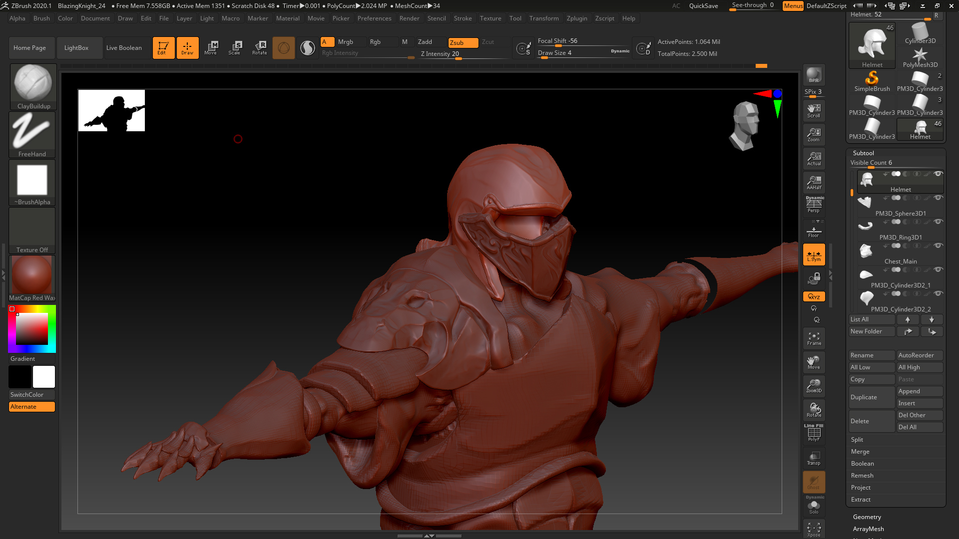
As far as actual work, I am just starting to up the resolution of the different tools here, basically just subdividing them and adding in details. I think I like the pauldron at the moment, though it is not as sleek as I was initially thinking, so who knows where I will go with that. Right now I am working on the helmet, and as always, tips and tricks for ZBrush are always welcome. This is going to be the first high res character that I have ever made, unless you count a troll, even then though, this will be the first time that I have started in ZBrush, so it has been fun to learn more about the program.
Thanks and enjoy!