Hi, i wanted to toss some of my own suggestions that i thought might workout well, i like what you've done so far i think though that some of the rope choices are very saturated atm.
(Removed)
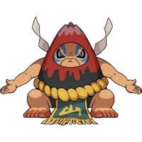
I've chosen possible complementary colors to the body, hope it helps nice work and it looks like the concept to me, super cool! - bottom right one supposed to be brown.