@Brush_Tony @maximrybinsky
Thanks guys for the suggestions! Unfortunately I don't really like the idea of the helmet because I wanted to make it unrelated to wars, but I really liked the idea of the color palette, so here it is 
and as a bonus a quick turn-around


your design is looking really great!
I personally love the black/yellow and the ocre color schemes. I can't wait to see where you take this next
Really cool idea, I like where this is going!
These have some Metropolis vibes. Maybe look into that and other German Expressionists films for inspiration? Since you are going with Germany and all... https://en.wikipedia.org/wiki/Metropolis_(1927_film)
I'm back! here a little wip between one engagement and another If you have any advice or criticism, I am listening

Enjoy!

Damn that looks great  Very nice materials.
15 days later
That's one eerie champion! XD Love the design, show us more pls! =D
19 days later
I'M BACK!
Time is running out, as soon as I have started studying illutration, I'll make it!
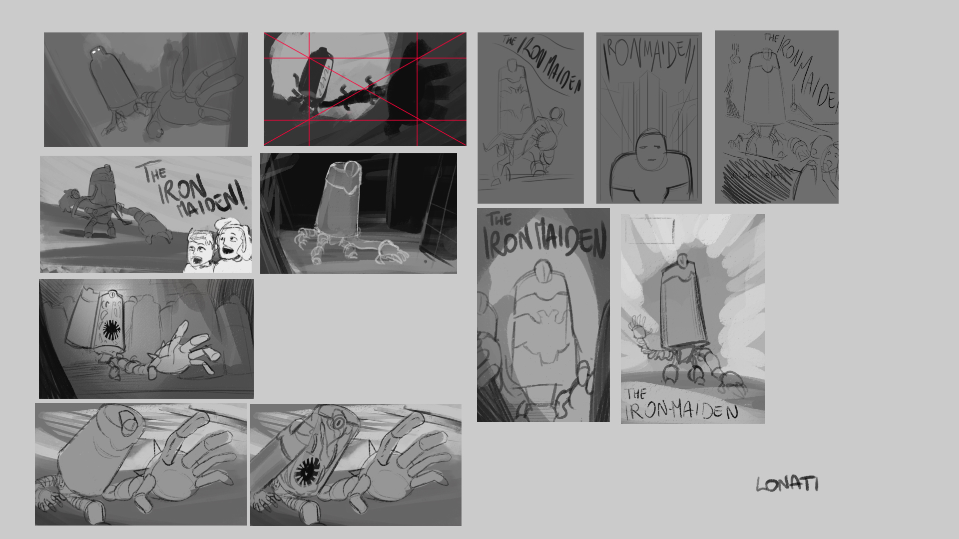
My idea is to recreate a monster movie poster from the 30s / 40s / 50s entitled "The Iron Maiden"
I like the top left aaaand the one in the middle (vertical format with dark corners).
Here is the sketch of the illustration and the mood tests


I would go with c because it fits best with the color theme (Germany) 😄
I think you are right, maybe I add some orange and yellow, thanks
11 days later
I think I'm done 
thats creepy.. i love it!
First of all really cool and unique idea for germany just a tip you could make the worm things a bit more slimy and translucent, also what could make it pop more is if you added some cool light right now its mostly warm if you want i can make a quick color paint over?


Nice concept, pretty original. On the illustration, i second what @dreamsequenz said about the cool light, i noticed you added it on the hand in your last post, i think it would actually work better if the cold light was instead on the body of your character; it would push the character back in the perspective giving more depth in your composition, while emphasizing the nice shape your character has.
Or maybe you could even get rid of the warm light on the character and rely solely on the cool light to define him, just a thought i am not sure it would work.
Another idea would be to have the light hitting him from the top left corner be more intense, like a highlight and letting reflections do the rest of the defining.
Or maybe increase the intensity of the light streak behind you character to attract the eye to him more
Just suggestions to experiment.