I don't have that good of an idea what I'll create just yet.
Picked Sweden, because it's my home country.
I'll start with some general research first.

I think I'd enjoy trying to combine the look of vikings (both real and fantasy) with various elements from the traditional midsummer celebrations (obviously not the one from that weird horror movie).
Going for a female character would be the more interesting choice in my opinion. Might be because the midsummer dress mixed with some viking stuff sounds cool to me.
Not planning on going hard in on too many versions and variants. I just want to draw something, lol.


Ok, so after getting down some of my initial thoughts on canvas, I'm 100% sure I want to go for some kind of commander/shield-maiden type of character. Someone who leads the charge. I mean, I haven't heard of vikings that ran solo raids (pretty sure the Swedish vikings were more merchants than raiders, but nevermind that).
I have a soft spot for strong and physically built women (that still have a feminine look to them). It's such a cool look, so I'll go for that.
I think i'll try a mix of image two and three for the charcater. Perhaps I'll explore some outfit options before moving further into illustration.
I really like the last one, for me its the most impressive one

I think I've already decided on a bunch of stuff by now, such as colors and her laurel.
Here are some general thoughts, from left to right:
- The wolf head adds more personality than just the fur on it's own. The lack of flowers could be made up for with weapons/tools (that have flowers on them).
- The chest piece is the least interesting one, but it looks pretty nice and sleek. Overall, feels like the least daring design. Shape variation is pretty meh. I'm not sure I like it.
- This one really mixes the two and the result was something that sort of doens't fit into either of my inspirations. I quite like that. If I can sharpen those aspects and bring it all together, I think it'll turn out nicely.
Plan going forward:
Use the design on the right as a base and try to "complete" it. The design on the left is a good indicator of when it leans too far into "midsummer girl with viking gear", which obviously wouldn't be a good "mix" of the two.
To-Do:
1. Final Design
2. Final Splash


I hope I can make it in time. Work got me running low on free time.
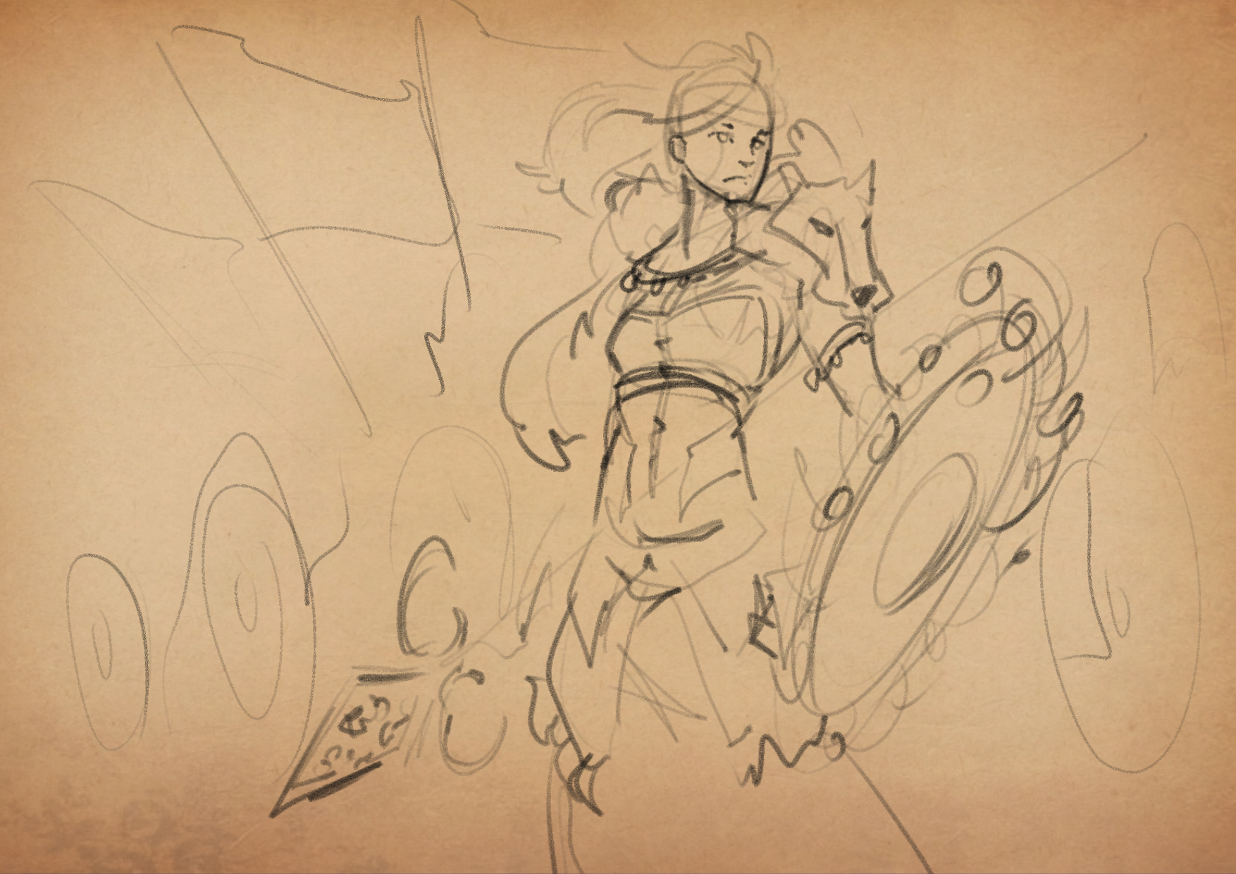
Anyways, today I managed to sqeeze in some weapon design for her.
Initial thoughts:
1) The laurel is part of the polearm, one way or another.
2) The weapon belongs to someone leading the charge.
3) The weapon should look used. (Got to look a little roughed up to fit a viking.)
How they were met in the final design:
1) Laurel is attached to the tip, giving the weapon some interesting shape distribution.
2) Polearm doubles as banner, without looking too fancy.
3) Broken tip, laurel falling apart, banner is a mess - this thing has been on the battlefield.
I'm not to concerned about giving her a shield. I mean, I most likely will, but I don't think it'll be important enough for me to go too deep into designing it. It'll match the rest of her gear, that's about it.
Can't wait to see the finfished piece, loving the style and design. Really cool idea to mix viking and midsummer elements =) The 2nd sketch with the hero holding the polearm is really good. I like the relaxed pose, kind of regal and confident. Will surely show of both the weapon and hero in an awesome way =) Good luck!!
Since both you and @prinzmoana thought the 2nd one was the most interesting one, I feel very inclined to explore that option more now. I think the final image has to feature the entire character, so I don't know if I can crop it like that tho - could be wrong about that.
Thanks!
Your champion need to be 80% visible or more. I believe knees and up should be sufficient. I mean, if you have a champion from top view or something close to that, the legs are all gone, so a cropped out shin should be more than fine. As long as the judges don't have a really cranky day 
80%? That's not too bad then.
I can work with that, lol.
Fingers crossed for uncranked judges!

Seeing as my drawings were featured on the Cubebrush social medias, I feel extremely motivated.
Here's what she'll look like, save for some pattern work I have yet to do.
I'm kind of just banking on that the painting process just "works out" and I can get all the details down at that stage.
There's still some refining left to do on this sketch, not to mention the back view, but as soon as that's done.....
Paint time baby!

Threw on some rough colors, just to see what it'll look like.
I quite like how it's looking so far.
Will go forward with this.
I'll limit the pattern work to the cloth going down from her belt (is it a loin cloth?), the shoulder strip and those bands wrapping her tunic right below her shoulders.
I wonder... Is it better to adress the back now or do it after I've painted the front?
One option would be to paint the front, then make a copy of it and paint over that.
The other one would be to have a back view with flat colors only, but that requires lineart of the back - which I'd probably want to have done before I start painting.
Giving a Swdish person blonde hair and blue eyes is a bit stereotypical, but I do think it fits well in this particular design - considering the colors of the flag. A bit of a design freebie there, for sure!

I went with the 2nd option, so I had to draw the back before I began painting.
Might go over it with some touch-ups here and there by the end.
For now, enjoy the progress I've made so far on the front view.
I'm happy with how she looks, as I wanted her to have a bit of a masculine face. I mean, it's still very feminine, but I think her jawline and chin makes it look a bit rougher.
I'll most likely leave it in a messy and painterly stage like this once I'm done. Admittedly, I am spending more time than I what'd be effecient at this stage, but I quite enjoy it... so it's sort of fine? Anyways, this character sheet will look nice in the portfolio.
love the outfit
@dreamsequenz Thank you!
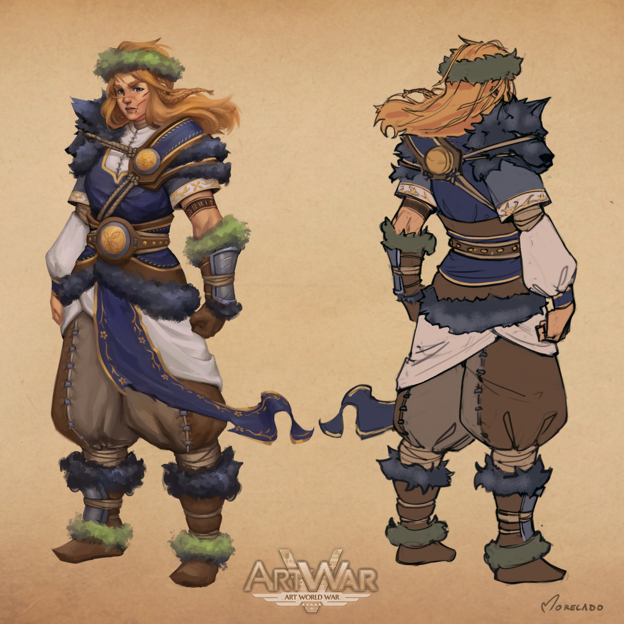
Designing phase is done!
(Ok, ok, the back isn't quite there yet. I'll add the extras later on, but I'll leave it rough like that - unless I have time to spare later on and can render it out to match the front.)
I'm not sure I want the flowers in her laurels, but it's likely I'll add them in later.
I went with some more subtle patters for the various embroidery on her clothes.
From what I can remember, I don't think I've seen patterns that were more complicated than this. They exist, I'm sure, but I like it the way it is now. Not too overwhelming and most importantly - Not something that'll cause me pain in the final painting.
(Added my artist handle and the logo, so that I could post it to other social medias.)
Onwards we go!
Love it... the expression, the pose, the colors, her design in general ❤️
Thank you!
Such an all-encompassing compliment 
I love her design, the details work so well! I agree with your decision for the embroidery it is very beautiful and good luck with the illustration!
Saw this on twitter, love the design!  looking forward to seeing the illustration