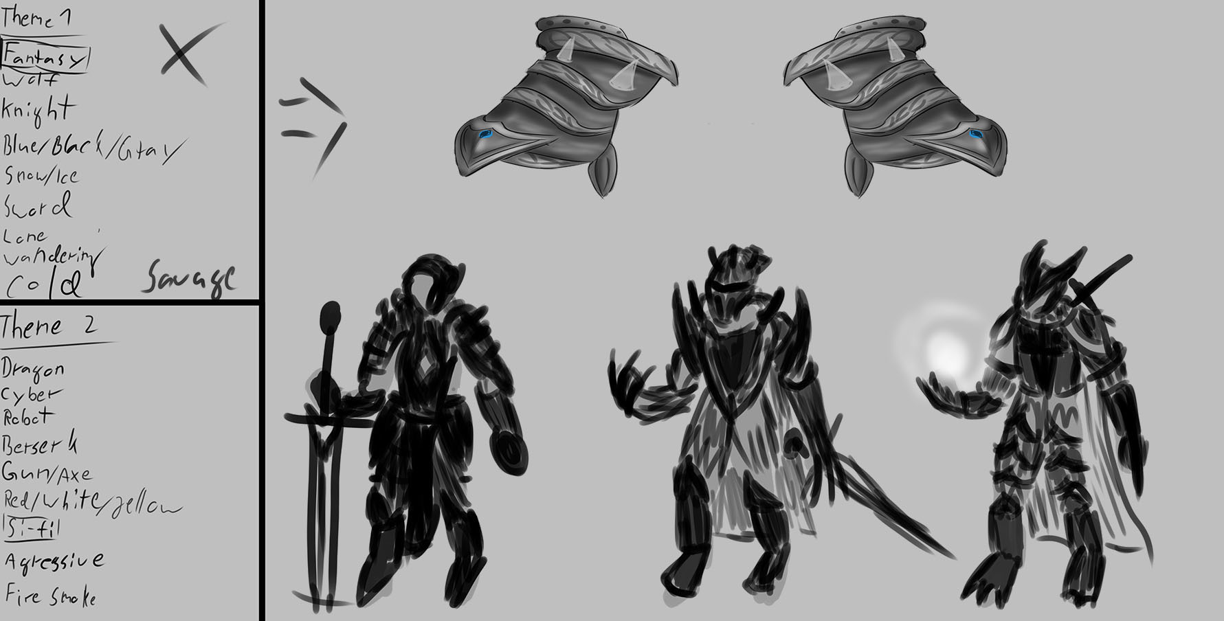
Here is the first part of the color and light assignment.


It is an old character concept from late 2019. (I know there some mistakes but I wanted to try the color palettes on something own)
I desaturated the character and copied it a couple of times. Then I took up to 5 colors from the shown colorwheel + one background color, switched the blending mode to overlay and roughly overpainted the characters. After that I zoomed out and looked how it feels. My favorite ones are 2 and 3. But normally I would use more desaturated and fewer intense colors for a more "realistic" look.
When I painted the character last year I did not use any values so there were just colors. That's the reason why the values are a bit off sometimes. But I still fell the original was not that a bad colorchoice


