Very nice! strong show of dedication, mate. The only critique that would be worth you acting on first would be to use more fluid lines, at the moment you are making sort of 'chicken scratch' lines inching around forms. Instead, try to use medium length flowing lines and straights to describe the silhouette of the form. You may want to increase the size of your brush and turn on all of your pen settings to help it feel more like a normal pencil (if you haven't already). Keep it up!
Thx, I will keep it in mind 

Hi Gondo, love the work one thing i can recomend you try doing is to draw clear lines instead of doing the chicken scratch technique (sorry i just realised someone has also mentioned this)
Hi Gondo,
I think you did very well capturing the theme of the words you wrote as "Dragon Realm". It gives me the feeling of something mythical and fantasy themed. It also gives me some DnD vibes ^^ ! Please disregard if this feeling is not correct ^^. I haven't reached the second term yet, but this looks like a lot of fun so far and I'm really looking forward to it  .
.
Keep up the great work  !
!
Thanks ^^
I am also not entirely finished with term 1. Stuff like gesture I still practice bevore working on the advanced stuff
I also did the work with the pen tool for the first time 
For the first one I used a peace from the assingment sheet as reference
the second one is inspired by a whelpling from wow but I left it by the head ^^
(The Artwork is not from me)
I finished the box cover task and I did a Book cover by puting some pictures together. I did no own cover because I just wanted to get in to smart objects and how to manage them.

I finished the second part of the photoshop assignments of term 2.
I learned a lot while blending the stuff ^^

The own Brushes are a Chain and a "brick wall pattern". My only problem is somehow the chains are not allways connect properly.
And I must improve my line weight ^^
brick work is great! youll be able to use that on a seperate layer and then perspective warp it onto your buildings for quick detailing!


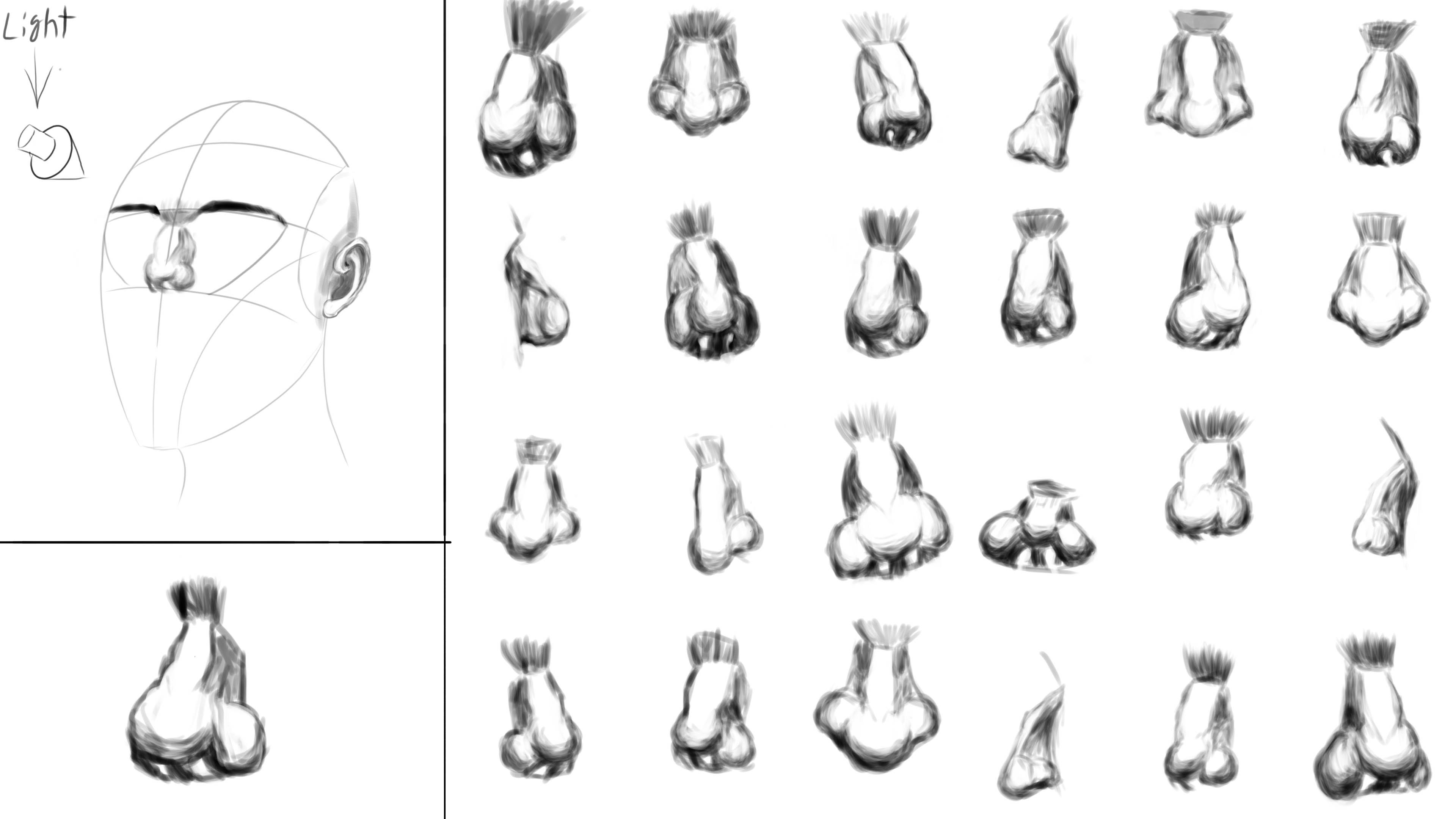
Hope you don't mind but I did a little draw over on your assignment. I think you've got the major forms down but I noticed a few things that could help you out.
You have the bottom plane of the nose bulging out a bit to much. It's mostly flat with just a bit of a bulge.
With elf ears or any kind of pointed ear I've noticed that stretching out that "y" shape helps the ear look more believable. And some of your ears looked a bit flat. Try tracing over the different forms of the ear like with the anatomy in the first assignment. I've done that before to just really get a better idea of how the form turns and overlaps.

You've made a good start, keep at it!
Thank you verry much. These little tips helped a lot. especially that one with the ear is good to know ^^
I do the tracing over the forms on photos before but not enough I think. I tend to go forward to fast.

I finished the first head.

like I sayd I will do one or more other ones till I am happy with it because tis one is not that good.
I had some problems with the eyes. on the head the eyes fitted good but alone they was verry flat. also I draw them too big I think.
An other Problem is my shadeing/blending. The Values are either too soft or hard. Thats why I need more practice in that.
Hi! I think that the main issue that the head might be a lack of volume. It seems like the features such as the eyes and mouth are sitting on a flat surface, while the face curves a bit so the features should show that. Also the eyes are spheres themselves, so the form of the eyelids and shading should reflect that more and it will help them not look as flat.
Also, would recommend being a bit bolder with your shadow by making them with harder edges. I feel like it's easier to map out the volumes this way and I also feel it's easier to go from hard edges to soft than the opposite.
I hope this helps a bit!