Welcome to my sketchook!
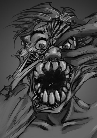
If anything comes to your mind about stuff you'll find here, feel free to comment, say hello, or leave a critique. I'll start with some quick sketches and digital stuff; the first digital one is older, a year old if not more, the second one was made a few days back. I'll draw a few more like these to get myself going and, hopefully, I'll jump into studies. The last one turned out to be too smooth and... infantile? I'm working on something more realistic with a reference. I'm already forcing it, because it seems too clean aswell. I'm looking for a "style" I'm happy with, but it's a little too early for that I guess. Let me know what you think. See you soon.


Hi Cafi! Love the start of your sketchbook! The more traditional looking sketches have a lot of organic feeling in the line, its very expressive and lovely!

Building a style digitally is something you may have to generate by working on studies and concentrating on realism foremost, and then expanding out in color/line/perspective. There are lots of ways to build though! :smile:

Thanks, ni0sh. I'll get to the studies tomorrow. I'll probably do some figure sketches, faces and drop them here. I'm just tired of this one, made with a photo reference. It's supposed to be Cassie from Skins, but I got carried out and stopped looking at the photo at some point. I don't know how to balance detail and shapes. The contrast between the hair, background and the face is too obvious. I'll try to work on this; I'm looking for a technique to blend them a little, make everything fit together. I'll do some experiments tomorrow. Thanks again for stopping by!

Hey, your stuff looks nice. I mean nice. Even the tearing zombie one is kind of nice, not that jaggedy terror-inducing thing:)

I don't think i can offer any tested solutions for the problem you mentioned with the last piece but i would experiment making the background more detailed/sharp edged and then play with the blur options.
In my opinion, the biggest difference between the background and your character at the moment are the edges. The colors, values (except maybe the pure white on the right) and level of details is good, it helps differentiate bg from the girl.
I'd want to keep bg on a seperate layer and try different degrees of blur. You can control how much you want to separate it from the Cassie.

One day, i will start with the faces and manage to draw people, like you and not some unintentional orc-human hibrids;)

Oh, and welcome to the forums!

Hey! As Rokdem said, edges are the large definition between planes on the drawing. I'd reccomend working on your edges some more, especially in the internal aspects of the face. That will help center your focus.
You can also manipulate the values and/or color between the planes using effects like color burn or simply painting. An example would be painting in more contrasts on the portrait plane, and then simplifying the background's value variety.

Hope this helps! Most of what I have to offer about this is from the Istebrak community, the critique work there has a lot of focus on portraiture :smile:

Suggested Topics

Want to read more? Browse other topics in Art Blogs or view latest topics.