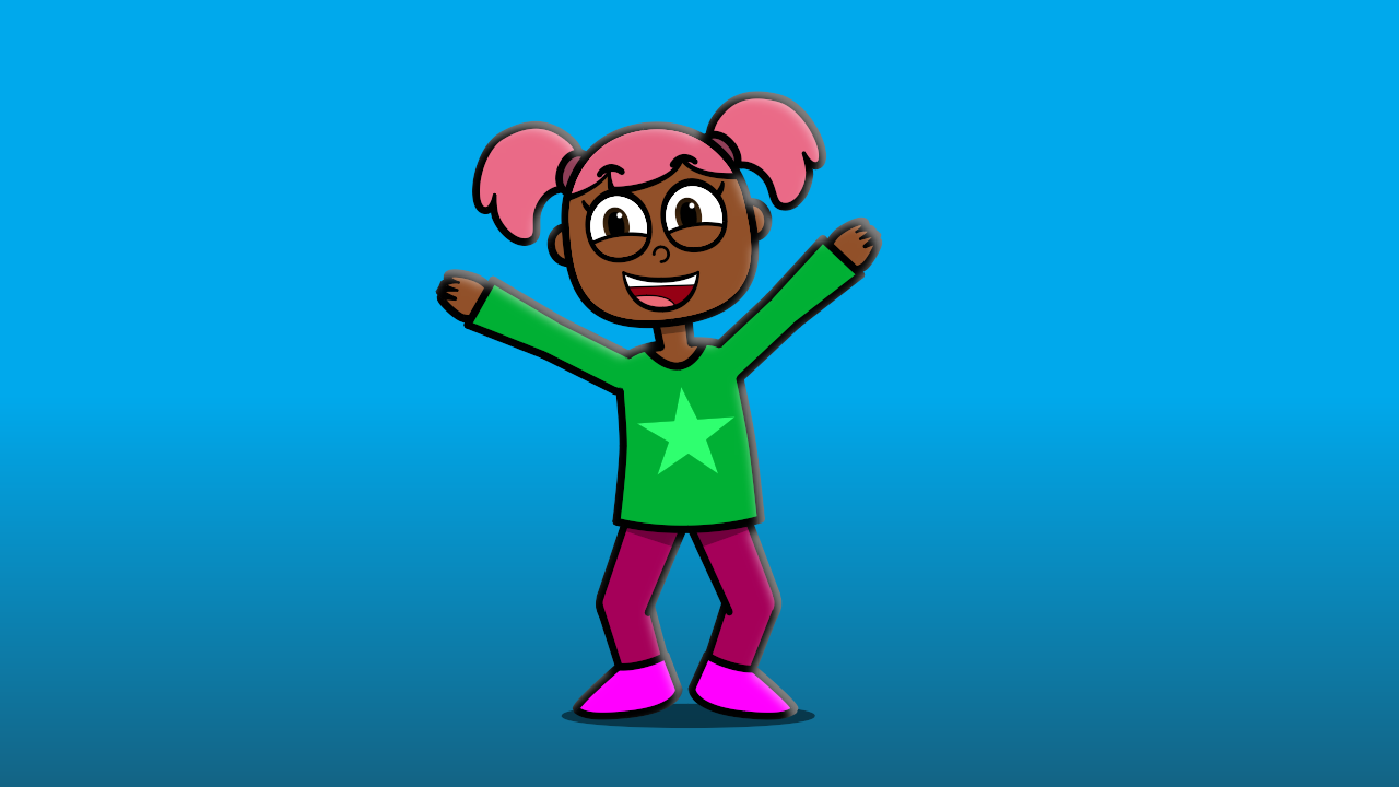
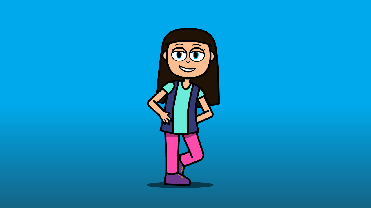
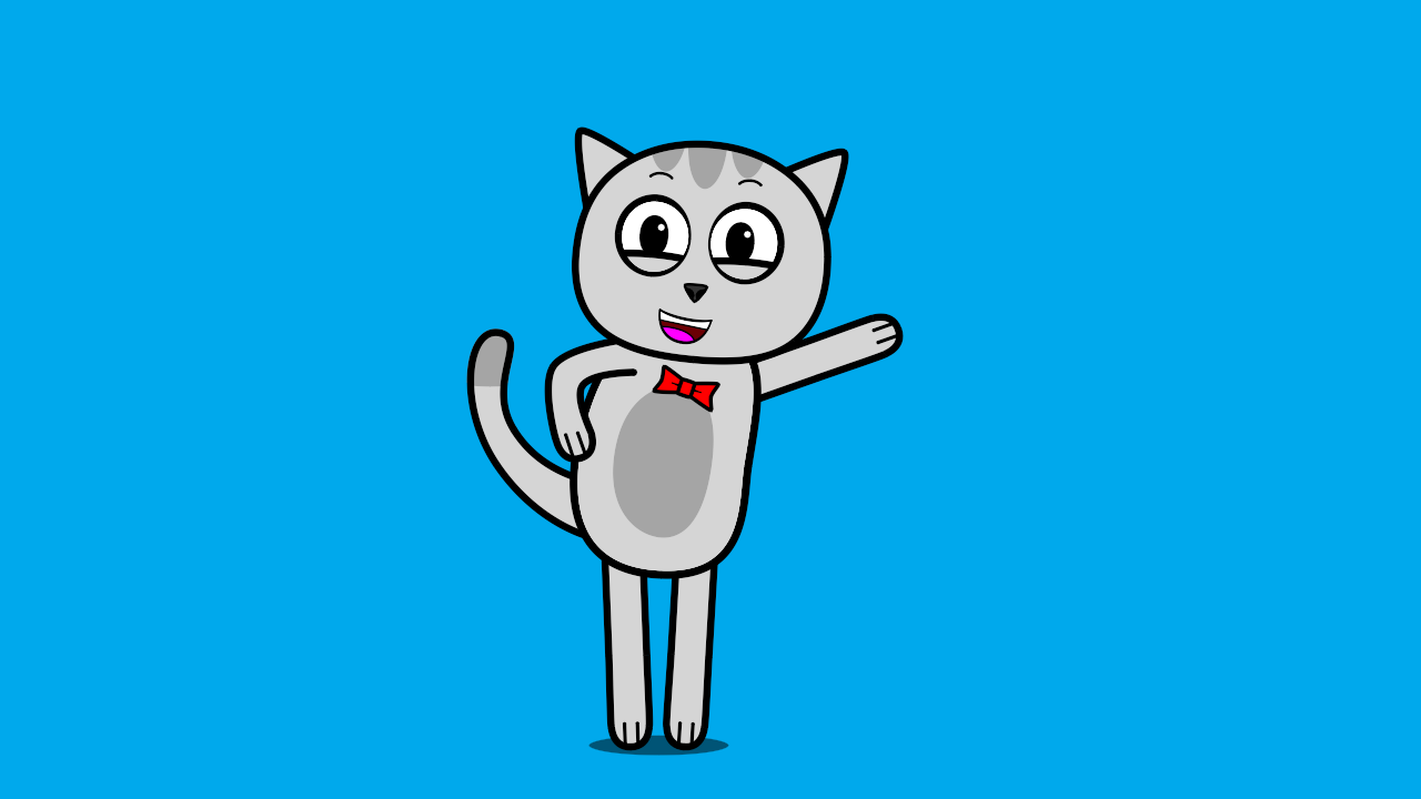
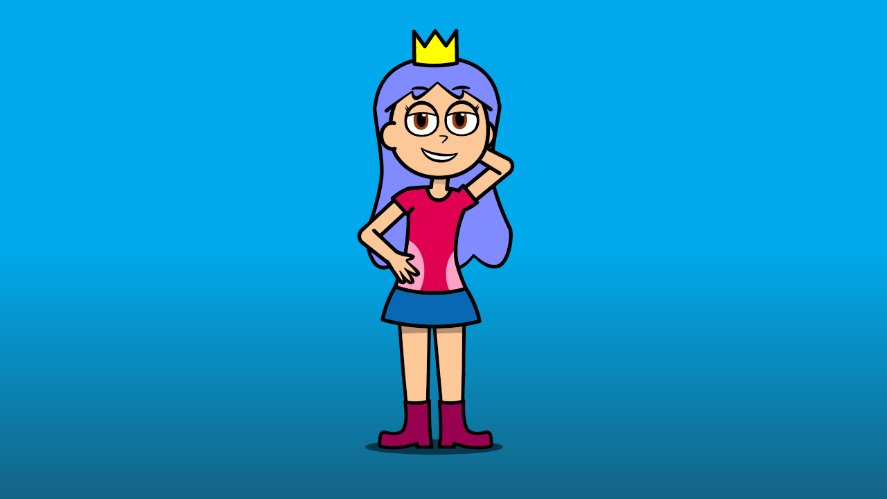
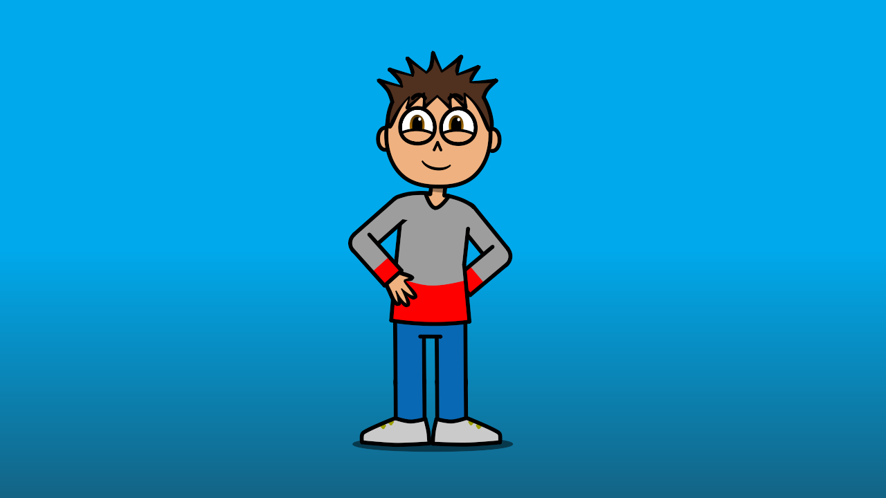
I really like the thick line work and simple shapes here! That feels very in line with typical children's cartoons. Something that might be off putting is the very saturated colors. I know children gravitate to bright colors, but the pinks are off-putting to me.
Otherwise, you did a very good job keeping the additional elements on each character to a minimum while giving them all a unique silhouette. My favorite character is probably the boy as I find the bright red with the gray and blue appealing. I think my child self probably would have liked the girl with the crown simply because she has a crown.
Keep up the good work.