In theory it is similar to vignetting yes.
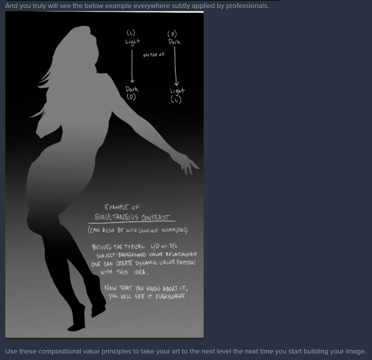
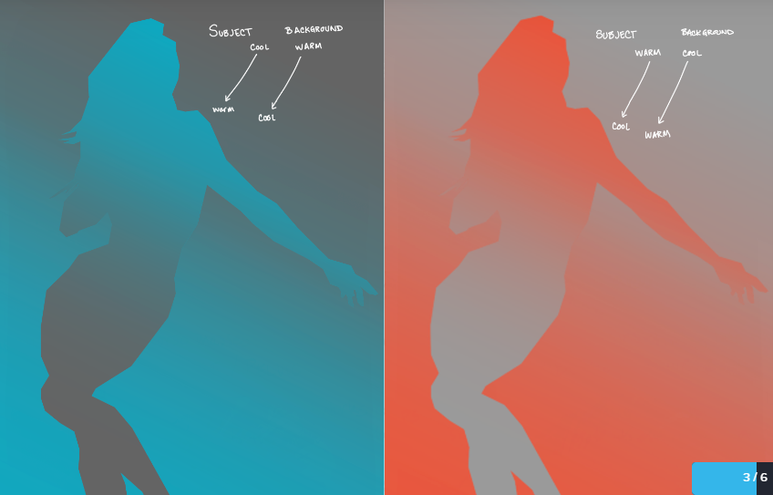
So - that is a example I created to illustrate a theory, to try and represent the 'counter change' of HUE in composition. Where the figure changes it's warm and cool hues against the background's. I attempted to explain that after I explained the VALUE version of it.
I've heard it called two things in my life "Counter-Change" or "simultaneous contrast". Ultimately its compositional theory for value and color composition, it isn't specific to light theory.
As taught to me by Marshall Vandruff, the 'counter change' theory can be applied to have subtle or extreme contrasting effects, to create a diverse impact on the composition itself. Enhancing the focal point - or subject. To force the viewer to look at the part that is the most interesting, and push the eye path back and forth.
Amed Aldoori - I heard him say it in a youtube video and called it "simultaneous contrast" which I personally like better as a descriptive title.
This theory - was taught to me after the application of --
light figure on dark background -- or -- dark figure on light background.
Background/Subject value relationship was hammered into the smooth brains of my peers and myself. And then we were shown this theory - once we were ready to learn more.
So to illustrate that theory for the fundamental of value being represented in composition we were taught something similar to this.
.

Of course this could be reversed, applied sideways, diagonally, straight up and down, harshly, or subtle. Whatever the creator wanted.
After we learned some thumbnails and practiced and were lectured too.
Guess what was next.
Warm Subject on Cool Background. And/or Cool Subject on Warm Background.
With figures or creatures or concept art and whatever - not only did dark/light apply, but now color relationship of cool/warm applied. In it's simplest form - this is composition. When people have ask me about learning color and applying it to their pieces - this is where I always start.
The more advanced section next is the "simultaneous contrast" of warm/cool relationships - which is the example you pulled. 
w
(from the top down in direction-see arrows)
Cool to Warm subject - on a - Warm to Cool background
Next to -
Warm to Cool Subject - on a - Cool to Warm background.
I hit ctrl-I to inverse the screen and took a snapshot and just laid it next to it. It also changed the values when you hit ctrl-i on a layer - but I was too lazy to remove all value - and this was the result.
Now this isn't used everywhere all the time! But it is a theory that can be applied even in the most muted of palettes - and value patterns. In POP SPLASH ART you will see it all the time.
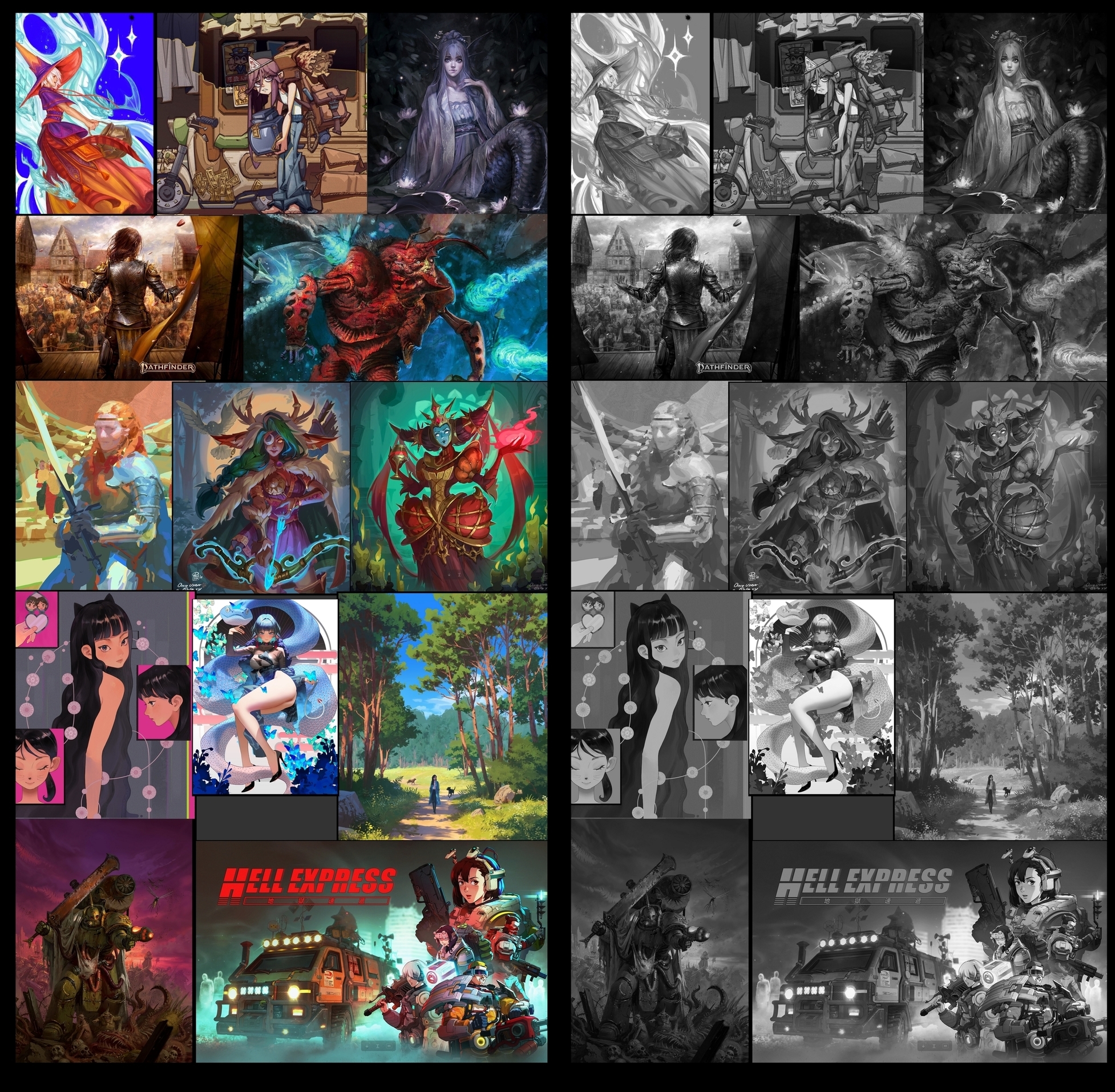
Here are some varied examples of people making the same choices in values, and hue that I just picked at random from artstation just now this very second. Notice the subtle difference between subject and background, or the extreme difference.

Now you will see it everywhere. Notice though in the examples- that to create value and color patterns that are effective this can happen on every element -
not just the whole gradient of the figure composition overall-
the head, hands, clothing, background elements. Everything is adjusted to create the illusion of depth for the viewer, to make a figure pop off the page, or hide in the shadows.