- Thank you! I finally cleaned that up. Meanwhile started 3 more ..I have a habit of taking too long to finish a piece, then I lose interest in it and just start something else. I found 8 from recently i started and abandoned, that are decent enough to not delete, but not finished. There’s also been a number of drawings I felt I “outgrew” - became better before I finished them, and it would be easier to start from scratch than fix them. Anyone else thinking that?in24.0k
- Lady Death Fanart Collectible: Part 6 Polypaint and base Hi, it’s time to share with you another part of the process to create this fanart piece. Polypaint As this is my first collectible fanart I didn’t have previous experience with polypaint so I tried my best and played a bit with it.I wanted to give a ghostly and eerie look to Lady Death, she is beautiful and deadly, but at the end of the day she is a woman that died and was reborn at hell as an avenging spirit, that’s why I gave her skin tone a bluish very cold tone.As you will see I gave myself some creative freedom to deviate from the traditional color scheme that this characater has in comics and illustrations.To add a bit of sensuality by painting some freckles on the face and the chest. The dark nature of this character was the perfect excuse to gave her a kind of goth make up, very dark shadows around the eyes, blue lips and fingernails. I know that the original character includes sexy red lips but I wanted this girl to have a sexy but at the same time creepy look, that’s why we can see some thin veins emanating from her eyes. The biggest chromatic change I did for this character is at the hair. Lady Death has a characteristic white weavy hair but in my fanart I decided to gave her a very saturated blue color.The reason behind this wasn’t only an aesthetic choice. I want that the face area strongly pulls the attention of the viewer so this area needed a stronger contrast. Another reason is that I want her to have a more modern look, as I mentioned before, I’m strongly attracted to women with goth/punk look. I gave myself half an hour or more to analyse the work of experienced sculptors that create collectibles and I discovered that the use of darker values on the skin is often applied to create a greater sense of volume and three-dimensionality. I found that areas with heavy ambient occlusion are the perfect places to paint with darker colors in order to increase the separation between different forms. Even though she has a bluish skin tone, I used a bit of warmer hues in areas that, in real life, tend to go towards red and pink, this is very obvious in the nose, cheeks, and knuckles. Thinking with a logical mind it’s completely absurd to have warmer tones on the body of a zombie like creature but I didn’t want to limit myself by using only blue tones, it looks boring and artificial. In real life these colors are created by blood vessels in areas where the skin is very thin. ** Scythe **for her weapon I applied a cool gray with some warmer variations, this color scheme is influenced by the work of H.R giger. Base I’d like to talk about the design for the base which, to be honest, I forgot to develop along with the character.My main idea with the base is to show that Lady Death inhabits a very sterile and arid land, at the end of the day she is at hell.You can see a that she walks over dirt and rocks, a sign that she’s surrounded by death and loneliness. As part of the landscape we can see some bones and skulls to reinforce the idea of lack of living creatures, yet we can see three hands that try to reach her legs.This hands represent that all creatures are subordinated to her power and seek an evil blessing with a simple touch of the princess of the damned.1- The hand with skin burns represents the souls of those who are newcomers to hell, tortured souls that suffer for the sins comitted on earth.2- The hand with greenish rotten skin and pustules is the reminder of the decay that has infected the souls of those who have been trapped and have forgotten their humanity3- Last but not least, the hand of a demon shows that even dark creatures and entities bow before her presence. The cherry on the top, at least in my vision, are the simese twins that emerge from the ground, this malevolent creatures remind us that in hell there’s only perversion and any trace of innocence is lost. Thanks for reading till this pointI’m really happy to be very close to finish this creative journey, last but not least it’s mandatory to talk about splitting the sculpture in several pieces to be printed, this will be my last entry before showing the final rendered images. See yaMay Zbrush be with youin1.4k
- memory 2min gartic phone, used ref 2m gartic, used ref for pose 2min gartic 2min gartic 2min gartic 2min gartic memory memory memory memory study memory memory memorymemory memory memory memory memory memory study memorystudy study stylized left memory, right study study memory memorymemory memory memory memorymemory memory, porportions r offmemory memorystudystudy memorymemorymemory memory memory memory memory memory memory memory, right leg is a bit broken The feeling of only getting 1 - 3 likes on a social media post will never not be discouraging. But nothing is discouraging enough to make me quit drawing. I think the strategy of drawing a lot of stuff and waiting a while to post is good though rather than posting it immediately and then feeling that sadness on the next set of drawingin
- studies studies juri study imagination, how I feel before a speech imagination imagination study something I drew for my presentation also drew this for my presentation, didn't fix the one hand being bigger than the other imagination + study study studies study study, I need to fix the face a bit based on screenshot from anime but in my style study. except for the eye study studies studies study. changed some things tho imagination imagination imagination study studies, except top right samurai based on anime screenshot wolverine studies, changed some of the poses a lil, not very good at all, but first time i drew the character ever. semi study studies study imagination imagination imagination , for first time ever i tried to draw over 3d model for middle pose, I dont like the result tbh, but it makes it much easier than coming up with it from memory.imagination, except right figurestudies imagination + studies, coming up with action poses r hard, these are not dynamic enough, I will redraw better ones in future. imagination , imagination imagination study, except for eye imagination imagination imagination doodles except for the two chrollos imagination storyboard thumbnail, idk if i ever shared this. my storyboards end up being a little detailed since i usually just draw in one layer.in21.9k
- Hello! My name is Vithor, I am from Brazil, studied Design at a local college worked as an illustrator for more than 10 years. I took a time off around 3 years ago and am trying to get back in my art shape and maybe become professional again. Here are some recent pictures: You can find timelapses for most of them on my instagram: www.instagram.com Vithor Albertim (@vithor_albertim) • Instagram photos and videos 123 Followers, 638 Following, 19 Posts - See Instagram photos and videos from Vithor Albertim (@vithor_albertim) Comments and critiques are always welcome.Cheers!in784
- Thank you @daceronine! If I remember I save in google cloud, I will have to stick a note to do it more often. Lamp is from life. Poses are from refs but I look at refs for a while and then try to do it myself and look it up if needed. Outfits and rest is from imagination Something went wrong while installing system so we will have to wipe everything again... pc works but something is wrong. We will wait till internet is done and I will save everything on cloud this time Threads came out in eu. It's been 3 days and I had more engagement than after half a year on instagram. It feels really nice I hope it stays this way A portrait of old dude. It's the same character I posted a while ago. Inspired by Bayard Wu work. At first I thought of him as a bear but I named him Fenrir and I think wolf suits him better. Eye gave me a bit of hard time but I think it is fine now. I focused on face and forgot about area below. The way I draw hair clashes with greying hair. I had the same problem while doing Lohse's white hair. Does it looks like it is greying here? I love how desaturated red looks blue there. I keep lying to myself that I will use different color scheme but It all comes down to this blue and yellowish one it is just flipped this time Have a great day!in47.4k
12 days later
Hello @jbean5000
Lets see if we can help you out a little bit. It looks like your put in a great effort and did your best. So lets run through some tips to help your piece. Check out some of my other critiques to see if they help you in your character design, anatomy and rendering.
1 - Well let me stop you right there cause it looked like you tried to do both. A school uniform, or military uniform should signify focused training of some kind. Especially one that involves a martial art. The the focus of this design is going to allow the person to move, be protected, and conduct combat without being in the way. But also go to class? Maybe.
But we need to break it down even further. Is it for fencing practice, ceremonial, or actual fencing dueling combat? The more in depth you go into the story the more the design draws itself in your mind and in your planning. Here we have a more appropriate shape to your fencing attire, be it military or school. But also you can see you can repeat the design element shapes to create unity throughout the design, for example.
2 - When I began making corrections and drawing over your anatomy I started to realize that the skirt might have been to cover up the lack of hip and leg anatomy knowledge. Or the pose just got away from you.
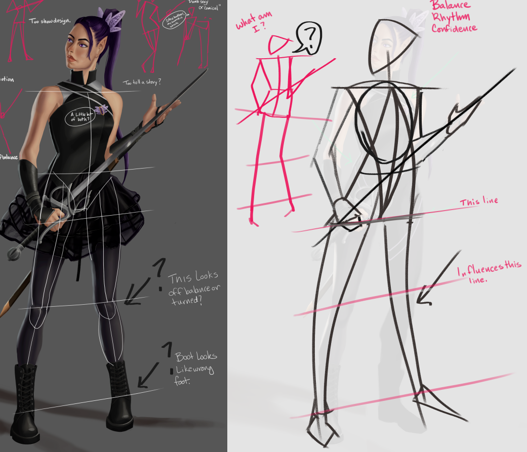
.
3 - When you are making your poses I dont know if this was what you chose or what you ended up battling towards your finish. Maybe a little bit of both. But remember to try little mannequins and think if you should tell a story, or show the design. I have no idea what term 5 is, but I'm guessing its design. But having the ability to move the person matching their personality can help push a character narrative.
..
4 - Now lets nit pick some of the design. Things like this look uncomfortable. Give the armor room to bend at the joints or bend the armor. I chose the former to illustrate. I also took off some of the palm to emphasize the foreshortening of the hand.
..
.
5 - I have drawn Reilly method heads on critiques before, but we can just drop a couple lines in here and see that the facial features are not lined up with the correct head perspective. Spend a little more time on that hair to get rid of that sharp lasso tool line. Make a more convincing hair edge transition. Also where is the shadow under the collar. I can se there is space on the side so there should be enough space to see a cast shadow.
.
.
6 - I didn't do a demo of this next part because I think I have spent lengthy time in the critique section explaining it with examples and it takes a lot of time.
But!
The value groupings need to be uniform throughout the entire piece. The darkest dark's need to remain the same across all the skin (as well as all the other surface elements in the picture) depending on the light design. 4 values plus a darker occlusion to really unify it. You really have to separate your shadow and light shapes to define the direction of the light source for the viewer. You may have 'over rendered' this and that is why it looks this way. Just look up shadow shapes and value groupings.
Lastly.....Give that rim light some pizazz! This is concept art after all darnit !!!
Anyway, you did a great job and pushed yourself. It takes sand too ask for help on something you've done your best on. Keep up the good work and post an update if there is one. Not many do. I hope your critique in class goes well and you get some good lessons.
Hi brohawx,
I apologize for not responding sooner, but I honestly thought no one would respond after a few days, so I stopped checking. I need to get better at my forum follow up.
I really, really appreciate you taking the time to give me such detailed feedback with examples. It's very helpful and will help me improve on my next piece.
A couple of things:
The skirt was not to hide the thigh or leg, as I feel okay with the anatomy. However, I think my issue is with keeping things in perspective, and I need to be more aware of this when working on my figures.
I'm still struggling with values and understanding how to keep the darkest darks or lightest lights uniform and that certainly happened in the skin. I'll check out your other critiques to see what I can glean from those.
Thanks again!
Suggested Topics
Topic | Category | Replies | Views | Activity |
---|---|---|---|---|
Perspective and Face Proportions | Art Critique | 7 | 149 | 1d |
General critique needed | Art Critique | 6 | 1.2k | Oct '16 |
Inktober 2018 critique | Art Critique | 4 | 1.3k | Oct '18 |
Trying to improve at paiting clothing and fabric. Feedback would be appreciated | Art Critique | 1 | 639 | Apr '23 |
Character Design WIP (Critique Needed!) | Art Critique | 4 | 1.8k | Oct '20 |