Hello @jbean5000
Lets see if we can help you out a little bit. It looks like your put in a great effort and did your best. So lets run through some tips to help your piece. Check out some of my other critiques to see if they help you in your character design, anatomy and rendering.
1 - Well let me stop you right there cause it looked like you tried to do both. A school uniform, or military uniform should signify focused training of some kind. Especially one that involves a martial art. The the focus of this design is going to allow the person to move, be protected, and conduct combat without being in the way. But also go to class? Maybe.
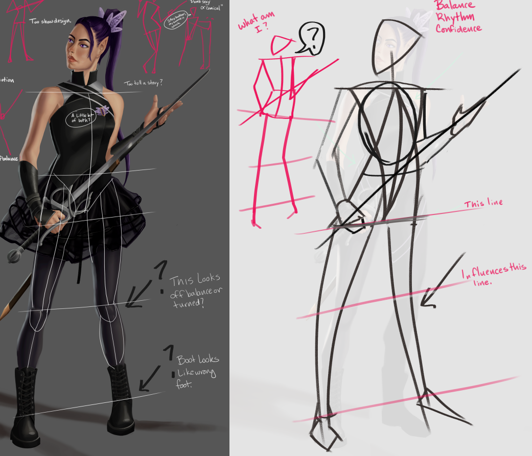
But we need to break it down even further. Is it for fencing practice, ceremonial, or actual fencing dueling combat? The more in depth you go into the story the more the design draws itself in your mind and in your planning. Here we have a more appropriate shape to your fencing attire, be it military or school. But also you can see you can repeat the design element shapes to create unity throughout the design, for example.

2 - When I began making corrections and drawing over your anatomy I started to realize that the skirt might have been to cover up the lack of hip and leg anatomy knowledge. Or the pose just got away from you.

.
3 - When you are making your poses I dont know if this was what you chose or what you ended up battling towards your finish. Maybe a little bit of both. But remember to try little mannequins and think if you should tell a story, or show the design. I have no idea what term 5 is, but I'm guessing its design. But having the ability to move the person matching their personality can help push a character narrative.

..
4 - Now lets nit pick some of the design. Things like this look uncomfortable. Give the armor room to bend at the joints or bend the armor. I chose the former to illustrate. I also took off some of the palm to emphasize the foreshortening of the hand.
..

.
5 - I have drawn Reilly method heads on critiques before, but we can just drop a couple lines in here and see that the facial features are not lined up with the correct head perspective. Spend a little more time on that hair to get rid of that sharp lasso tool line. Make a more convincing hair edge transition. Also where is the shadow under the collar. I can se there is space on the side so there should be enough space to see a cast shadow.
.

.
6 - I didn't do a demo of this next part because I think I have spent lengthy time in the critique section explaining it with examples and it takes a lot of time.
But!
The value groupings need to be uniform throughout the entire piece. The darkest dark's need to remain the same across all the skin (as well as all the other surface elements in the picture) depending on the light design. 4 values plus a darker occlusion to really unify it. You really have to separate your shadow and light shapes to define the direction of the light source for the viewer. You may have 'over rendered' this and that is why it looks this way. Just look up shadow shapes and value groupings.
Lastly.....Give that rim light some pizazz! This is concept art after all darnit !!!

Anyway, you did a great job and pushed yourself. It takes sand too ask for help on something you've done your best on. Keep up the good work and post an update if there is one. Not many do. I hope your critique in class goes well and you get some good lessons.