DISCLAIMER: THIS IS NOT HOW YOUR IMAGES IS SUPPOSED TO LOOK! - ONLY YOU CAN DECIDE THAT - THIS IS AN ILLUSTRATION THAT IS TO TEACH A THEORY AND ALL MY OPINIONS ARE SUBJECTIVE.
Hey Verr!
Thanks for all of the information - this is probably the longest post that I have ever seen in the critique section. It made it really easy to respond to everything so thank you for that!
Always cut yourself some slack and take time to enjoy making it and just enjoy being creative. You don't ever need anyone else to tell you that you good. Never seek validation through online means - because trust me no one is going to ever tell you, "Hey you are good enough pal, we all approve!"
You will just have people asking you how you do that thing you do and why.
Lets get on with the critique shall we. It's been a while since the last critique so lets knock some dust of of the old wacom tablet!
----- REGARDING YOUR CONCERNS -----
VALUES HIGHLIGHTS AND LIGHTING
"I think what held me back here is a worry of just completely silhouetting/losing detail and being unsure of how to properly handle values effectively due to lack of practice and experience."
This is often the case with many people starting out. So lets go over a few ways that you can change that before you start rendering. So I want to go over some principles for composition - before we lay them down onto some of your demonstration paintings.
SUBJECT BACKGROUND RELATIONSHIP
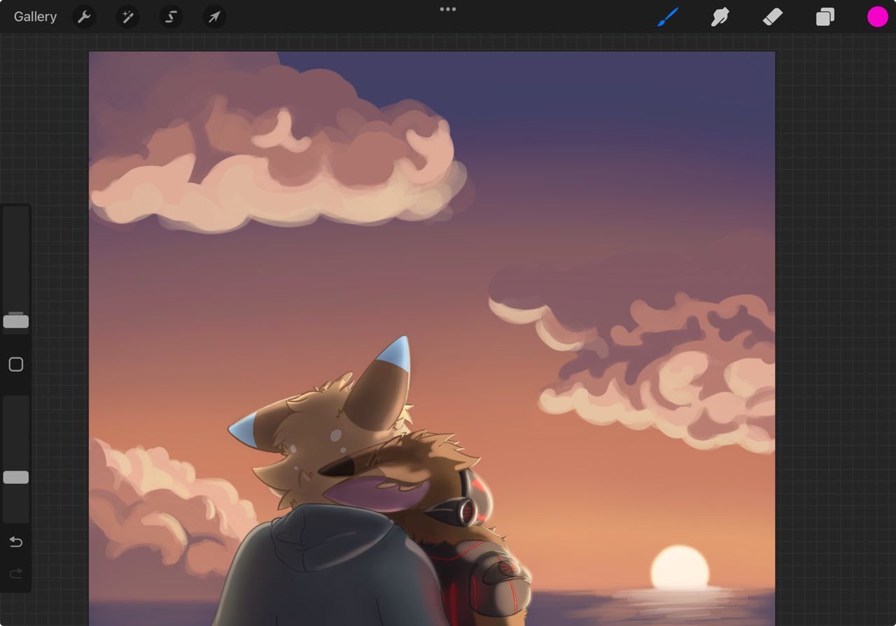
When considering composition of a piece for now – consider the separation of the subject or the background. Yours is clearly dark subject light background. This is how every illustrator is trained. This way you can group the values together to manipulate the composition – instead of worrying about being “right” like so many people early on are concerned with. What's right – is the mood you want to compose. And where you want there to be a focal point - aka the subject.
Here are some examples of people using dark on light, and light on dark - not to mention cool on warm and warm on cool subject/background relationship theories. Notice how subtle and extreme they can be with contrast.
Go ahead and look around on artstation for a few minutes. Notice it everywhere.
The Controlling Variables
Light, neutral, or dark. Light your value pattern of your image with those three choices.
Think about what the energy level, visibility level, and emotion are on sliding scales like a character creation tool. There are many combinations.
Consistency
The constants however have to be there to make things READ.
Those are direction, intensity and color. All of which need some work in your piece.
CLINT CEARLY - 4 LIGHTS AND LEAVE IT AT THAT
Never worry about it again I think I mentioned this a few times in other posts and maybe one for yours. Never the less, stick to it. You don't have to have them all but you can only ever have these four.
Backlight – (aka rimlight) separating the subjects from the background
Fill light – (ambient light or bounce light) is hitting the shadow side of the subject
Key Light – the main light source, sun or spotlight, causes a clearn NOTAN, or separation of light and shadow.
Background Light – the one that is lighting only the background separate from your subject, it may or may not have any influence on them.
But you must make a pallet - to keep your constants. Direction, intensity and color
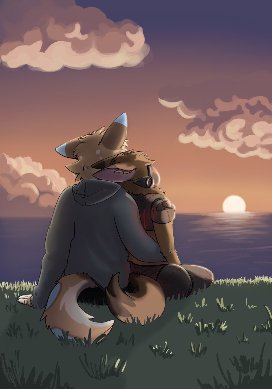
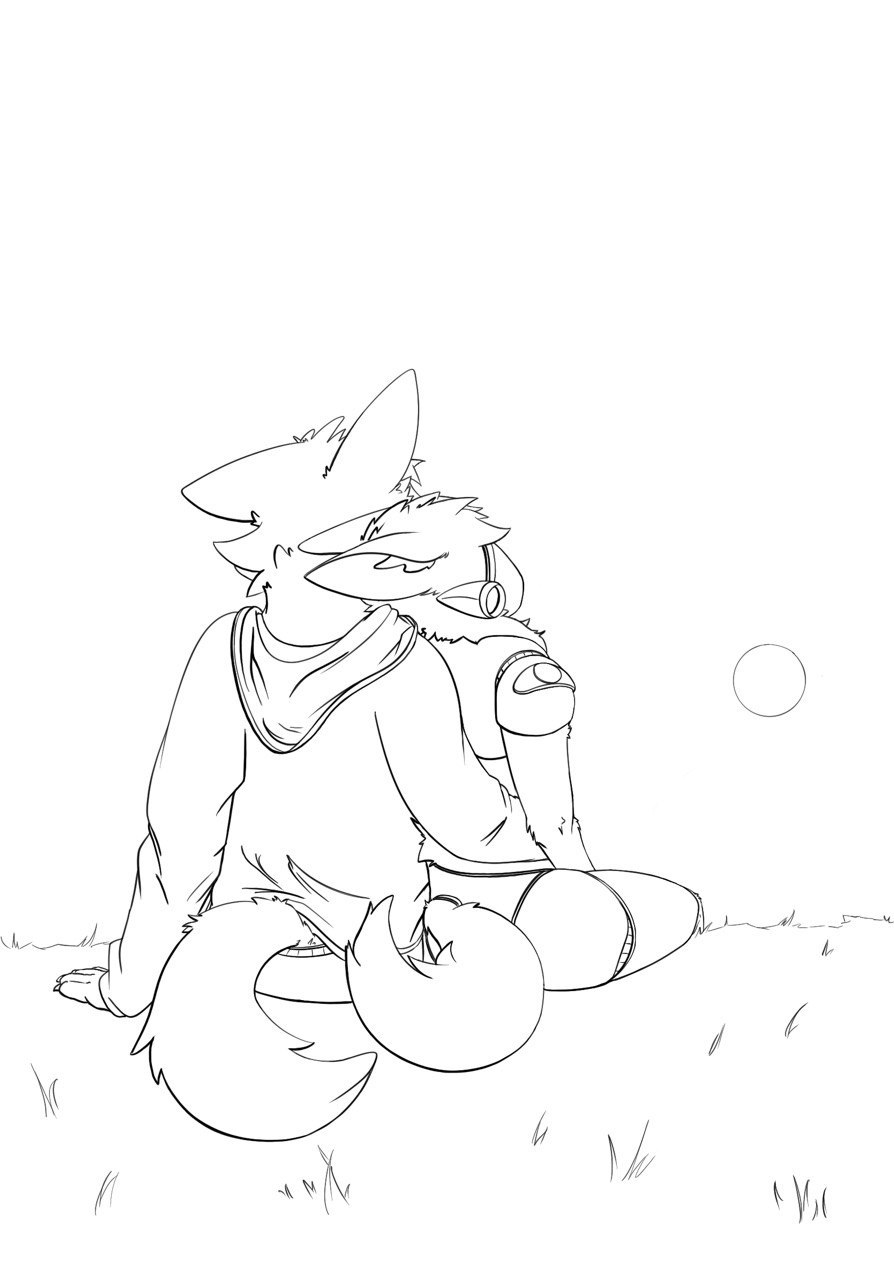
GRASS
I think this is great - its grass - we get it. Unless you wanted to tell more of a story with natural landscape that exists near a cliff that erodes due to the elements effects on the geology - keep it simple. The story is the love not the way you struggle to paint the landscape beneath them. With that being said - we don't want it to distract from our subjects now do we.
CLOUDS
They might be a bit too busy sure. They might also have too hard of edges on them and are not necessarily in perspective, but also we missed the opportunity to bolster the intention of the piece. Which leads me into my next pointer.
SUBJECT / WEIGHT / EYE PATH
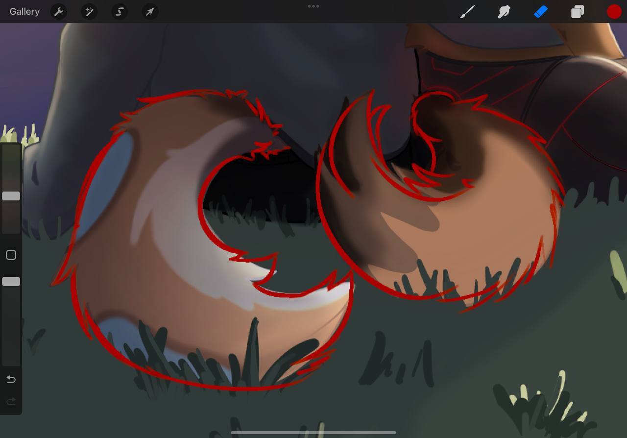
The eye naturally wants to wander. And will do so with every piece of contrast that is placed along an eye path. And what every great illustrator does is puts items of contrast, value overlapping, shapes via implied lies - a bit of everything - to make the eye move around the picture. You ever wonder why you go all over a piece and stare at one for so long? Because the illustrator designed the piece to draw you in. Think of weight - as something that actually means GRAVITY but for the eye's attention. Use the elements of the picture to cause small droplets of gravity that pull the eye around the piece.
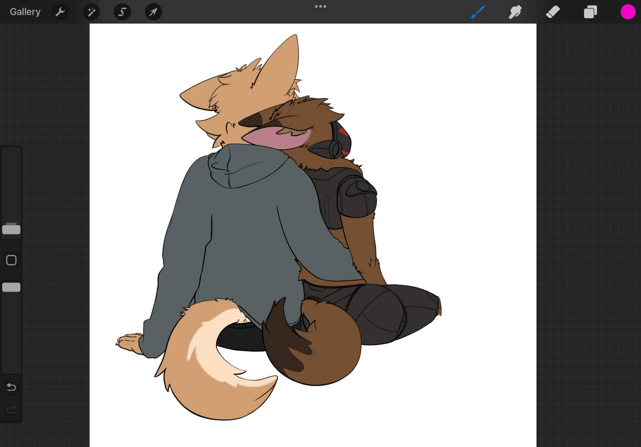
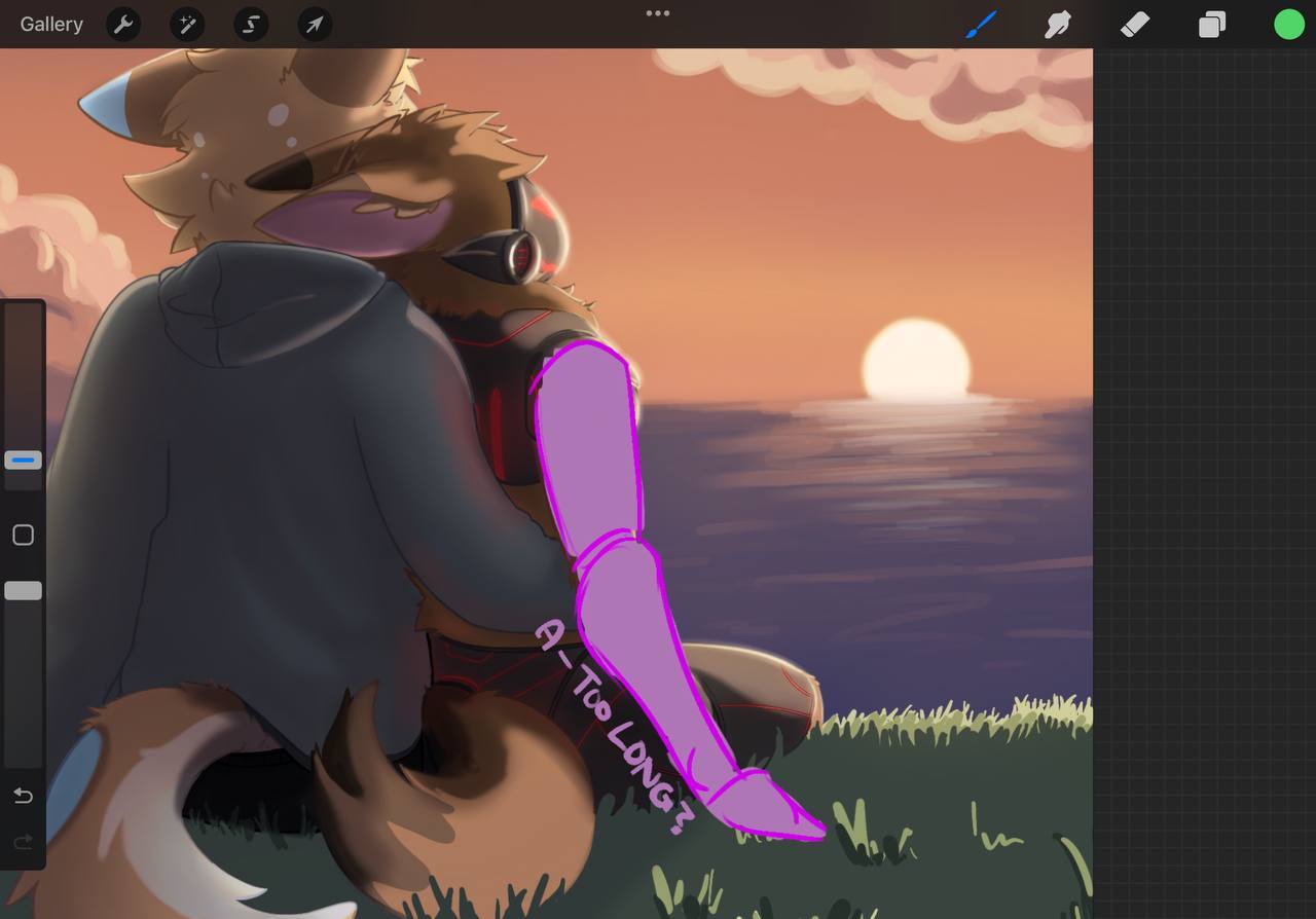
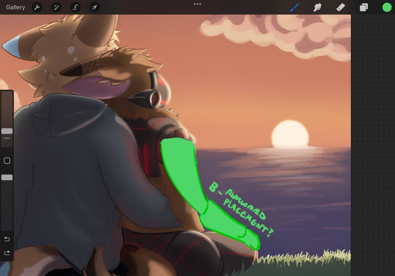
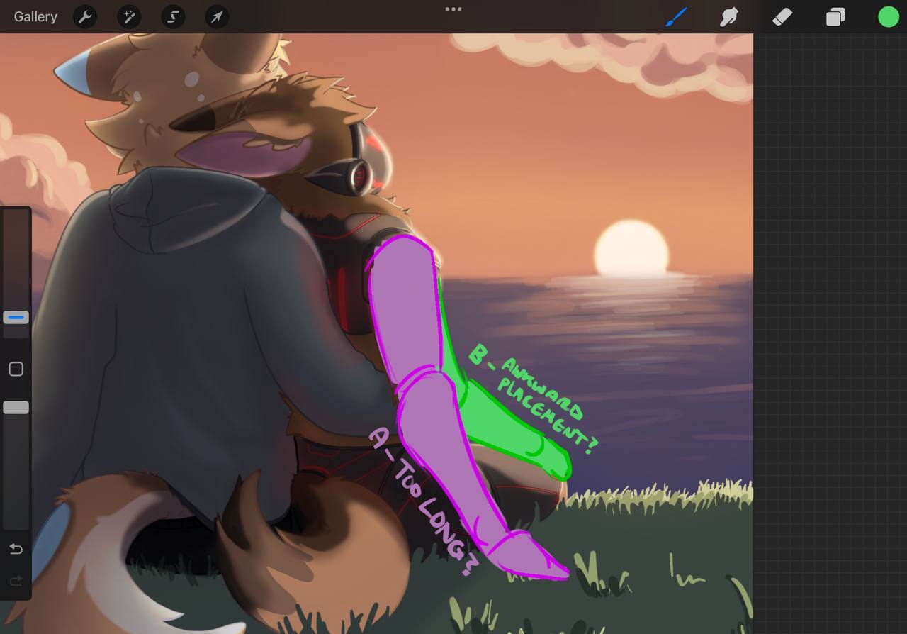
ARM – as the LITTLE SPOON in the couple's position
We may not have to see the whole arm – and if we are not thrilled by it or if it has to tell part of the story or express something it is okay to lose it.
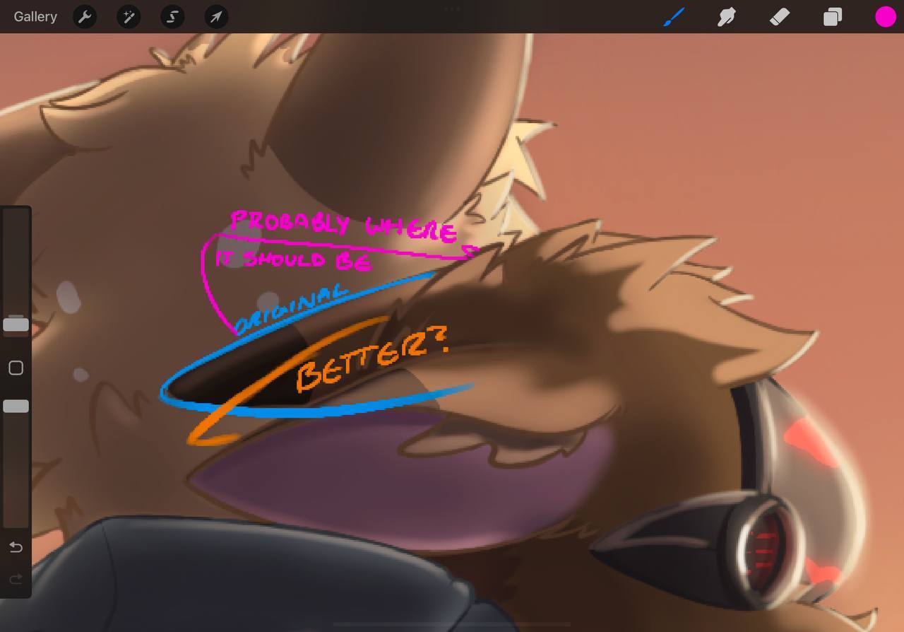
The SOMETHING ELSE
Yes you softened the edges of the piece and dulled the contrast allowing us to focus more so on the subjects. Not bad instinct. Did it improve the piece? Only you can judge.
------- REGARDING FINAL THOUGHTS SECTION ------
PEN CONTROL
I don't see specific issues here. Your calligraphic penmanship with mark making – especially with digital painting will change over time. Your use of the tool for digital illustration is limited to perhaps just using the brush and not the lasso tool as well.
FOUNDATIONAL KNOWLEDGE AND PLANNING--
I think you are ready to plan out some compositions before your next piece for sure. The quickest way to do that for starters is break things up into big medium and small shapes so that the relationships are not all the same, causing hierarchy and variety to occur - with unity - among your shapes. Think in “essence” of a shape and how it best can describe it from the two theory videos provided.
Change the Way you see shape designs forever - youtube
Design Theory - Shape Appeal - youtube
Design Theory - Big Medium Small - youtube
Finding the essence - this talk, along with its many other well made points I find often helps people understand where the pedigree of the styles the have come from - and why they look the way they do. Specifically pay attention to the part about essence if you will.
https://www.artstation.com/artwork/yJmel8
Rendering--Go and look at your art god/parent/chosen master. Or just humbly, a 'style guide' for rendering in the style you think is the bee's knees.
Make sure that you understand how the style is effected by simply having the light and dark separated on the form through NOTAN.
Is it cel-shaded?
Is it painted over the contour of the form with the paintbrush or pencil?
Is it painted with the classic round airbrush from digital painting?
Is it filled in after the artist lasso tool's the shapes they wanted?
All of those different techniques will affect the style guide ultimately.
Master one style guide first of the ones that you admire. It will be the easiest to be motivated by those when you are starting off.
IF that technique involves simple line art that is part of the illustration similar to an anime or a cartoon – great. If the line art is not as important and you can get away with a drawing instead of a fine line art -- great.
Consider everything that you do part of the process, and from now on – everything you do will be designed as part of a style guide -- aka the process.
LIGHT THEORY - AND APPLICATION/PROCESS
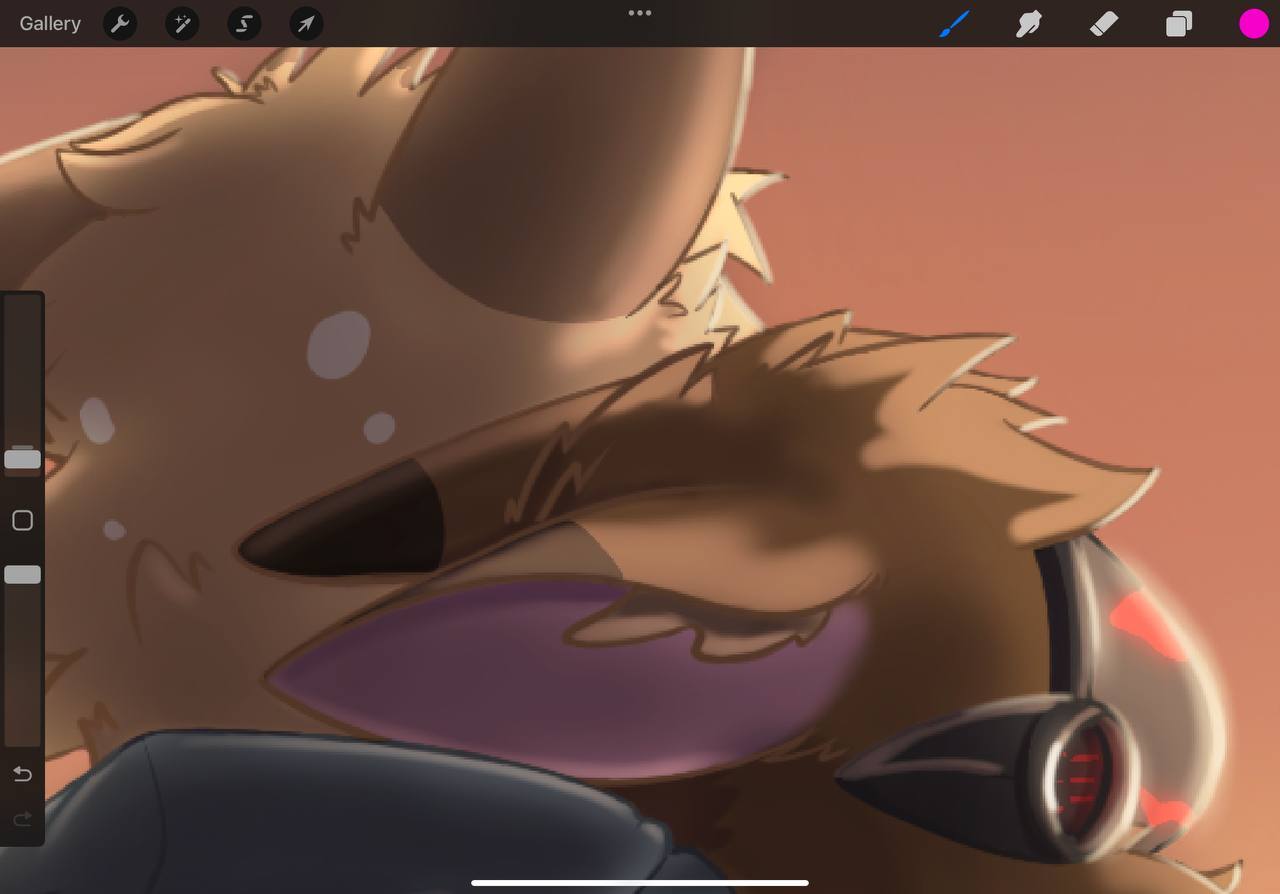
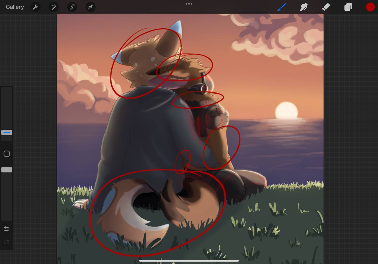
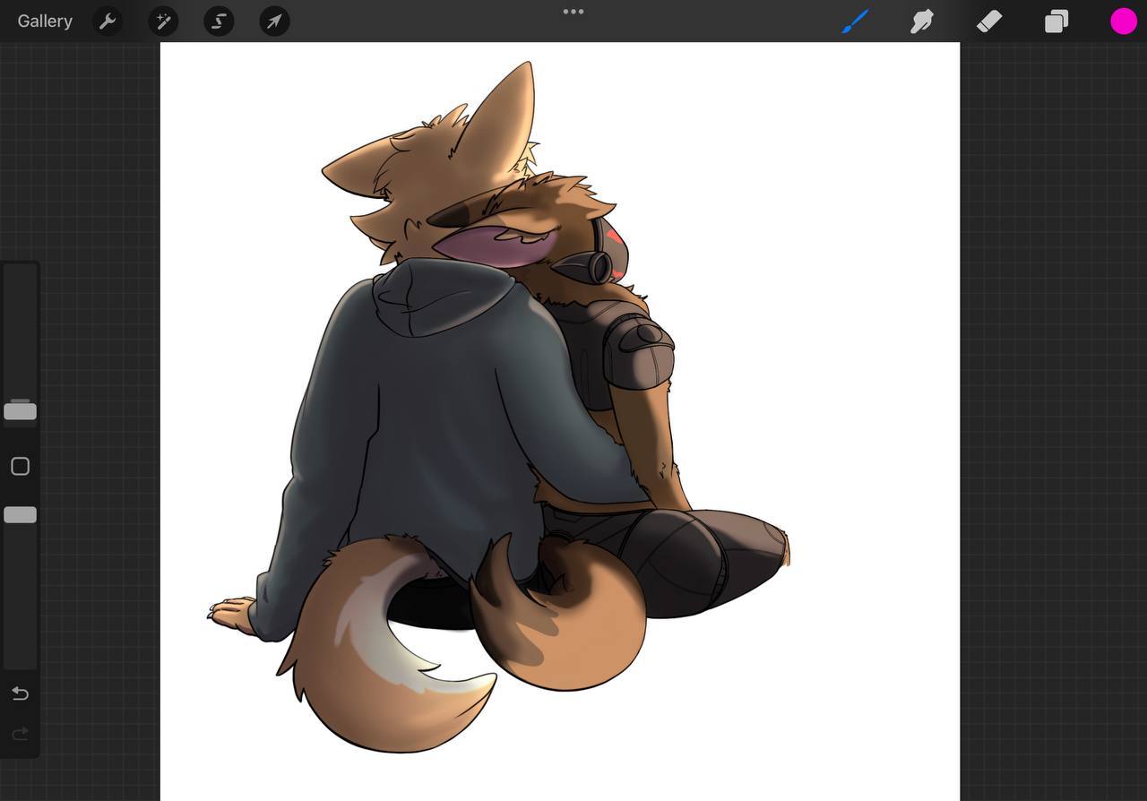
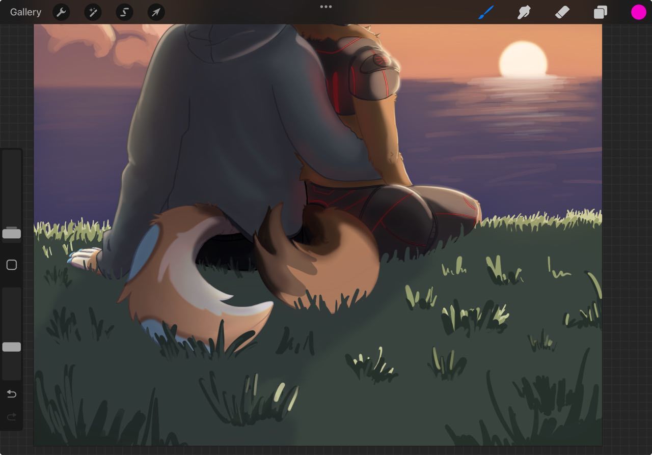
What I think you need to work on is light theory for forms. Overlapping and occlusion shadows that recede into the darker parts of the crevices of the forms, creating the illusion of overlapping. This is the limiting factor of values per element that I mentioned before
This is the detail you need without over-complicating the illustration - and allowing it to READ. Also simplifying your thought process to the four light theory from before. This has three light sources – two of which are hitting the subject.
Backlight – (aka rimlight) is hitting the subjects from the sun.
Fill light – (ambient light or bounce light) is hitting the backs of the subjects.
Key Light – There is none – there is no major light source causing shadow shapes to halve to be made like the ones on your subject
Background Light – the one that is lighting only the background separate from your subject.
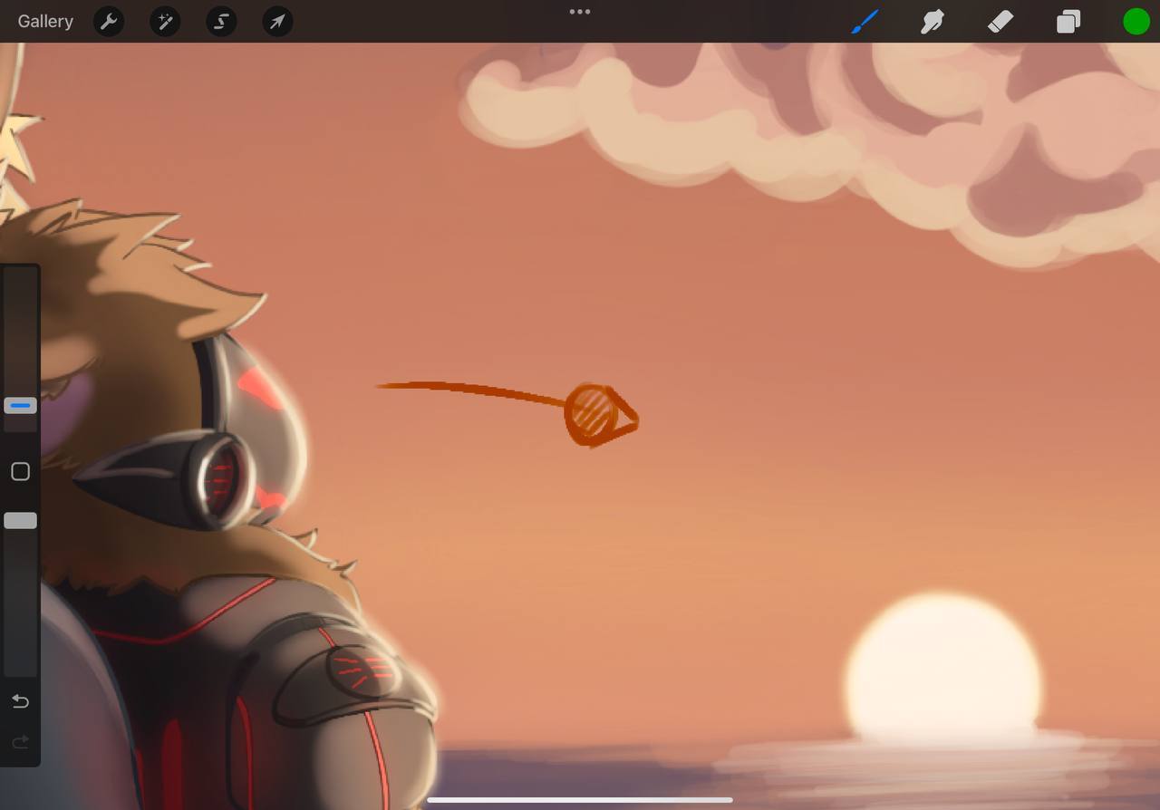
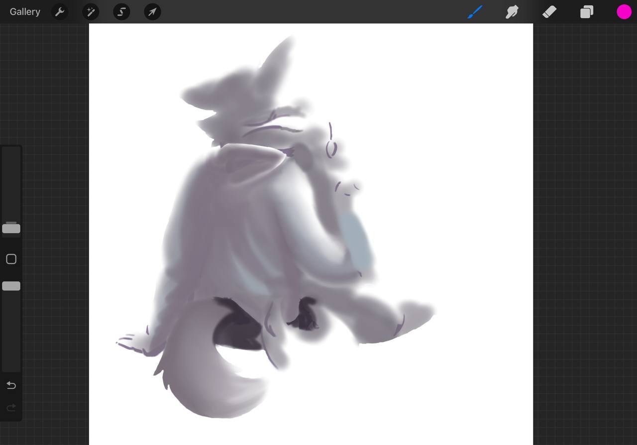
Lets take the rim light from the sun only as rim light- remove this pesky strange places that should definitely be in the shadow and add the flats back into your image for a moment. Its not 100% back to flats but this will help me illustrate my point.
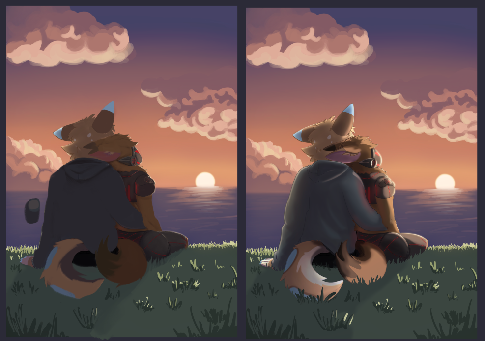
Now lets show you how you can use the fill light to create the form on the subjects for the details that are in the shadow.
Lets add the fill light from the twilight, and the occlusion shadows to the folds of the jacket and tails, head etc. You can see my little pallets there.

Now I want to note the contradiction that I have placed here with occlusion shadows - being the third color in the shadow side of the elements of your illustration.
Howard Pyle - who taught many golden age illustrators - always taught to put your details in the light or the shadow. Never both. I believe this is for the sake of readability. Otherwise it looks too busy. So if we stick to that rule, we are adding detail to the shadow here. And we are not confused by having to look at the light side of the figures on the other side anyway.
LINE ART QUALITY - AND PROCESS/APPLICATION
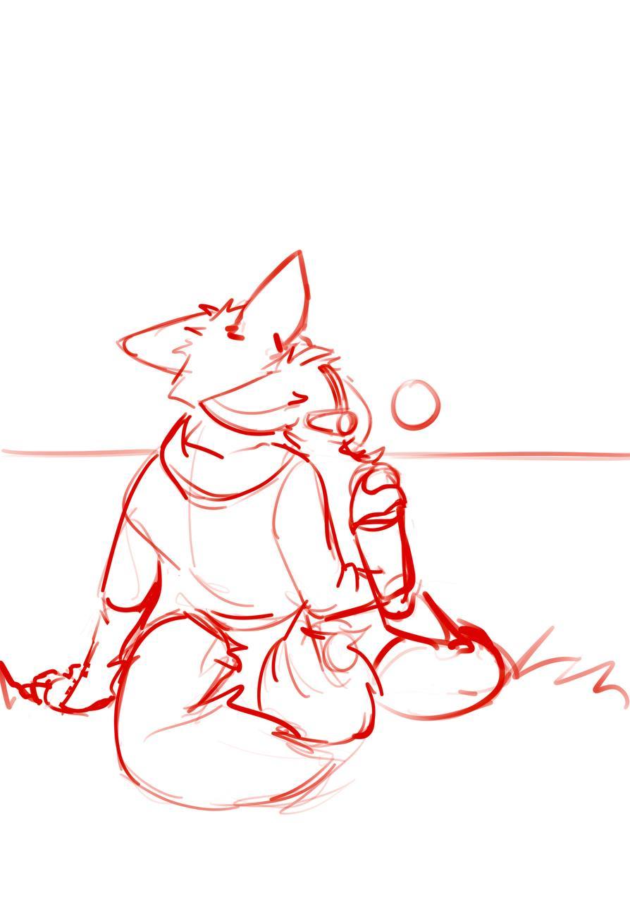
Line quality & thickness control (how to keep it confident but not chunky?)
Lets imagine for a moment – that line weight actually has a purpose in the drawing itself – almost like “notes” for your future painting by doing two things.
1. Details – add more details where you think you know you want the focus to be for the painting.
2. Weight – use the weight and dark spots to add overlap to the shapes and forms, not to just arbitrarily add line weight variety.
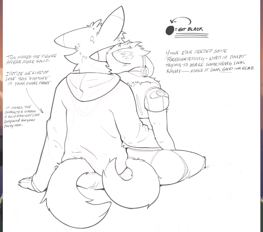
This way when you take a break and come back you have planned where the attention to detail is going to be with all the information in the heads. And all the blank space in the rest of the areas. Then you also see which element is overlapping which - this is where you make your sweeping changes. Always take a night away from it and come back to find errors. Or mirror that canvas constantly until you don't see any.
FUR AND HAIR THAT READS!
Fur/hair that reads soft & layered without going hyper-rendered and appears like it exists in a 3D space.
This just takes practice - and it will take some practice, because I have seen some that are masterful
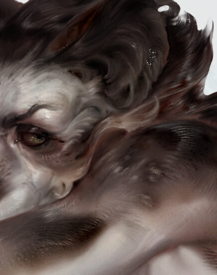
https://www.artstation.com/artwork/YKONVK
–
And I've seen some that read very well and are fun.
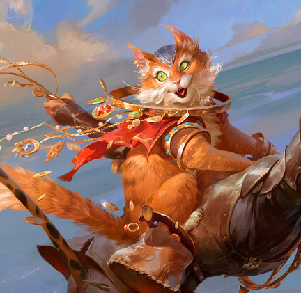
https://www.artstation.com/artwork/a0rgzL
===
But this is part of the style guide and will affect your future style guide for your illustrations.
Lighting/values from a light source (how far should I push shadows/shading without losing form?
Remember what I said about Howard Pyle? Well this extends some of that.
For every element in your piece remember this - never use more than FOUR VALUES to paint them - otherwise they become busy and distracting and confusing - not allowing for clear readability with shapes, and shadow shapes clearly defined for our monkey brains.
Use the split for values like this.
LIGHT SIDE
Two values - mid tone and highlight
SHADOW SIDE
Two values - core shadow (or terminator) (this can be cast shadow with hard edges or form shadow where the form turns away from the light)
and fill light.
You can decide through your own studies and research how you can manipulate the values of a piece from these choices. So when we are going to paint something like the back of your characters to make them read, and keep the detail that you wanted without it being confusing. We have core shadow (dark and flat tone) with the fill light hitting the area. That is two colors - for every element (tail, jacket, metal, fur...etc) in the shadow side. I will show you what I mean.
For the rest of your painting - You want it to 'read'. The point is not to render the grass to perfection. Or be the best at painting the grass and clouds. The point is how much do you actually have to paint the grass - for your painting to not need more detail in the grass than necessary. Don't make the grass distracting in other words. Make it just enough.
That is how far you should push it. Two values per light, two values per shadow. Outside of that is occlusion shadow in the darkest areas where no light is present. Occlusion shadow we will add last in the demonstration.
----------------- REGARDING FEEDBACK YOU WANT MOST--------------
We've covered this a bit already and I know that you have pained over them for this piece.
Remember – that every element in your art work can be a supporting element for the purpose of the composition. Whether it is to move the eye around the frame, or hide one of the elements because it doesn't mean as much to the viewer – but it might be important for value pattern of the composition.
You are already doing the part that people struggle with the most these days which is being consistent. Just keep finishing pieces until you cannot tell what is wrong anymore. Make notes and keep asking for help. You will get there.
Keep up the great work.
Ta for now.