Haha, no need to apologize!, I'm just happy that it was the small suspension bridge instead of the whole main castle arch cause that'd be a pain to fix.
Thank you so much for your feedback, you were 100% right, the closest part of that bridge was fairly smaller than the one further away, so I went back and fixed it, much appreciated!.
I'm just gonna go ahead and upload some last minute updates from today's drawing session, I might adopt a daily update schedule instead of weekly cause I tend to lose track of what I haven't posted and what I have.
All I did today was 1 almost full page of different perspective studies, and a few random Line weight practices.

I also went back to my 3 point perspective drawing and attempted to add some contrast between the castle/wall and the sky, just cause I felt like a purely white castle with a pure white sky didn't work so well. I also tried to add some very simple shadows around what I'd consider to be the most important parts of the wall.
I haven't started with light related studies yet so I'm bound to make mistakes here, Correct me if you please!.
And thanks to Snakker for letting me know my suspension bridge wasn't correct in terms of perspective!, I went back and changed simply using warp, quick and easy fix, though it still doesn't look fully right to me, Might go back tomorrow and fix it fully.

Glad I could help, looking good. Amazing how dramatically some shading can change an image
Indeed, Even though all I did was some basic shadows that probably aren't correct it still makes it look more 3 dimensional.
Keep up the good work private! The dedication is strong with you!
Thank you so much!, Though the dedication could've been stronger, haven't done anything this weekend cause friends, but that's alright, hopefully next week will be better.
Random Quick little update
It's currently Sunday 11:42pm where I live and I got bored so I tried getting back into drawing after a 3 day break.. Friends take up a lot of time but I love them 
So I did a quick little 15 Min gesture session
And I also tried learning The Bean, it was a fun little 2 hour session trying to figure out how to draw the motion of the torso with the bean. Any tips on what to do better is appreciated!.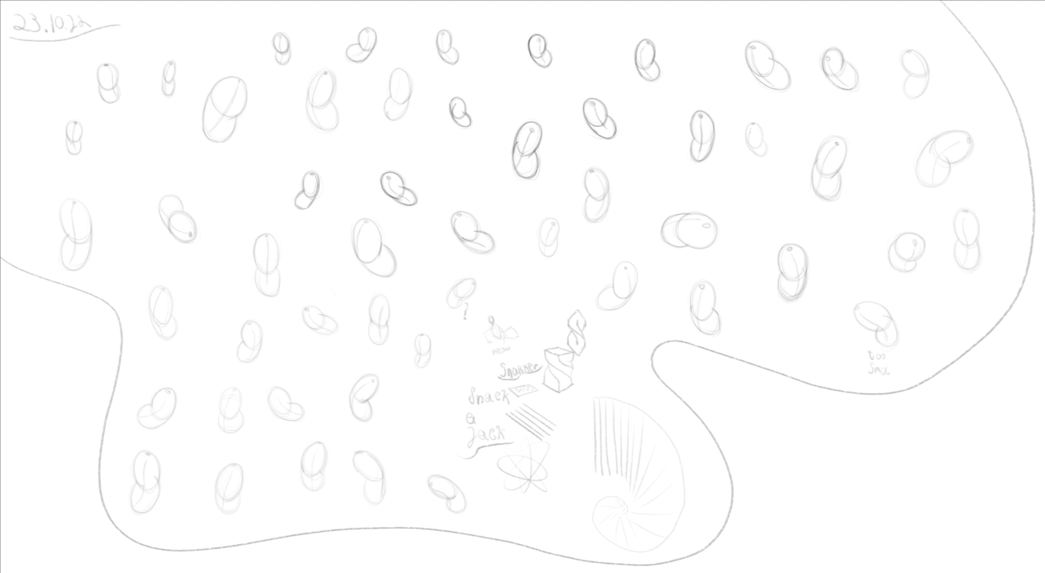
Awesome beans
Never thought I'd hear anyone compliment my Beans Haha, Thank you as always Snakker!.
Random Update #2
Aalright, Here's another quick little update, I've started properly trying to draw Forms in Perspective, I should've started this a long time ago, but I just don't know when I'm "ready" for the next step..
I tried to incorporate all the different "elements" into my drawings, everything such as Deformation, Connections, Overlapping, and Interactive Shading though I might've gone a bit overboard with the shading, mostly cause I'm experimenting.
As always Critique is welcome!.
1st Attempt
2nd Attempt, I tried to use brighter values instead of really dark gray or almost pitch black, but it came out a little flat looking imo, I'll also do more soon but I need to fix my damb sleep schedule, It's 6am here..

Oh man these are really awesome, especially like the first one!
For me something about the square twisty form at the top of the second attempt feels off, I think the silhouette where lines intersect make me think of a concave surface but the light seems to hit uniformly hinting at a flat surface, maybe the fix would be to make the intersection more seamless or add some shading to suggest it is truly concave if that was what you were going for
cheers
Thank you for your kind words Snakker!. And yeah i see what you mean, And i think the issue was my linework being off with the whole cube thing, I wanted it to be a flat surface but my linework obviously says otherwise.
Thank you for the feedback anyways!, I'll try to keep my linework in line with what I'm imagining next time!.
Random Update #3
Currently working on fixing my sleeping schedule cause I flipped it completely earlier this week, so during the day I kept practicing Volumes in Perspective, and I've also started doing some DrawaBox practices secretly, currently on my 4th day of doing them instead of gesture drawing, just taking a temporary break cause my current style of gesture drawings just feel so boring to me, and unrewarding, which is why I'm still working on getting better with the FORCE Method and The Bean.
I also found an older shading practice, and man.. looking back on it, (even though it's probably just a few weeks old) it's pretty bad.. Some don't make any sense at all in terms of light direction or just the general Volume.
I also forgot to upload a Figure drawing I did yesterday.
And here's todays Volumes in Perspective, I didn't really do much, I'm on 4-5 hrs of sleep trying to fix my schedule so I didn't have a lot of energy.
I tried to keep my line art in line with what I had imagined, and when it comes to light I'm not sure if I did it right, so any critique is welcomed!
And thank you for checking in on this random update, much love!

ooh your volumes in perspective is really good!
tho i think that ball on the bottom would still have a little bit more light at the top half or 1/3 of it at least - but it b lookin noice 
Great work
Loving the volumes in perspective. I think the shadow on the far right wouldn’t curve back as much but I could be wrong, regardless really cool. This seems to be a great exercise for 3d drawing
I’ve checked out a bit on that drawing with force series of books, looks like ideas of how Glen Keane would draw his disney characters conveying lots of dynamism. Do you feel it’s a good read or easy to understand?
Cheers
That shadow on the far right was actually not supposed to be a curved shadow even though it really looks like it now that you say it, the top part of that shadow was supposed to be the cylinder that extends from the far left to right, and the bottom part was from the 2nd cylinder that connects from the long boii triangle in the middle to the top right.
But thank you for the feedback, I need to watch out for connecting shadows that form a different shape that isn't supposed to be there.
About the Force books, I actually use the Youtube Series on the Force Method and I'd recommend you to check them out rather than books for now to get the general gist of it if you're interested. For me personally it's a rather easy to understand concept, but actually executing them isn't as easy as they make it seem. I mean duuh, they're professionals xp.
Here's a couple of the videos if you'd want to them check out!.
I won't post all videos as that'd extend this post more than it is
Improving Line Quality and Rhythm - FORCE Series Part 1
How to Simplify the Motion of the Torso - The Bean
Awesome, thanks for the share, lots of valuable info and interesting ideas here
cheers!