Alright, and here is the final batch of potrait excercices.

Wanted to do ol' jack sparrow. Love the character.

Also was eager to try my hand at Ahri. I love her design and the artist, so I really wanted and excuse to try to learn by emulating it

Wanted to challenge myself with something different, so figured an old face would be interesting. It was HARD. All the wrinkles made it hard to make it look acceptable.

Also wanted something different here. Figured I would try a dark skinned woman with a unique face.

If you look at all the 10 potraits, I think there's some definitive improvement as I got more familiar with faces and shadows on them.

I definetly learned a LOT. I think I was able to get a good grasp about the main face muscles and how their structures affect the face overall. From thick eyebrows to no eyebrows. Small mouths to big mouths. Young to old.

It's all very unique, but the pieces are definetly there.

This is probably one of the excercics I've learned from the most on regards to face anatomy. And it was a lot of fun as well!

And another manga page to also check the progress there. I'm slowly learning that for manga, clarity is often much more important than art quality. How framing affects the "feel" of a scene.

I understand why some mangakas stick to simple white and blacks with few tones, and the emphasis on overal page structure instead of individual frame detail.

It's.... a lot to take in, and I clearly need to learn a lot more.

And finally another quick sketch of a manga character still being designed. Her clothes are... huh.. incomplete for now.

Nice portraits!

I started reading your comic and there is so much improvement since the first chapter!

I like blood in this page but I didn't notice it at first. Its value is to similar to values around it

interesting character!

You just made my day :smile:
Thanks for that. As long as there is conitnuous improvement, I'm glad.

On regards to the blood tone, it is kind of intentional to keep it low for some of these pages.

The idea is that blood is kept low and at a lower tone, slowly increasing in both contrast and amount as the scenes goes on, which can be seen in this other page when compared to a previous one

The scene also intentionally leaves the background white to hopefully give a more impactful contrast with the frame at hand.

The line of thought being that if the contrast and amount increases slowly, it will hopefully increase the impact of a scene like this one, and give the impression that the fight slowly becomes more visceral as it progresses.

That's the idea at least. I'm trying to apply different lessons on different chapters to see how they work as a whole.

Wew, another couple of rough days. But I really want to keep moving forward.

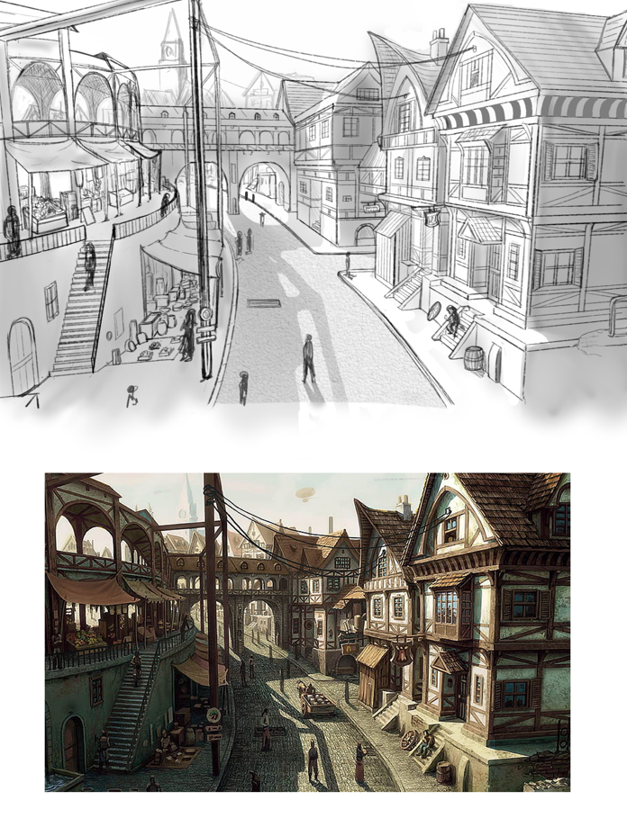
So the next excercice is 3 environments from references.

I... struggle with environments. It's not my forte for now, it takes me too long and it's hard to know how much details is enough, but maybe I just need to practice it more.

So here is the first one.

I first copied the perspective using a 3 vanishing point rule. I super imposed it over the reference, tried to get an accurate perspective rule, then constructed the bases and finally added the details.

I will say, this did force me to analyze the actual strcuture of the buildings. Like, what is the structure of the street under the tents? The walkway on the background that crosses the street seems to connect the building on the right with the plaza on the left. How do they connect?

Small details that you need to understand to draw the structure correctly, especially with perspective.

I could keep stacking and refining more detail, but I think I'll move to the next one.

And as always, a few more manga frames to share! Since these were the ones I worked on since my last post.

And as I learn more in general, I'm pushing to move to a more simple style so I can hopefully draw frames and pages faster. Trying to focus more on simple but atractive design, clean lineart, fewer tones, and much more simple shadows.

Below is an example of what I've been experimenting with.

I think it's simplier, but still looks good, and more importantly, took almost half the time as with other frames.

Anyway, I'll keep practicing and experimenting.

noice! that is a GREAT study!!

you captured the details so well!

Thanks! I believe the core of the excercice is to capture the overall "feeling" and not get too hung up on the small details. Especially to capture and understand the perspective the author was using.
I feel like, as long that objective is met, that's good.

Small update, another environment excercice. Tried to go with something more nature-like, but still with some structures to practice the perspective.

Seeing it's just lineart and such, it's hard to capture the spirit of the source. Especially when trying to do it quicly. Maybe I should have stacked more detail on the structures and trees. Not sure how far to go with these excercies.

On the manga side I just wrapped up chapter 22, and am currently just in the process of doing the draft and script, so not much to share on that end.

I posted them in different places already, but I don't think I shared them in this blog.

Cover art. I try to keep these simple, but at the same time use them to practice more color stuff.

A test I did trying to bring my drawing time down. Simplifying stuff in the drawing pipeline. I think this one took an hour and half from start to finish.

Next is the third excercice for environments, and I also need to get more manga stuff done.

ooh congrats! :smiley:

also really like ur shading and esp the lighting! :smiley:

keep up the good work and can't wait to see more!

Thanks! Your encouragement and everyone's has really helped me get this far!
Though I keep reminding myself there's still much to do, but one step at a time.

Aw thats nice to hear :smiley:

you're an inspiration since you've been working on your own manga already :smile:

to be fair, mine's not ready - not because of art - but cuz plotbuilding XD its a intricate story with a lot of characters that i have to flesh out :3

I wish you the best of luck with it! Everyone has a different pipeline and way to work, but something that has really helped me with the manga is to just jump into it and try to do the best I can with what I have. Self analyze, and make a conscious effort to improve. Not much different from how we are studying art, or any other skill really.

I'm eager to see what you put out when you are ready for it! It's always encouraging to see the works of others.

Ok, third exercice of environments from reference. That's the last part of this set. It does feel like it's getting easier, even if it's still a challenge and takes time to do. As usual with envs, could have added a bit more detail, but I think it met the objective and is good enough for now:

Also starting next chapter in the manga, so just a little frame to share for now:

As usual, it's been busy, but no rest for the weary, on to the next exercices!

Amazing job! I like how you suggest the floor of the environment, exercise, and the crab :smile:

And the manga, pretty good job too, I like how dynamic it is and the use of perspective, if I had to say something, maybe the shading from the foot behind makes it look weird, like flat, maybe if we consider the volume of the ankle. Something like this...

Thanks!

And I think you're right on the ankle shade! I'll add those edits a bit later today.

Small update today. Simply completed exercice 2 for clothes.

The model:

Dressed up:

Figured it would be fun to have her cosplay as Haley from Stardew Valley.
I used gradient shading to apply the colors, and a correction layer to adjust saturation.

The shirt is a bit tight by design, but there are still some notable tensions points, like the buttons.

It was an interesting exercice. Next is 10 clothed references (linearts). I think I have an idea on what to do with those, though I think those will take some time.

awe yea that shading as well as the folds all make it look so good!

Thanks! you'll have noticed that even if the exercice is for lineart only I make an effort to add some shading to it. Not only do I feel it makes it look better (and make me happier with the result), but I've been trying to do a conscious effort to practice shading as much as possible to get better at it. I feel it's one of those things that help the most and is many times hard to get right.

Move on to the 10 cloth exercices from photos.

Since this is about clothes analysis, figured I would use the oportunity to dress up some of my manga characters while still keeping the reference clothes.
That way I can also practice refining some of the designs I'm working on.
So in general, I'm aiming to imitate, by copying, even if it's not completly a copy. not sure if that makes sense.

It's gona take a while to do all 10, especially since I insist on adding some shading, but here are the first two:

And another recent page from the manga. Very happy how this one turned out. I'm trying to play around with some effects and framing.

I'll probably post again until I complete some of them, which will take a while as I work on the manga in paralel.