Dang love your work! These figures are fantastic, love your mannequin. These are so solid. I can't wait to see more! Keep it up!
@playforwho89 @Lockenheim Thank you once again 
Was painting my room this weekend so didn't have as much time for practice.
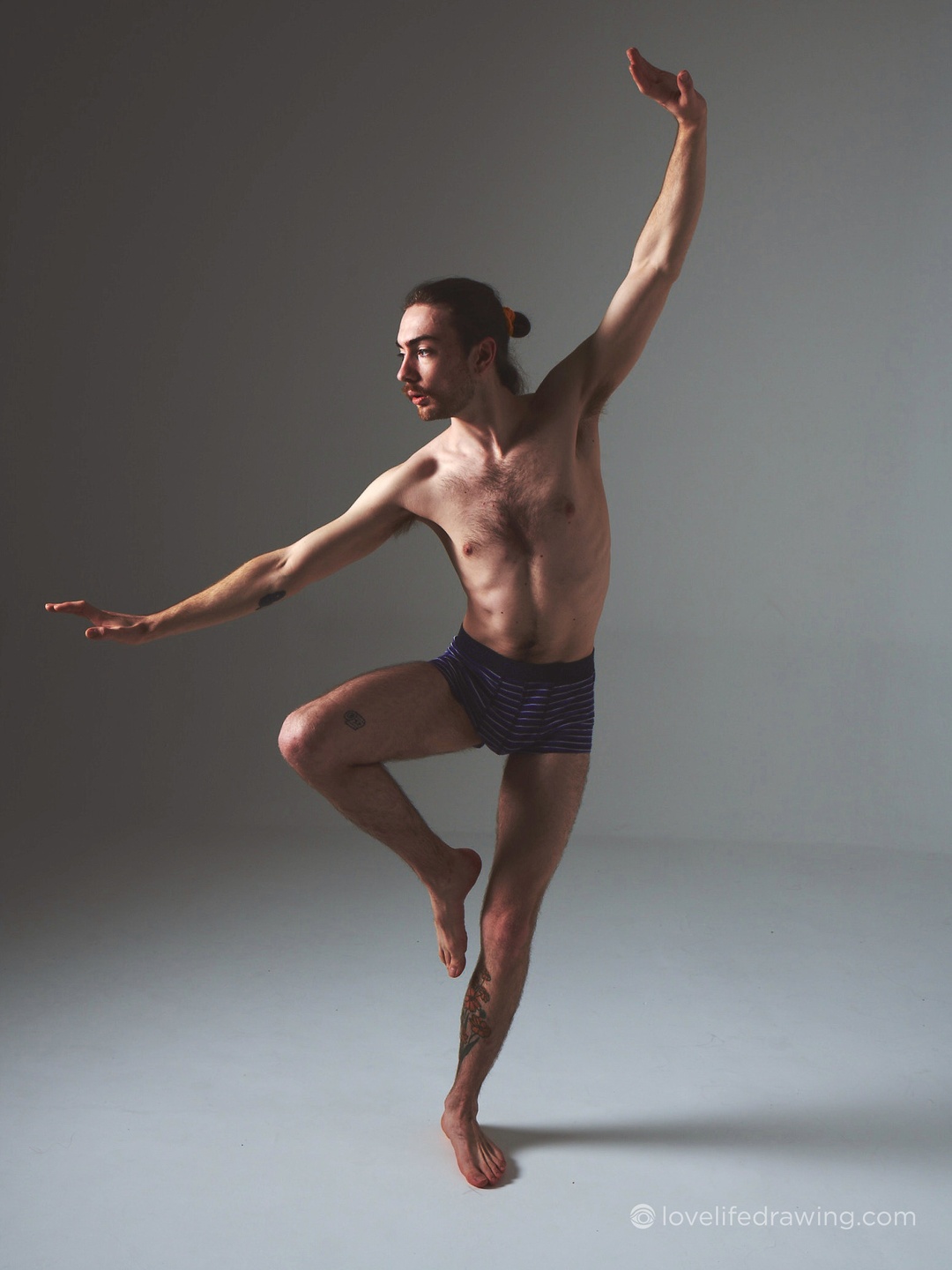
I think I felt some improvement particularly in my 2-minute gestures this week. I'm still trying to figure how to best simplify the legs from a straight on front/back view though. For example, the model's left leg in the final pose. If anyone has any tips that'd be appreciated.

I also finally got around to doing the first assignments for the Perspective and Photoshop portions of the class and the perspective seemed relatively straightforward for me.


For the pen control one, though, I wasn't sure if I was supposed to sacrifice accuracy for line confidence or vice-versa so I just did a mix of both. I also seemed to have a hard time getting smooth gradients on my pen pressure.

12 days later
Hey, so it's been much longer than I would have liked but here are the rest of my assignments for Photoshop for Digital Prod. 1:

If anyone was able to nail #4 for the image adjustments, I'd love to hear how you did it!

Not sure why the castle looks a bit off.

I don't think I used the color burn tool all that well here.

Some obvious stretching from liquifying but oh well.
Thanks to anyone checking these out and feedback would definitely be very appreciated! Next post should hopefully be much sooner.
Glad to see your work! These turned out very well especially the beach scene. Nice work!


Damn, those are really impressive!
I can immediately recognize the figures the moment I look at them and the lines are on point guiding my eyes throughout the flow of the line of action.
Good job, keep it going.
I absolutely love your gesture drawings, they are beautiful and so fluid! So much character!
Thank you very much for the kind words
awesome study there, question did you sketch those shapes or used shapes? those looks super clean
Realized I haven't posted in a while so here are some other drawings I've done.
I've really been enjoying doing animal studies from reference and with some of Aaron Blaise's courses.


I also drew this tiger portrait for my mom's birthday, which was on the year of the tiger.


I started on my other perspective assignment, but it's been kinda boring so I've been procrastinating finishing it. I might just skip the last two for now because I feel like my perspective skills are good enough to move on.
Wonderful animal studies! Keep it up!
14 days later

Not really finished as well as I would like, but I just wanted to get it done.
So yeah, I'm going to skip the 2-point perspective street assignment for now and move on to term 2 material.
Term 2

Starting with some rough practice with basic forms I did in my sketchbook. Drawabox really helped in making these easier.
Daaang really loving these twisty shapes. I should check draw a box I had such a brutal time learning this at a basic level.