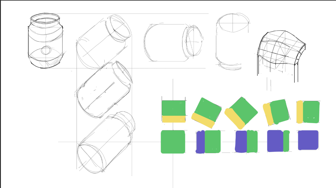
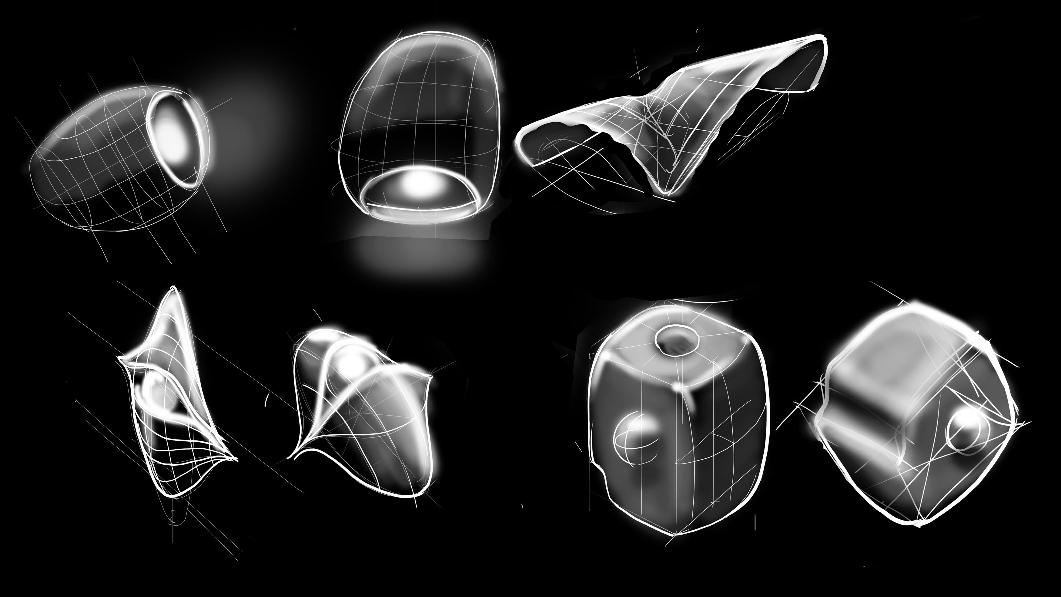
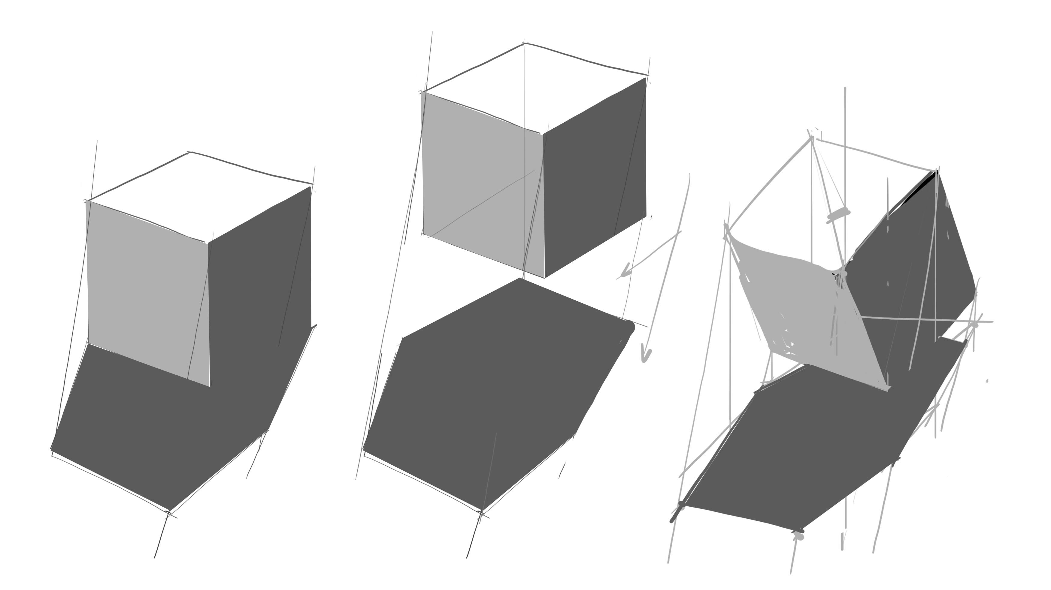
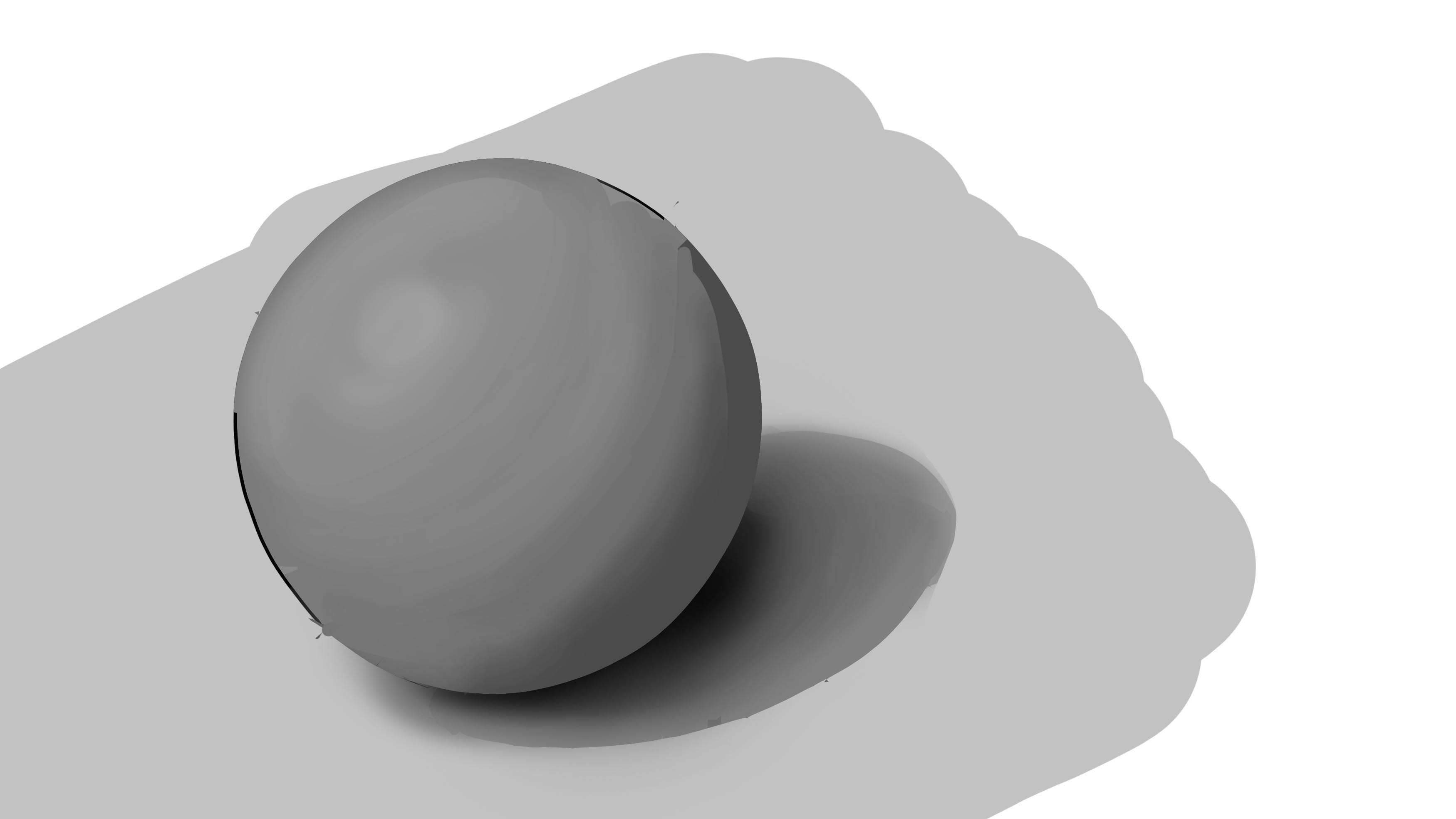
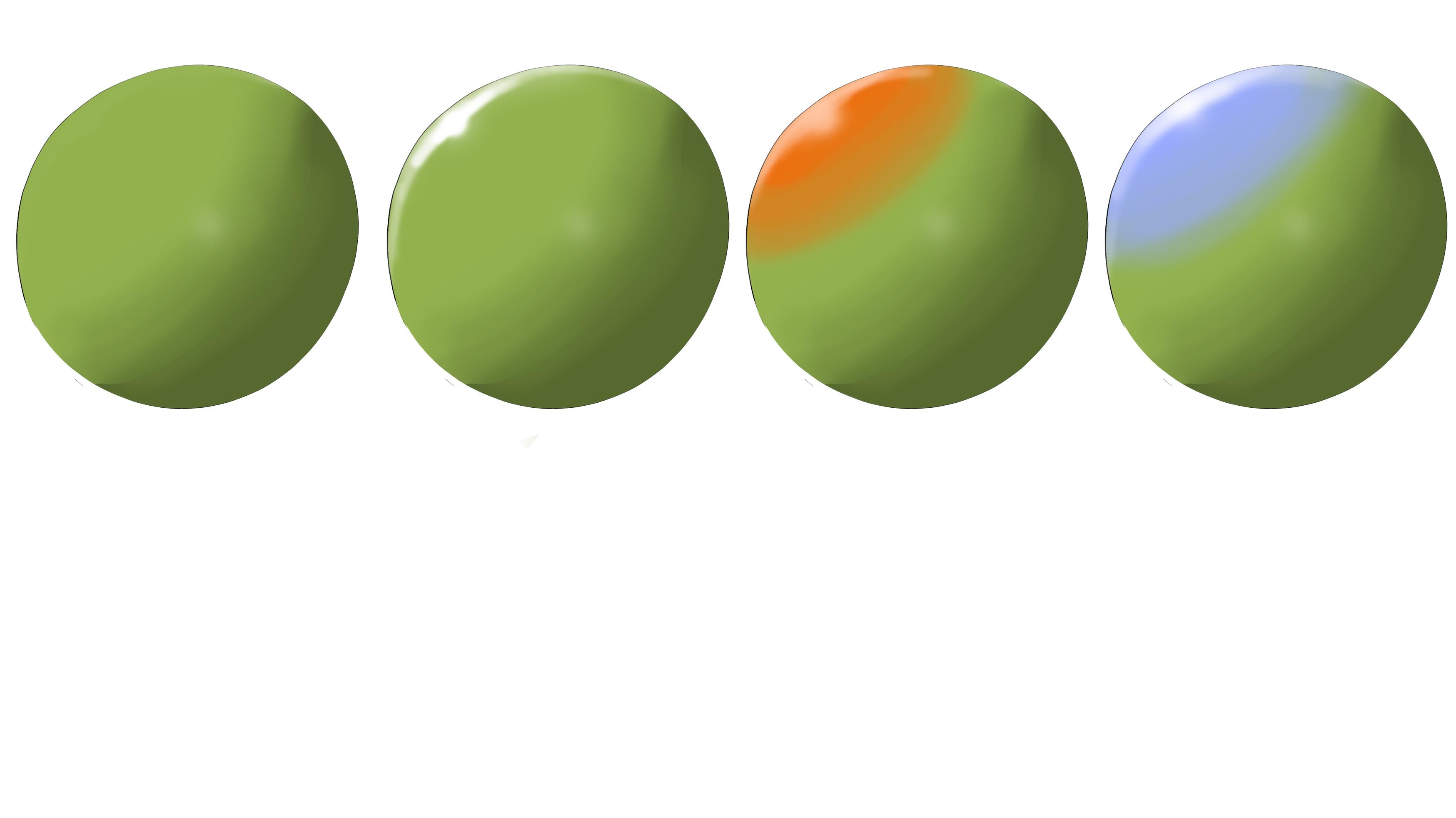
yes I used purposely a mid value tones since i wanted to realize a highly illuminated ambient (this should be kinda like a sunny day outdoor whit a pure white local value) and I want to see how values change on different ambient light. I had some doubt about casted shadws on latest study I did this exercise...at moment I am focusing more on this kind of study and color study. If you want to push further dark into a illustration (for any reason) under this kind of light you would emphasize ambient occlusion on any part or you would have a lless ambient light and a strong local light, that will push more the difference betwen light and dark area (this would be a nice study later, for now I am focusing more on ambient only). First thing coming to mind is Caravaggio 
...and I probably should have done this on night study  but I still want to first study ambient more .