Hi!
My name is Douglas Sales, from Brazil. I have started the course some time ago but didn't get far. I'm going slowly but steady this time.
I have been learning to draw in completly isolation for quite some time, and have been feeling down because i'm not seeing too much improvement. I've decided to follow the many advices i heard to get involved in a community and get critique.
I don't really have a goal with art today, so i'm experimenting a lot of stuff.
Lately i've been learning about 3d Sculpting, Visual Effects, Animation and traditional drawing.
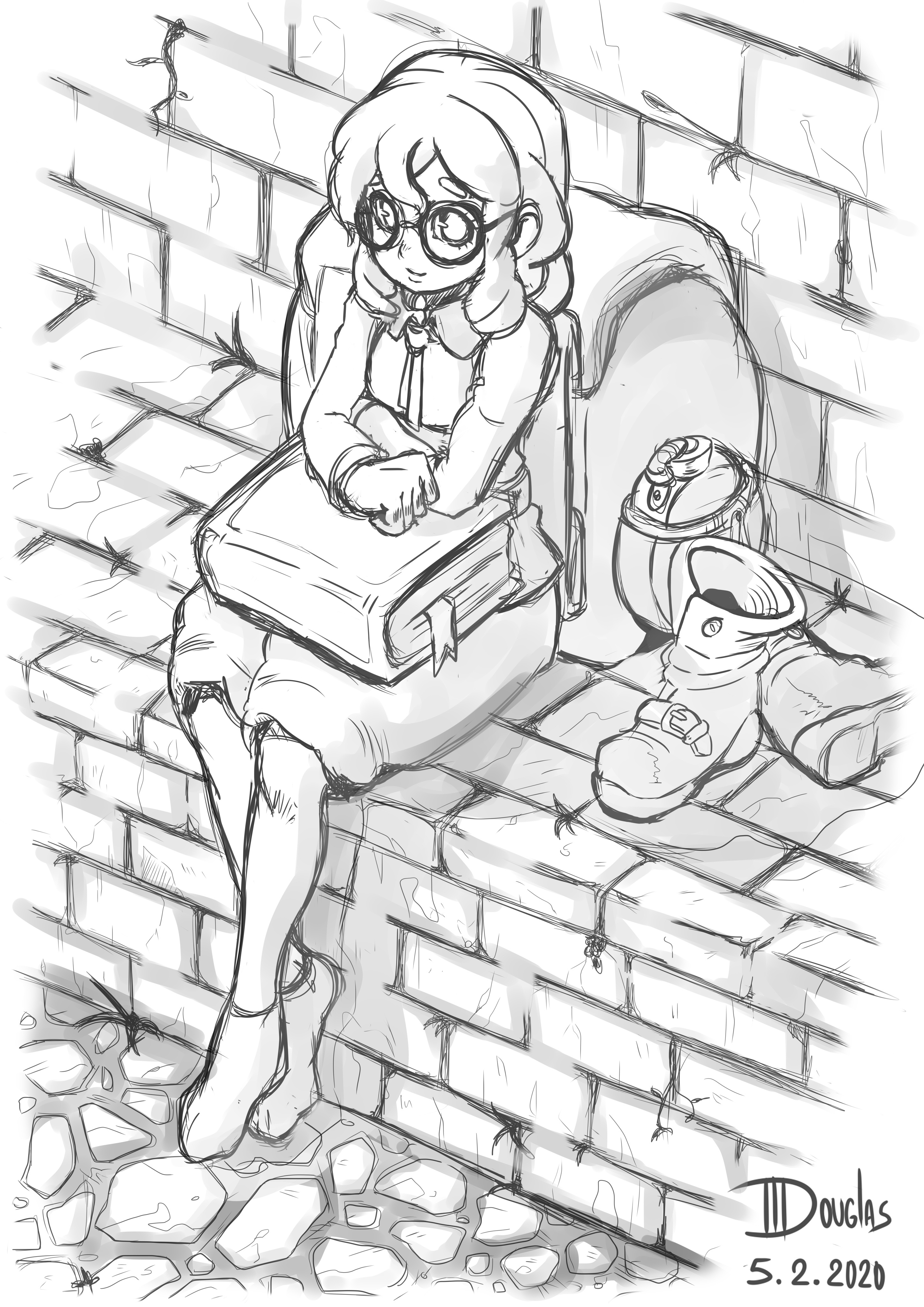
I'm posting some of the drawings that i'm most proud of.
I've drawn the toad from observation (photo), the others are original characters.


I'm taking the course in order, currently making term 1 Nude Figure Drawing assignments and gonna post them soon.
Any advice/suggestion/critique are welcome, including in my rusty English! Haha

Pen Control Assignment


Image Adjustments


Nude Figure Drawing
Skeleton Practice


Proportions (Watching and Drawing)


(From Memory)

Welcome Douglas! Your Before-Art-School drawings look awesome already! Looking forward to see more from you :smile:

Hello and welcome Douglas! I quite like the lines and more generally the character drawings that you have posted. It seems like you're starting from a good base already, so it will be nice to see your progress.

And I think your English is fine, although I'm not a native English speaker either, so maybe I'm not the most reliable to judge that 😆

Hey! I appreciate the attention!
I'm very happy to meet you. :smile:

@yaigrie i've seen your latest LOTR drawings, it's really nice, looking forward for more stuff!

@cedricgo I'm really unconfident about my language skills, so it can be hard sometimes, haha! I love your art, it's amazing.

Today was a day of suffering, as i struggled to get things done for term 1 measurements assignment, but more than that, it was a happy day, because i found a big flaw that i need to work on. After failing for several hours, i discovered that i'm always exagerating the angles and making things much bigger than they really are.
I often have difficult in being consistent, like making the same character over and over again, as they look quite different from a drawing to another, and now i found a culprid, haha!
This one is the better that i got so far, i kinda cheated, putting it in front of the reference a bunch of times, hahaha.

i'm gonna be working on this for some time. :smile:

Worked on some more measurements today. :smile:
I'm very happy with the results, it is far from perfect, but i feel that i got really better with it, since i wasn't even capable of finishing this before (except that one piece yesterday, haha).


I think i gonna go to the next step now.
Let me know if you see there's something i've missed.

Looks nice! Nothing really jumps at me as being wrong :+1:

Thanks cedricgo! :smile:
Today i worked in the Perspective 1 assignment:


I've made many mistakes and probally could have more patience, i also made those water pipes that didn't end very good, but it was fun!
I can't wait to try 2 point perspective too... but i think i will try to draw other scenes in 1 point, until i get mory confident.
As always, any advice is welcome!

Hey Douglas! Bem vindo ao ArtSchool 😃👍
Your pieces are amazing already. And I'm quite jealous of your measurement assignments, you nailed them really fast! (It took me WEEKS of pain and suffering to start getting them right 😅).

I also really liked your 1-point perspective assignment. As far as the perspective and proportions go, you nailed it. Maybe one thing to think about as you move forward to 2 and 3 point perspective studies is the line art: things further from "our view", their lines can be softer, and as the objects get closer and closer, the lines get thicker and darker. Makes sense?

Keep up the awesome work! Looking forward to see what comes next!

@dangras-almeida To be honest it was not my first time doing it, i've tried doing measurements some time ago in a more traditional drawing course, but nothing as complex, i've made mostly cups and some vegetables hahaha.

I've been doing gesture drawings every day, i feel that i don't really know what i'm doing, but i'm hoping to get better!

I've worked some more with perspective, tried a bunch of things and failed a bunch of times! It's really hard to draw buildings and props, but i will keep trying it! Environment art is really cool to see and is definitily something that i want to be good at. :smile: :smile:


I'm gonna step up to term 2 now! There is so many things that i wish to learn!!! :smile: :smile:

for gesture, you're trying to capture the energy of the pose while focusing loosely on proportions when you start adding mass the body parts but yours look great and they capture the poses well. also nice house in perspective. :smile:

Thanks Kosmonaut!

I've been working on term 2 photoshop assignments, decided to inspire the logo on a tabletop rpg i've been thinking of running with my friends! :laughing: :laughing:
I was thinking of putting some stars and stuff, but decided to keep it simple.

I've made the little monster too! A good and old LV 1 slime! :smiley:

Let's gooo!

EDIT: Should i upload images with lower sizes? I've tried to edit the html code that appears to make them smaller, but it did not work... :sweat:

Nice logo and monster! I like the colors on the logo and the logo itself looks clean. :smile:

Hi!
I have been practicing every day at least a little, i have been doing gesture drawings and trying to pratice perspective some more... there's nothing really worth showing about that tho, haha.

I did the term 2 Line Weight and Shading assignments.
The color blending has been a kinda daunting for me, gonna show it when i get at least a more or less decent result hahaha. :persevere:

I also did a sketch for the Vivi fanart event, i'm not finishing it for now, but i decided to post it here since people seems to like it :smile: ! I'm planning to revisit it later!


Let's gooo!

  • for the shading assignment, it looks like you either didn't blend the values enough or used the airbrush to try to get a more blended result.

  • You also may want to make the background color different from white since some of your white value is lost on the canvas, or you can use lines to indicate where the forms stop. The white values also depending on your light source's intensity and distance, if there is an almost pure white as your lighting color then I would think it would spread a lot farther and you would have fewer mid-tones and shadows

  • I may be wrong about the light sources but from the arrow I assume is coming from the side. like for the one on the far upper right the light source looks like its coming straight from the right but it may be coming from behind it making the lighting make more sense if so disregard the last part of the previous point. great practice overall though love your Vivi sketch. :smile: