• Gave myself 5 days to do something. This is what I managed to do. I'm trying to get better at illustrations, but I have patience to work on something for 3 days maximum :( Splash_Process.jpg5000x3140 2.21 MB Splash_Process-6.jpg3896x2429 2.83 MB concept list char copy.jpg5388x3000 1.7 MB
    20.4k
  • Did a character concept for a course.https://www.artstation.com/artwork/P6gm3y - more:) list1.jpg3541x1920 2.82 MB
    20.4k
  • Day 4: Star Wars May The 4th =] Queen Padmé Amidala in my art style! First time drawing her and I really enjoyed making this one! Used watercolours, ink pen, acrylic markers and gold paint for accents on my Canson mix media sketchbook. I hope you like it!
    80.6k
  • A creature design from a while back
    by
    6.5k
  • Here is some more recent stuff, I need to make more body studies
  • It's been a while and god, it is so cringe to go through all previous messages xDmy study.
    20.4k
  • Thank you! I finally cleaned that up. Meanwhile started 3 more ..I have a habit of taking too long to finish a piece, then I lose interest in it and just start something else. I found 8 from recently i started and abandoned, that are decent enough to not delete, but not finished. There’s also been a number of drawings I felt I “outgrew” - became better before I finished them, and it would be easier to start from scratch than fix them. Anyone else thinking that?
  • Lady Death Fanart Collectible: Part 6 Polypaint and base Hi, it’s time to share with you another part of the process to create this fanart piece. Polypaint As this is my first collectible fanart I didn’t have previous experience with polypaint so I tried my best and played a bit with it.I wanted to give a ghostly and eerie look to Lady Death, she is beautiful and deadly, but at the end of the day she is a woman that died and was reborn at hell as an avenging spirit, that’s why I gave her skin tone a bluish very cold tone.As you will see I gave myself some creative freedom to deviate from the traditional color scheme that this characater has in comics and illustrations.To add a bit of sensuality by painting some freckles on the face and the chest. The dark nature of this character was the perfect excuse to gave her a kind of goth make up, very dark shadows around the eyes, blue lips and fingernails. I know that the original character includes sexy red lips but I wanted this girl to have a sexy but at the same time creepy look, that’s why we can see some thin veins emanating from her eyes. The biggest chromatic change I did for this character is at the hair. Lady Death has a characteristic white weavy hair but in my fanart I decided to gave her a very saturated blue color.The reason behind this wasn’t only an aesthetic choice. I want that the face area strongly pulls the attention of the viewer so this area needed a stronger contrast. Another reason is that I want her to have a more modern look, as I mentioned before, I’m strongly attracted to women with goth/punk look. I gave myself half an hour or more to analyse the work of experienced sculptors that create collectibles and I discovered that the use of darker values on the skin is often applied to create a greater sense of volume and three-dimensionality. I found that areas with heavy ambient occlusion are the perfect places to paint with darker colors in order to increase the separation between different forms. Even though she has a bluish skin tone, I used a bit of warmer hues in areas that, in real life, tend to go towards red and pink, this is very obvious in the nose, cheeks, and knuckles. Thinking with a logical mind it’s completely absurd to have warmer tones on the body of a zombie like creature but I didn’t want to limit myself by using only blue tones, it looks boring and artificial. In real life these colors are created by blood vessels in areas where the skin is very thin. ** Scythe **for her weapon I applied a cool gray with some warmer variations, this color scheme is influenced by the work of H.R giger. Base I’d like to talk about the design for the base which, to be honest, I forgot to develop along with the character.My main idea with the base is to show that Lady Death inhabits a very sterile and arid land, at the end of the day she is at hell.You can see a that she walks over dirt and rocks, a sign that she’s surrounded by death and loneliness. As part of the landscape we can see some bones and skulls to reinforce the idea of lack of living creatures, yet we can see three hands that try to reach her legs.This hands represent that all creatures are subordinated to her power and seek an evil blessing with a simple touch of the princess of the damned.1- The hand with skin burns represents the souls of those who are newcomers to hell, tortured souls that suffer for the sins comitted on earth.2- The hand with greenish rotten skin and pustules is the reminder of the decay that has infected the souls of those who have been trapped and have forgotten their humanity3- Last but not least, the hand of a demon shows that even dark creatures and entities bow before her presence. The cherry on the top, at least in my vision, are the simese twins that emerge from the ground, this malevolent creatures remind us that in hell there’s only perversion and any trace of innocence is lost. Thanks for reading till this pointI’m really happy to be very close to finish this creative journey, last but not least it’s mandatory to talk about splitting the sculpture in several pieces to be printed, this will be my last entry before showing the final rendered images. See yaMay Zbrush be with you
    1.4k
  • memory 2min gartic phone, used ref 2m gartic, used ref for pose 2min gartic 2min gartic 2min gartic 2min gartic memory memory memory memory study memory memory memorymemory memory memory memory memory memory study memorystudy study stylized left memory, right study study memory memorymemory memory memory memorymemory memory, porportions r offmemory memorystudystudy memorymemorymemory memory memory memory memory memory memory memory, right leg is a bit broken The feeling of only getting 1 - 3 likes on a social media post will never not be discouraging. But nothing is discouraging enough to make me quit drawing. I think the strategy of drawing a lot of stuff and waiting a while to post is good though rather than posting it immediately and then feeling that sadness on the next set of drawing
  • Urban Dragon Girl Wip Urban Dragon Girl_wip1.jpg5000x5000 1.11 MB
  • Long time no see! New artworks produced lately
    6.4k
  • studies studies juri study imagination, how I feel before a speech imagination imagination study something I drew for my presentation also drew this for my presentation, didn't fix the one hand being bigger than the other imagination + study study studies study study, I need to fix the face a bit based on screenshot from anime but in my style study. except for the eye study studies studies study. changed some things tho imagination imagination imagination study studies, except top right samurai based on anime screenshot wolverine studies, changed some of the poses a lil, not very good at all, but first time i drew the character ever. semi study studies study imagination imagination imagination , for first time ever i tried to draw over 3d model for middle pose, I dont like the result tbh, but it makes it much easier than coming up with it from memory.imagination, except right figurestudies imagination + studies, coming up with action poses r hard, these are not dynamic enough, I will redraw better ones in future. imagination , imagination imagination study, except for eye imagination imagination imagination doodles except for the two chrollos imagination storyboard thumbnail, idk if i ever shared this. my storyboards end up being a little detailed since i usually just draw in one layer.
    by
    21.7k
  • Quick fun sketch. CyberFish.jpg2394x3857 674 KB
  • Neon Gambit This is a fan art of my all time favorite character Gambit from the X-Men.I made this a birthday gift (26.04.2024) to myself and honestly I really do like how it turned out in the end =] I hope you like it as well =]
    80.6k
  • Art Blog - April to September 2023 Suffer a little burn out. Look at some memes. Here's some art from in between. critique.jpg1333x5736 1.77 MB
    20.1k
  • And some more! Been painting over them a bit more this time. Some variants I tried for the old guy using mainly the liquify tool. Someohow looking a bit like Owen Wilson (not intended :D)
  • Cafe sketch/color study
  • Hello! My name is Vithor, I am from Brazil, studied Design at a local college worked as an illustrator for more than 10 years. I took a time off around 3 years ago and am trying to get back in my art shape and maybe become professional again. Here are some recent pictures: You can find timelapses for most of them on my instagram: www.instagram.com Vithor Albertim (@vithor_albertim) • Instagram photos and videos 123 Followers, 638 Following, 19 Posts - See Instagram photos and videos from Vithor Albertim (@vithor_albertim) Comments and critiques are always welcome.Cheers!
  • @patrycja.lerch Thank you I created another variant, which might capture the witch look I was going for better
  • Thank you @daceronine! If I remember I save in google cloud, I will have to stick a note to do it more often. Lamp is from life. Poses are from refs but I look at refs for a while and then try to do it myself and look it up if needed. Outfits and rest is from imagination Something went wrong while installing system so we will have to wipe everything again... pc works but something is wrong. We will wait till internet is done and I will save everything on cloud this time Threads came out in eu. It's been 3 days and I had more engagement than after half a year on instagram. It feels really nice I hope it stays this way A portrait of old dude. It's the same character I posted a while ago. Inspired by Bayard Wu work. At first I thought of him as a bear but I named him Fenrir and I think wolf suits him better. Eye gave me a bit of hard time but I think it is fine now. I focused on face and forgot about area below. The way I draw hair clashes with greying hair. I had the same problem while doing Lohse's white hair. Does it looks like it is greying here? I love how desaturated red looks blue there. I keep lying to myself that I will use different color scheme but It all comes down to this blue and yellowish one it is just flipped this time Have a great day!
  • Been bad about posting updates on the forum. I figure I should just throw down stuff. instead of waiting until I finish something.
    14.4k
  • Havent done much this year since I am focusing on learning programming and deving my own Indie Game . But here 's a New Year Piece 2024 , she 's the mascot for my Game Studio - Lucid Realm : Lucid Chan ! LucidChan_v001_sketches.jpg3072x4352 973 KB
  • IMG_0637.jpeg3240x4050 1.6 MB
  • Long Crested Eagle studyI had so much fun making this one and honestly I love that Eagle! It looks so cool! Used for this one high quality watercolours, high quality watercolour sketchbook/ cold press and it was 300 grams paper.I hope you like it!
    80.6k

Your personal details:

Name: Hannah Waring
Email: hnwaring@hotmail.com
Website: https://www.artstation.com/lunasmoon
@Facebook: https://www.facebook.com/hannah.waring.982

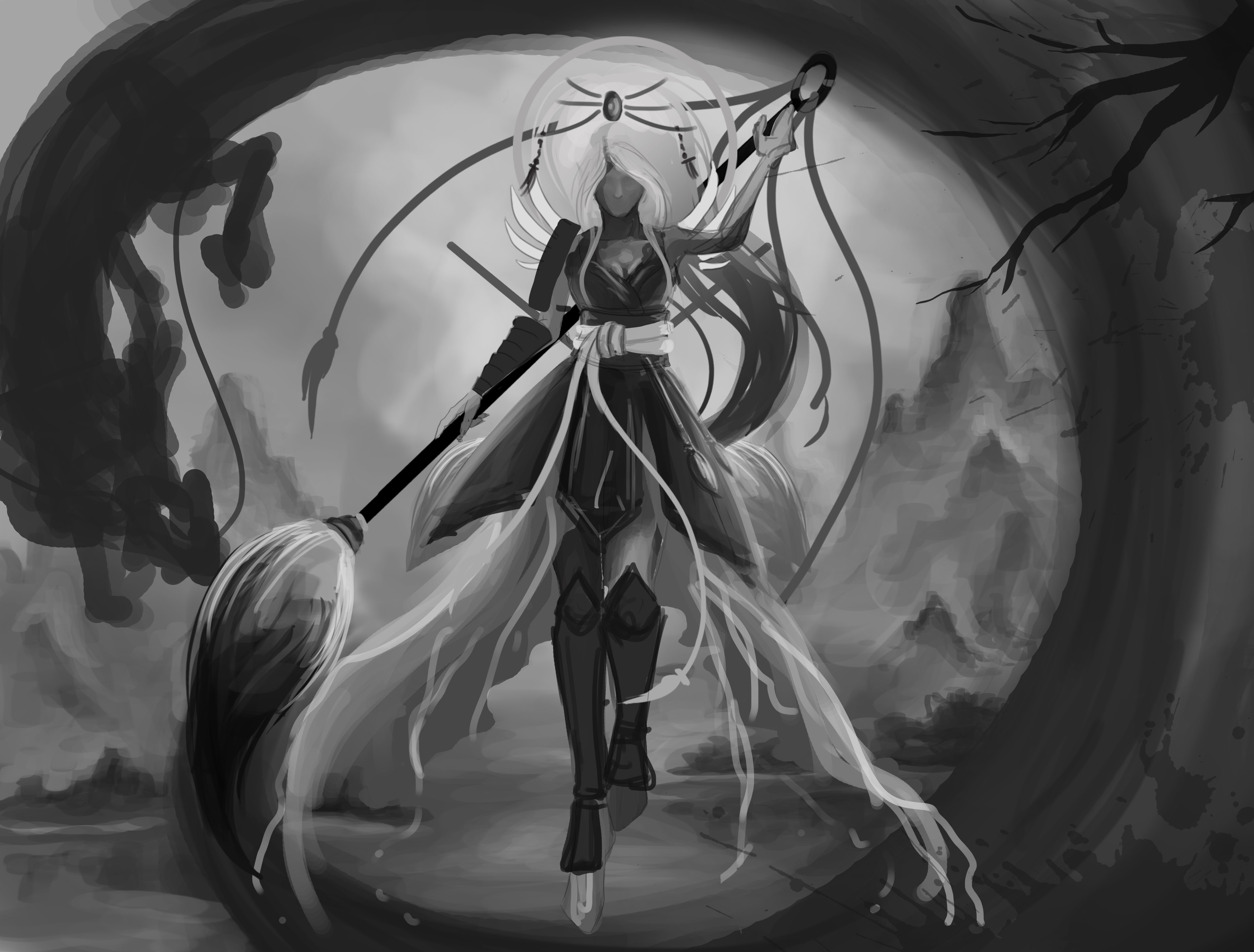
For the Light side: Akemi, the Ascendant
With her power to manipulate and create the flow of ink, she summons beasts of the Zodiac to aid her in her fight against the Dark Realm's creatures.

Final Illustration:

Concept Sheet:

~~~~~~~~~~~~~~~~~~~~~~~~~~~~~~~

Hi All!

I've only just started sketching ideas, however, after a lot of thinking my character shall be going down the path of Light!

These are some quick silhouette ideas:

Exploring my favourite silhouettes:

My next stages are to do some tonal variations and ideas! Exciting stuff =]
I hope to create something interesting for you all!

Great thumbnails so far, top right in the last image is my absolute favourite! Love to see your tonal variations :smile:

Thank you!
That's my favourite also! I can't wait to expand on her outfit. I really want to put a lot of arty reference into her design and 'weaponary'. I really love her movement and attitude. I shall hopefully post my tonal variations soon!

I can't not wait to see them, best of luck to you!

Hehe does she have a paintbrush? That would be a really nice idea :smile:
Looking forward for your design :smiley:.

She does!!! =D I was thinking she could harness the power of ink as her 'weapon' =D
Maybe a warrior of Calligraphy? I wanted to take the Art War literally into my design haha
- Glad you like the idea!

I've done a couple of sheets of tonal ideas!
I really love her brush weapon and I'm loving the idea of her harnessing ink as her power.
Perhaps calligraphy will be her personification? Half-armoured with calligraphy written over the cloth she wears (or parchment?)
I really want to keep the circle's in the design also to show the 'good character' symbolism and link to 'Light' = Sun!

Next will be some more refined work and rough line-work.
(Plus also some face ideas!) =]

These are some colour ideas for my character. I'm looking at traditional Japanese Ink painting for inspiration and colour palette. I've also developed my characters powers and she will summon Ink Japanese Zodiac creatures! I thought this would fit her aesthetic really nicely and gives her brush prop much more context =]

Next I shall look at her back, colour palette some ideas and then develop my final concept!

I started sketching up some thumbnails - with three values only - to think about how I want to portray my character in the Illustration. I used only three tones as I wanted to concentrate on the values of the painting. Something which I have been practising a lot of lately! Hopefully this will really help me achieve a great sense of depth within my painting.

Two main points I really want to project from my character are: Graceful and Mystical. Something I shall keep in mind!


After sketching these down, I circled the ones I like the most in red. I really like these designs as I really love the movement and points on interest in the idea. I want to create a lovely flow of interest and not over-power the characters design too much with her powers.


Next I shall look at the ideas which really draw me in, see what it is which draws my attention, and try finalise an idea!!

So I'm working on both the Illustration thumbnails and the turnaround at the moment for my Character (Still need to pick a name!!! I shall have a good reflect on this over the weekend =] ). The turnaround is still in its very rough stages as I'm just working out a few pieces of the design as I draw. So currently lots of lines everywhere and simple shapes.

-> But hence another moodboard! I want to make sure that the armour she wears fits right and looks 'right'. I want it to be stylish and practical!
I'm also looking into movement and I'm drawing up another moodboard now - I just love reference and inspirational images whilst I work!

On the turnaround Work in Progress screenshot I have a couple of reference images of ladies with white hair - this is because I'm making sure that when I tone my piece, the skin, hair and clothing are distinct and don't get lost in each other!

I've worked up my thumbnails!! After doing this I did change a couple of bits, having ideas springing into my head as I sketched and painted haha. Always the way!
I'm really leaning to the bottom right image - I think it shows off my character and her powers really nicely. The idea is that I would paint a summoning circle behind her as she summons the dragon from the zodiac to help her fight.
The pose would allow me to show off how graceful my character is (I really need to think of a name for her!!) and with some careful flow, I can show off her outfit and bring in some really lovely lighting.

Hi!
Nice graphic choice. Just be carefull of the tangent between the circle behind her head and the top of your canvas. Make sure the overall shape does not look like a "no parking" sign, especially if the background is white, the dragon and her stick reds.
:golf:

So over the weekend I changed the composition for my Illustration!
I had a good talk with one on of my tutors to discuss if my idea was strong - I wasn't feeling my painting and couldn't put my finger on what was wrong. Then after chatting for a while and then taking many photos of myself over the weekend, I came up with this shot!

I think it feels much more stronger, with more flow, action and a much more interesting perspective =]

Last week of working on my art for ArtWar2!!! Time to get my skates on!


These are some photos my boyfriend took of me last weekend for inspiration for my new composition! It was very amusing to do and I got a very dead arm from holding my brush prop! (It was way heavier than I remembered)

I played around with colour on this piece! I really liked the blue/orange background. I think it really helped bring out my character and her colour palette.
The only problem I had now was the movement in the piece!

I re-studied the pose reference and I've decided to start my illustration over again to get some really good curve and flow. I managed to lose that in my illustration before this, and instead of trying to mend it I thought it would be better to start again and also change the composition. The landscape approach I think gives me more room to explore my character and her summoning ability =]
Next I shall look at the clothing and really try to bring out her figure - I may change her outfit so I am holding off drawing up her turnaround =D I'm finding it much easier to determine her clothing and accessories in the illustration. It gives me a good look into how her outfit would work.

I had a good discussion with my tutor about this illustration - he pointed out the lack of movement/gesture I had in my previous image - to which I thank him! This is a big challenge so I love to hear as much feedback as possible!
I love learning from other people =]