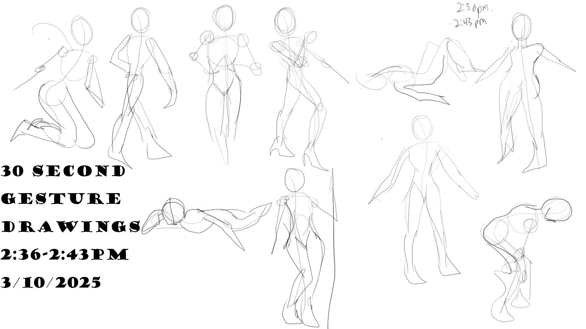
This is the last of the two-minute gesture drawings. Am I getting better at this or not?

I did some portrait studies. I focused on the faces and expressions. While looking for mouth studies on Pinterest I found these. They looked cool, so I drew them as well. The tounges were pretty fun to draw.

One of the assignments involved drawing studies of individual facial features, including human ears, Elf ears, wolf ears, noses, and eyes.