man, they both look so good, but i will go with the greener one, just because i like green, but i will admit that the contrast on the blue one is pretty great
Hi Josh! Peanut here! Great work overall, and I can see the time you invested in these works
Question: who is the main focal point here?
If the answer is SC then, here's what I observe
Both pictures have too much vibrant colors or areas that has high value (IMO), meaning my eyes cant rest on one area. Although, the green BG achieved the primary obj (which is SC is the main focal point) there are still a lot of colors (or value) that creates (more) noise.
I suggest to lower your values (and I strongly suggest to use the curve tool please see below)

I only adjusted some small parts here and there.
Now, if your focus is in SC's face (and SC as a whole), then I think the objective was achieve. Here, I also found that the light on the box competes with SC's face too much (too bad, few more tweaks and Ill ruin this beautiful image you made). But I think this created more focus, which also creates a more defined story for SC. I admit that there are still areas that are more lit (or has some high value) but if you look it as a whole, it compliments the main focal point.
Please work on your values Josh!
These are all my POV, please let others critique your work too
GLHF
It is very interesting how other people can see the same image 👀🤔
For me the blue version and green version both work quite well in terms of balance and composition. I still prefer the first one from the overall feel it goves me, my eyes naturally land n santas head first, he does feel a little high up, my eyes go down following his legs. The base is trisngular and gives it some balamce, I still feel a bit of am emptyness at the lower left. I then follow with the goblin messiness in the middle that is appropriately chaotic to finally flow towards the thrown object to the right
I think it has pretty good flow amd the composition is dynamic and interesting, but yeah that’s my view in it 😳😂
I also think Peanut's version works, but its kinda dark
Cheers!
For me the focal point lays on the chest, because of the gold and the amount of detail around it, I guess. Only thing I would eventually change is the brightness of the window in the top right corner, bc it's not that important (I assume) and takes away a bit of the focus ^^
I am so disappointed in myself for not finding this topic earlier. Your work is amazing and inspiring. I love the Santa Claus artwork (and you did it just in time before Christmas - nice!). I really look forward to learning from your studies + drawings
Thank you everyone comments and opinion!
I had done work before Christmas.
I turned the backgound more bule at the end.
This is the lastest ver.


During the Xmas holiday I stop to draw a few days. So I didn't update until now.
This year I want to draw more slowly and focus on practicing art lines and proportional.
A lot of time was spent on color before, but the proportion and structure I almost ignore it.
Every time I draw an original work, I feel very strenuous.
This few days study:

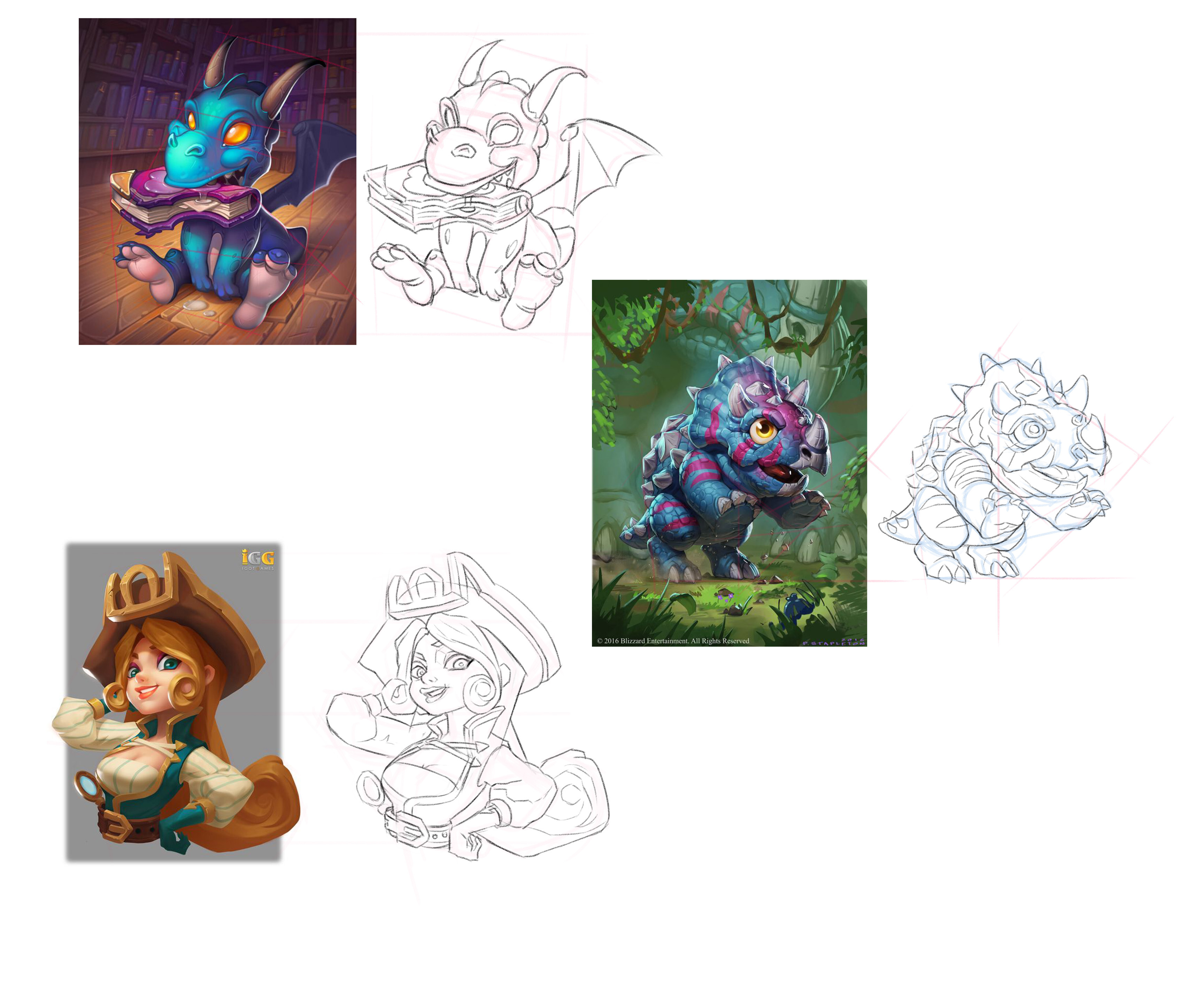


The art work:
Cookies Clicker Grandma

omg ur art looks amazing! each study looks so professional!
Ohhhhh so much good stuff! First congrats on the christmas illustration, it looks great - so much polish now
Second, loving the studies - for a second I thought you painted them all and was like omg, but really great job
And the grandma, very nicely done!
Btw, who made this character, I really like this style?

I don't know who is the artist is.
I just serch it from pinterest.
Gotcha, good stuff
14 days later
Your attention to detail is fantastic and you work super fast!
Suggested Topics
| Topic | Category | Replies | Views | Activity |
|---|---|---|---|---|
| Gibson - Art School Journey - Term 1 | Art School | 108 | 7.5k | Apr '23 |
| David - Art School Journey | Art School | 5 | 566 | May '23 |
| Term 2 - Peter | Art School | 17 | 3.5k | Oct '18 |
| Yan Ling - Art Journey | Art School | 47 | 7.0k | May '22 |
| Alii’s - Art School Journey | Art School | 22 | 1.5k | Jun '24 |