Hey guys,

I just finished this illustration and I want some different thoughts on it, other than mine, lol.
Do you find the lighting ok, or is it something to change there?
Please leave a comment!

Thanks! Have a great one!

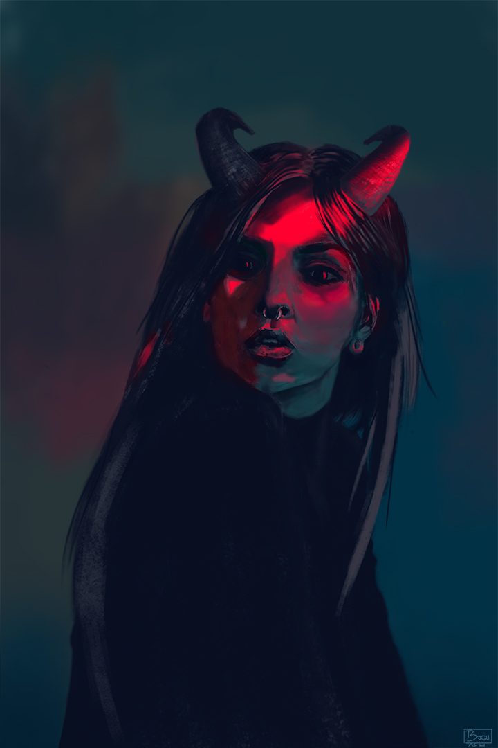
I did some Hue changes and I think it looks cool xD I'll upload these too.

I think the red / blue version is most effective. To my eye there is a lot of unnecessary space at the bottom. I think you could easily crop an inch or two off the bottom for a more effective composition.
Lastly, owing to the demonic nature, wouldn't a second light strip going across her other cheek make a cool cross?

Uuuu, that's a great idea! I'll try it out. Thank you very much! xD

Really nice! I love the vibe. I definitely like the red one a lot. I also think the green one is cool too. It gives her a more supernatural look the her. I feel it makes her look a bit more creepy too.

I also agree that a second lightstrip creating a cross shape might be interesting.

Nice job!

Thank you very much for the feedback @cedricgo ! I'm glad you like the illustration!

2 months later

The vibe and colors are amazing! At first your illustration is very striking cause your use of colors/values is super good, but the more I look at it the more I see details that look off. For example the jawline looks like it has a protrusion on it because it's not really defined. I'd define the elements with fewer, bigger strokes.

The bridge of the nose and the nose in general also looks flat, I always have this same problem lol

Thank you for the feedback! <3
Hehe, the nose is always a problem xD I'll try to work on these details.