Character looks so cool! I love the horns
14 days later
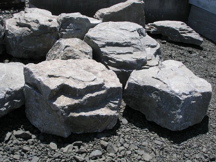
Studying rock texture was fun. Added a few process notes so that I don't forget them. I also played with how light would fall on the surface and reflect on it. I believe its also crucial to observe from real life rocks in order to get the their shapes and details right and memorised for your own visual library and to learn environment design. I would love to hear your thoughts, suggestions and feedback on this.
I have also attached my rock references below for my studies.


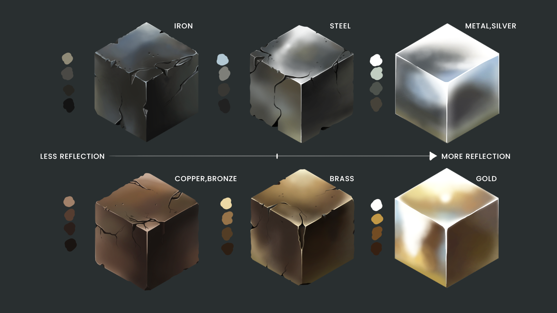
In studying metal textures in Photoshop for concept art, I explored creating realistic surfaces by combining noise, gradients, and lighting effects. The process taught me to balance fine details like scratches and imperfections with broader lighting techniques to add depth. A key challenge was achieving the subtle interplay of highlights and reflections to make the metal appear convincing, which required experimenting with blending modes and layer adjustments. Through this, I learned the importance of observing references and also adding them to my visual library. Would appreciate any feedback from your side.


Very nice studies!
20 days later
You went crazy with both the rocks and metal. I like you posting your process too cause I learnt something from it
Good to hear!!!
More in depth study for metal texture, this time I chose more complex references. This took me a while and was a bit time consuming but hope this helps anyone wanted to learn texture studies. I also welcome any suggestions or feedback on your side regarding an mistakes I could be making. Any suggestions on the type of brush would also be helpful. Currently I'm playing around with a texture brush and default photoshop brush mainly soft round brush and the hard round brush.

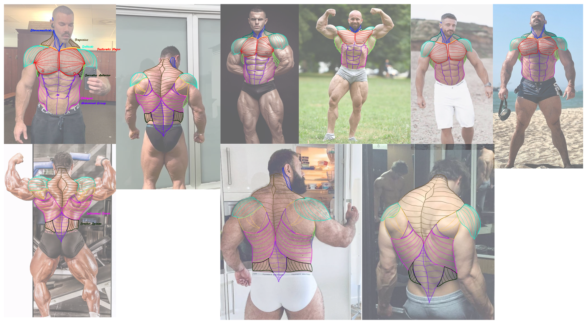
I also started with term 3 yesterday and exploring more muscle study for the back and front torso. Would appreciate any guidance or help regarding my exercise.
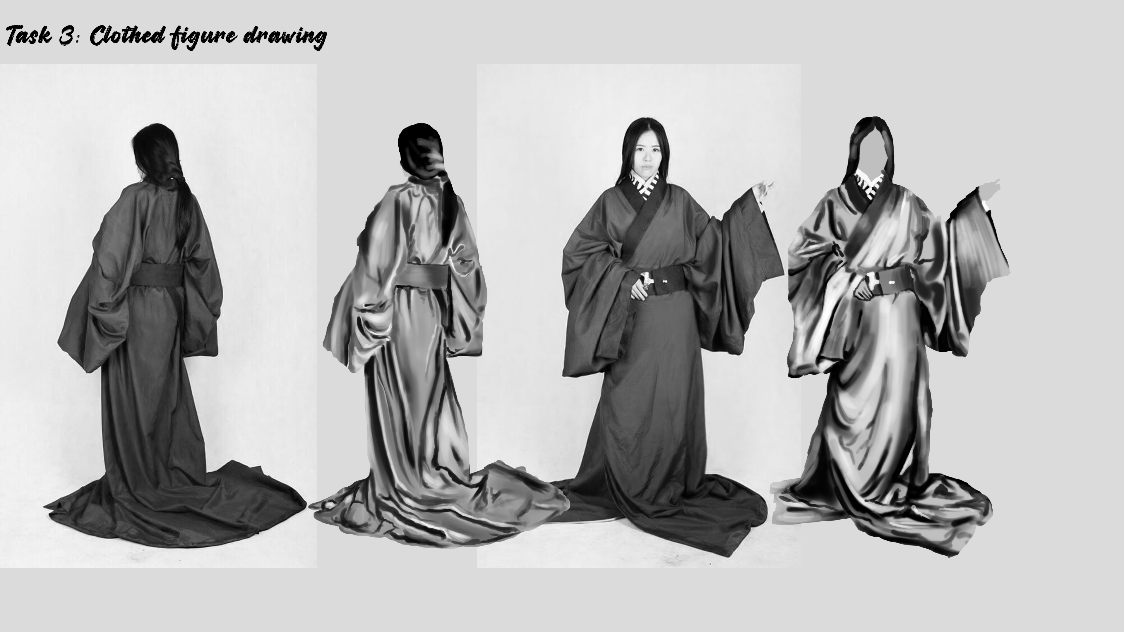
First attempt in term 3: Clothed figure drawing. Trying to get around the basics by highlighting the light and dark areas in a greyscale. I'm currently just using the basic photoshop brush for this. Would love to hear your feedback or any suggestions for the exercise. Maybe I can refine it further and add more details to the reference study later on.

These look good as hell. The only thing I can notice is that the reference has straighter line for folds in the fabric.
Thanks for pointing that out. While sketching or painting my hand jerks a little bit, especially when drawing geometric shapes. That causes my lines to give a rougher and uneven look instead of straight lines. But thanks.

It might be worth doing some value studies. These are very nice, but the values need a bit of work. The darks are too dark and the lights are too light. Convert the drawing to greyscale and compare it to your study. You won’t see any areas of bright white or black in the reference images when you do that and can compare where you are off in value.
Cloth study for today, will work on improving my value study as mentioned above. I already started working on these unfortunately so will start with greyscale references tomorrow. Thanks for the feedback though!
these lookgood I agree with kalienator here. some of these are a bit hard to simplify value wise, but doing value distillations or simplifying values into shapes and usind few values is extremely useful
cheers!
Continued with some more cloth studies with references. I went ahead with the idea of using black and white references to get the values right and not have extreme points of complete white and black shades. This has been challenging. Would love to hear your thoughts on these reference studies. I feel I still need more practice in order to get the highlights right.
I also did my first attempt in doing the 2nd exercise for cloth study, most of the clothes I did on the images are not from references hence the folds, creases and some of the light falling on the cloth texture was imagined by me. Feel free to give inputs on these too.


Analyzing historical references to understand fabric types, drapery, and layering. By closely observing reference images, artists can learn how different materials, such as wool, linen, and velvet, fold and interact with light. The focus is on practicing light and shadow placement to enhance depth and realism—highlighting raised areas where light hits and deepening shadows in folds and creases. This study helps in mastering texture, contrast, and the natural flow of fabric, essential for creating believable medieval attire in digital or traditional painting. Would love to hear what your feedback is regarding this.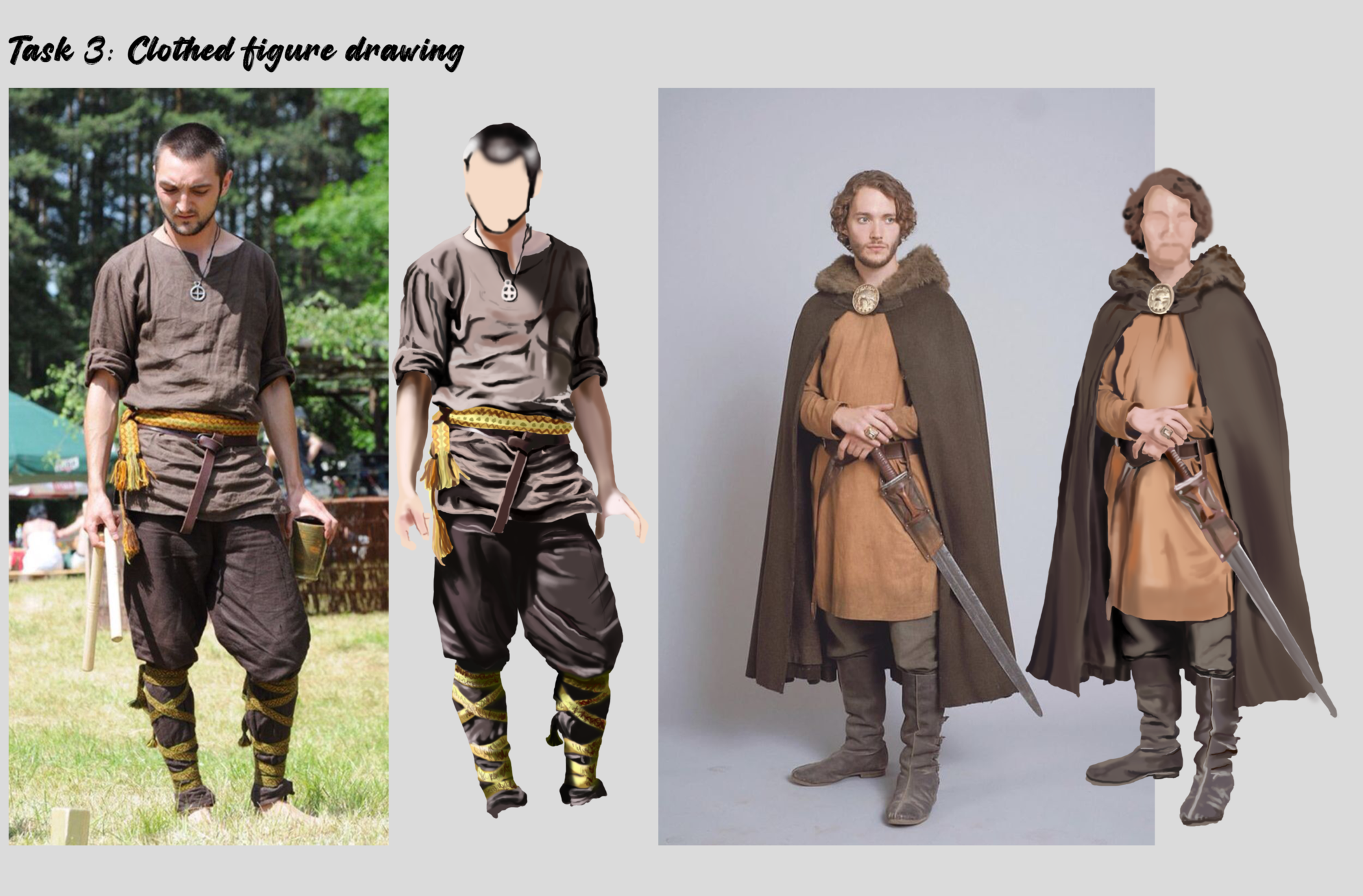
I think it looks great! The harsh light on the first one really leads to a pleasing shadow render effect. One area i notice a bit off is ij the softness of the edges and the value (tending to be too dark) on some of the more matte textured cloths like the first shirt and the second guys lower pants thingy. Try going for a more diffuse gradual soft edge with a slightly lighter value on those to capture the texture better
Cheers
11 days later
Material study for this week, would love to hear your feedback on the outcome. I initially started out with man made materials like metal, bronze, gold and then went ahead with natural and organic materials such as wood, water, rocks and much more. Really had fun doing these and share my work process here.

19 days later
Series of texture study, focusing on helmets mainly. Trying to get the correct texture for metal studies from various references. I also experimented with different brushes, starting from the default photoshop brushes to texture brushes. What are your thoughts or any feedback on this study?


Suggested Topics
| Topic | Category | Replies | Views | Activity |
|---|---|---|---|---|
| Term 1 - Monotone | Art School | 1 | 1.3k | Apr '18 |
| Natalie Viola - Art School Journey | Art School | 20 | 2.2k | Jan '24 |
| Term 2 - Head Diagram Challenge | Art School | 9 | 3.3k | Apr '18 |
| Yezibaba - ART School Journey | Art School | 7 | 1.3k | Jun '21 |
| Term 4 - Patmast | Art School | 18 | 4.1k | May '19 |