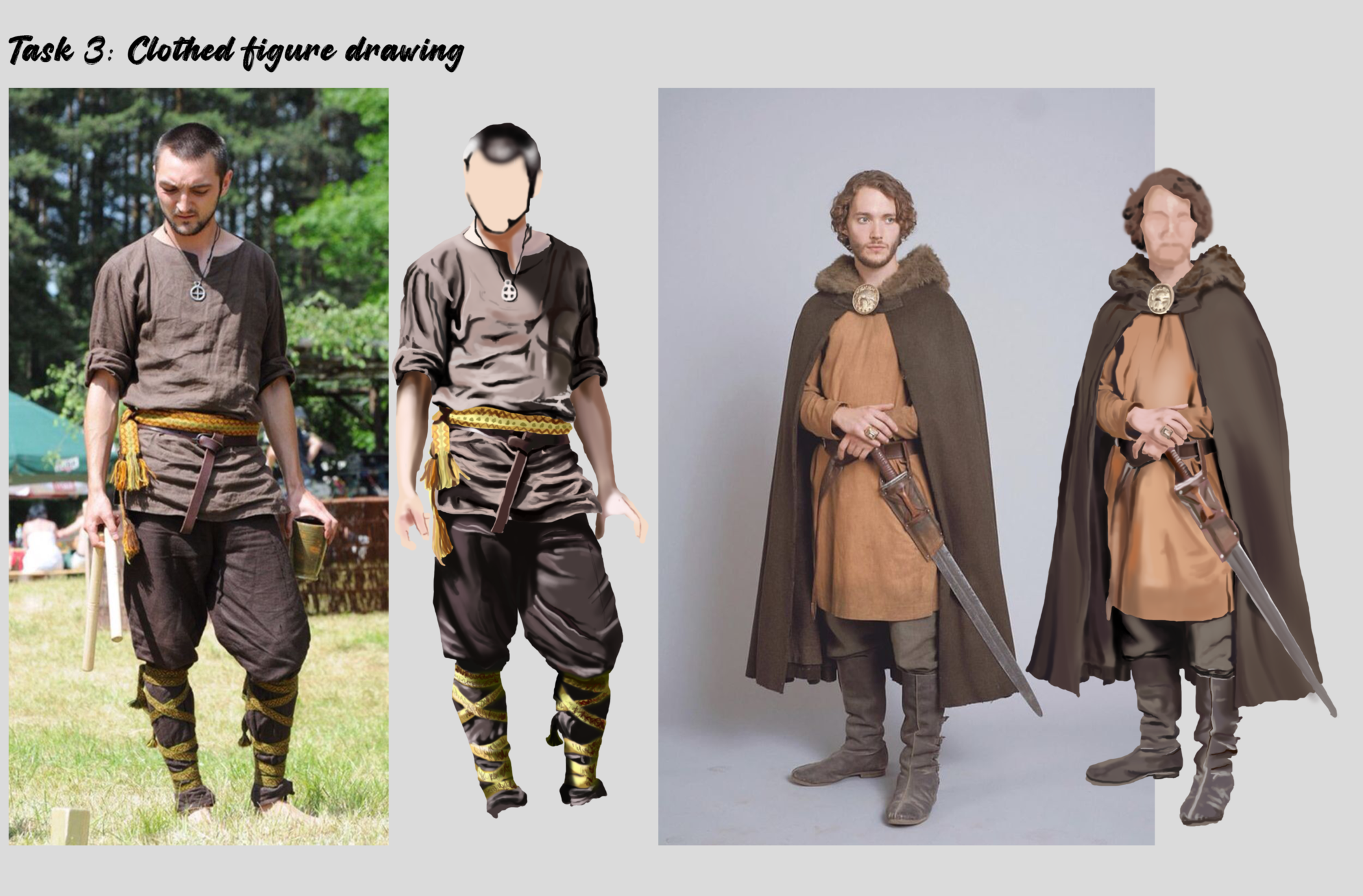
- Thank you! I finally cleaned that up. Meanwhile started 3 more ..I have a habit of taking too long to finish a piece, then I lose interest in it and just start something else. I found 8 from recently i started and abandoned, that are decent enough to not delete, but not finished. There’s also been a number of drawings I felt I “outgrew” - became better before I finished them, and it would be easier to start from scratch than fix them. Anyone else thinking that?in24.0k
- Lady Death Fanart Collectible: Part 6 Polypaint and base Hi, it’s time to share with you another part of the process to create this fanart piece. Polypaint As this is my first collectible fanart I didn’t have previous experience with polypaint so I tried my best and played a bit with it.I wanted to give a ghostly and eerie look to Lady Death, she is beautiful and deadly, but at the end of the day she is a woman that died and was reborn at hell as an avenging spirit, that’s why I gave her skin tone a bluish very cold tone.As you will see I gave myself some creative freedom to deviate from the traditional color scheme that this characater has in comics and illustrations.To add a bit of sensuality by painting some freckles on the face and the chest. The dark nature of this character was the perfect excuse to gave her a kind of goth make up, very dark shadows around the eyes, blue lips and fingernails. I know that the original character includes sexy red lips but I wanted this girl to have a sexy but at the same time creepy look, that’s why we can see some thin veins emanating from her eyes. The biggest chromatic change I did for this character is at the hair. Lady Death has a characteristic white weavy hair but in my fanart I decided to gave her a very saturated blue color.The reason behind this wasn’t only an aesthetic choice. I want that the face area strongly pulls the attention of the viewer so this area needed a stronger contrast. Another reason is that I want her to have a more modern look, as I mentioned before, I’m strongly attracted to women with goth/punk look. I gave myself half an hour or more to analyse the work of experienced sculptors that create collectibles and I discovered that the use of darker values on the skin is often applied to create a greater sense of volume and three-dimensionality. I found that areas with heavy ambient occlusion are the perfect places to paint with darker colors in order to increase the separation between different forms. Even though she has a bluish skin tone, I used a bit of warmer hues in areas that, in real life, tend to go towards red and pink, this is very obvious in the nose, cheeks, and knuckles. Thinking with a logical mind it’s completely absurd to have warmer tones on the body of a zombie like creature but I didn’t want to limit myself by using only blue tones, it looks boring and artificial. In real life these colors are created by blood vessels in areas where the skin is very thin. ** Scythe **for her weapon I applied a cool gray with some warmer variations, this color scheme is influenced by the work of H.R giger. Base I’d like to talk about the design for the base which, to be honest, I forgot to develop along with the character.My main idea with the base is to show that Lady Death inhabits a very sterile and arid land, at the end of the day she is at hell.You can see a that she walks over dirt and rocks, a sign that she’s surrounded by death and loneliness. As part of the landscape we can see some bones and skulls to reinforce the idea of lack of living creatures, yet we can see three hands that try to reach her legs.This hands represent that all creatures are subordinated to her power and seek an evil blessing with a simple touch of the princess of the damned.1- The hand with skin burns represents the souls of those who are newcomers to hell, tortured souls that suffer for the sins comitted on earth.2- The hand with greenish rotten skin and pustules is the reminder of the decay that has infected the souls of those who have been trapped and have forgotten their humanity3- Last but not least, the hand of a demon shows that even dark creatures and entities bow before her presence. The cherry on the top, at least in my vision, are the simese twins that emerge from the ground, this malevolent creatures remind us that in hell there’s only perversion and any trace of innocence is lost. Thanks for reading till this pointI’m really happy to be very close to finish this creative journey, last but not least it’s mandatory to talk about splitting the sculpture in several pieces to be printed, this will be my last entry before showing the final rendered images. See yaMay Zbrush be with youin1.4k
- memory 2min gartic phone, used ref 2m gartic, used ref for pose 2min gartic 2min gartic 2min gartic 2min gartic memory memory memory memory study memory memory memorymemory memory memory memory memory memory study memorystudy study stylized left memory, right study study memory memorymemory memory memory memorymemory memory, porportions r offmemory memorystudystudy memorymemorymemory memory memory memory memory memory memory memory, right leg is a bit broken The feeling of only getting 1 - 3 likes on a social media post will never not be discouraging. But nothing is discouraging enough to make me quit drawing. I think the strategy of drawing a lot of stuff and waiting a while to post is good though rather than posting it immediately and then feeling that sadness on the next set of drawingin
- studies studies juri study imagination, how I feel before a speech imagination imagination study something I drew for my presentation also drew this for my presentation, didn't fix the one hand being bigger than the other imagination + study study studies study study, I need to fix the face a bit based on screenshot from anime but in my style study. except for the eye study studies studies study. changed some things tho imagination imagination imagination study studies, except top right samurai based on anime screenshot wolverine studies, changed some of the poses a lil, not very good at all, but first time i drew the character ever. semi study studies study imagination imagination imagination , for first time ever i tried to draw over 3d model for middle pose, I dont like the result tbh, but it makes it much easier than coming up with it from memory.imagination, except right figurestudies imagination + studies, coming up with action poses r hard, these are not dynamic enough, I will redraw better ones in future. imagination , imagination imagination study, except for eye imagination imagination imagination doodles except for the two chrollos imagination storyboard thumbnail, idk if i ever shared this. my storyboards end up being a little detailed since i usually just draw in one layer.in21.8k
- Hello! My name is Vithor, I am from Brazil, studied Design at a local college worked as an illustrator for more than 10 years. I took a time off around 3 years ago and am trying to get back in my art shape and maybe become professional again. Here are some recent pictures: You can find timelapses for most of them on my instagram: www.instagram.com Vithor Albertim (@vithor_albertim) • Instagram photos and videos 123 Followers, 638 Following, 19 Posts - See Instagram photos and videos from Vithor Albertim (@vithor_albertim) Comments and critiques are always welcome.Cheers!in784
- Thank you @daceronine! If I remember I save in google cloud, I will have to stick a note to do it more often. Lamp is from life. Poses are from refs but I look at refs for a while and then try to do it myself and look it up if needed. Outfits and rest is from imagination Something went wrong while installing system so we will have to wipe everything again... pc works but something is wrong. We will wait till internet is done and I will save everything on cloud this time Threads came out in eu. It's been 3 days and I had more engagement than after half a year on instagram. It feels really nice I hope it stays this way A portrait of old dude. It's the same character I posted a while ago. Inspired by Bayard Wu work. At first I thought of him as a bear but I named him Fenrir and I think wolf suits him better. Eye gave me a bit of hard time but I think it is fine now. I focused on face and forgot about area below. The way I draw hair clashes with greying hair. I had the same problem while doing Lohse's white hair. Does it looks like it is greying here? I love how desaturated red looks blue there. I keep lying to myself that I will use different color scheme but It all comes down to this blue and yellowish one it is just flipped this time Have a great day!in47.2k
14 days later
Studying rock texture was fun. Added a few process notes so that I don't forget them. I also played with how light would fall on the surface and reflect on it. I believe its also crucial to observe from real life rocks in order to get the their shapes and details right and memorised for your own visual library and to learn environment design. I would love to hear your thoughts, suggestions and feedback on this.
I have also attached my rock references below for my studies.
In studying metal textures in Photoshop for concept art, I explored creating realistic surfaces by combining noise, gradients, and lighting effects. The process taught me to balance fine details like scratches and imperfections with broader lighting techniques to add depth. A key challenge was achieving the subtle interplay of highlights and reflections to make the metal appear convincing, which required experimenting with blending modes and layer adjustments. Through this, I learned the importance of observing references and also adding them to my visual library. Would appreciate any feedback from your side.
More in depth study for metal texture, this time I chose more complex references. This took me a while and was a bit time consuming but hope this helps anyone wanted to learn texture studies. I also welcome any suggestions or feedback on your side regarding an mistakes I could be making. Any suggestions on the type of brush would also be helpful. Currently I'm playing around with a texture brush and default photoshop brush mainly soft round brush and the hard round brush.
I also started with term 3 yesterday and exploring more muscle study for the back and front torso. Would appreciate any guidance or help regarding my exercise.
First attempt in term 3: Clothed figure drawing. Trying to get around the basics by highlighting the light and dark areas in a greyscale. I'm currently just using the basic photoshop brush for this. Would love to hear your feedback or any suggestions for the exercise. Maybe I can refine it further and add more details to the reference study later on.
It might be worth doing some value studies. These are very nice, but the values need a bit of work. The darks are too dark and the lights are too light. Convert the drawing to greyscale and compare it to your study. You won’t see any areas of bright white or black in the reference images when you do that and can compare where you are off in value.
Continued with some more cloth studies with references. I went ahead with the idea of using black and white references to get the values right and not have extreme points of complete white and black shades. This has been challenging. Would love to hear your thoughts on these reference studies. I feel I still need more practice in order to get the highlights right.
I also did my first attempt in doing the 2nd exercise for cloth study, most of the clothes I did on the images are not from references hence the folds, creases and some of the light falling on the cloth texture was imagined by me. Feel free to give inputs on these too.

Analyzing historical references to understand fabric types, drapery, and layering. By closely observing reference images, artists can learn how different materials, such as wool, linen, and velvet, fold and interact with light. The focus is on practicing light and shadow placement to enhance depth and realism—highlighting raised areas where light hits and deepening shadows in folds and creases. This study helps in mastering texture, contrast, and the natural flow of fabric, essential for creating believable medieval attire in digital or traditional painting. Would love to hear what your feedback is regarding this.
I think it looks great! The harsh light on the first one really leads to a pleasing shadow render effect. One area i notice a bit off is ij the softness of the edges and the value (tending to be too dark) on some of the more matte textured cloths like the first shirt and the second guys lower pants thingy. Try going for a more diffuse gradual soft edge with a slightly lighter value on those to capture the texture better
Cheers
11 days later
Material study for this week, would love to hear your feedback on the outcome. I initially started out with man made materials like metal, bronze, gold and then went ahead with natural and organic materials such as wood, water, rocks and much more. Really had fun doing these and share my work process here.
19 days later
Suggested Topics
Topic | Category | Replies | Views | Activity |
---|---|---|---|---|
Christine M. - Art School Journey | Art School | 7 | 963 | Jan '22 |
Term 1 - Harry | Art School | 0 | 805 | Nov '17 |
Art school pacing | Art School | 2 | 1.4k | Oct '19 |
Term 1 -Photoshop for Digital Production | Art School | 0 | 894 | Jun '18 |
Lee new student | Art School | 19 | 1.6k | Mar '23 |