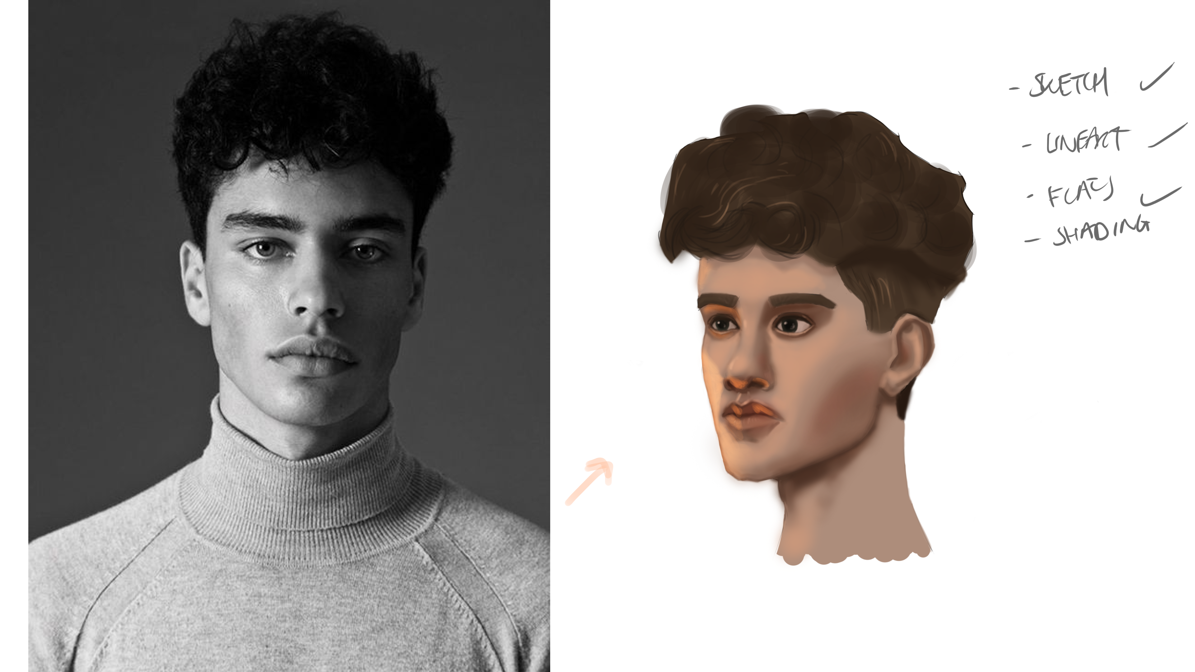
(Left hand side is a trace from the reference)
13 days later


Some head studies. Been a busy week with birthdays and work. I'll scan my sketchbook in a sec
great practice, if you don't mind me pointing some things out:
- on the first one the septum is too thick at the bottom so there should be less space in between each nostril,
- on the second one, there is less space between the chin and the mouth and the neck is also a little too thick on yours as well
- you could have pushed the angle of the face more on the third one as well it is more 3/4s than what you have, but very nice rendering on the head either way
- and for the fourth one the nose comes out farther and is generally bigger as well
You probably already saw most of these, so it may not help much but good practice and keep up the good work!
You are a saviour! I'll definitely try avoid those in the future Kosmo!

Still a W.I.P probably about 30mins in, should be happy with it after another hour


Very nice studies, good job! 

Good studies !! keep going 


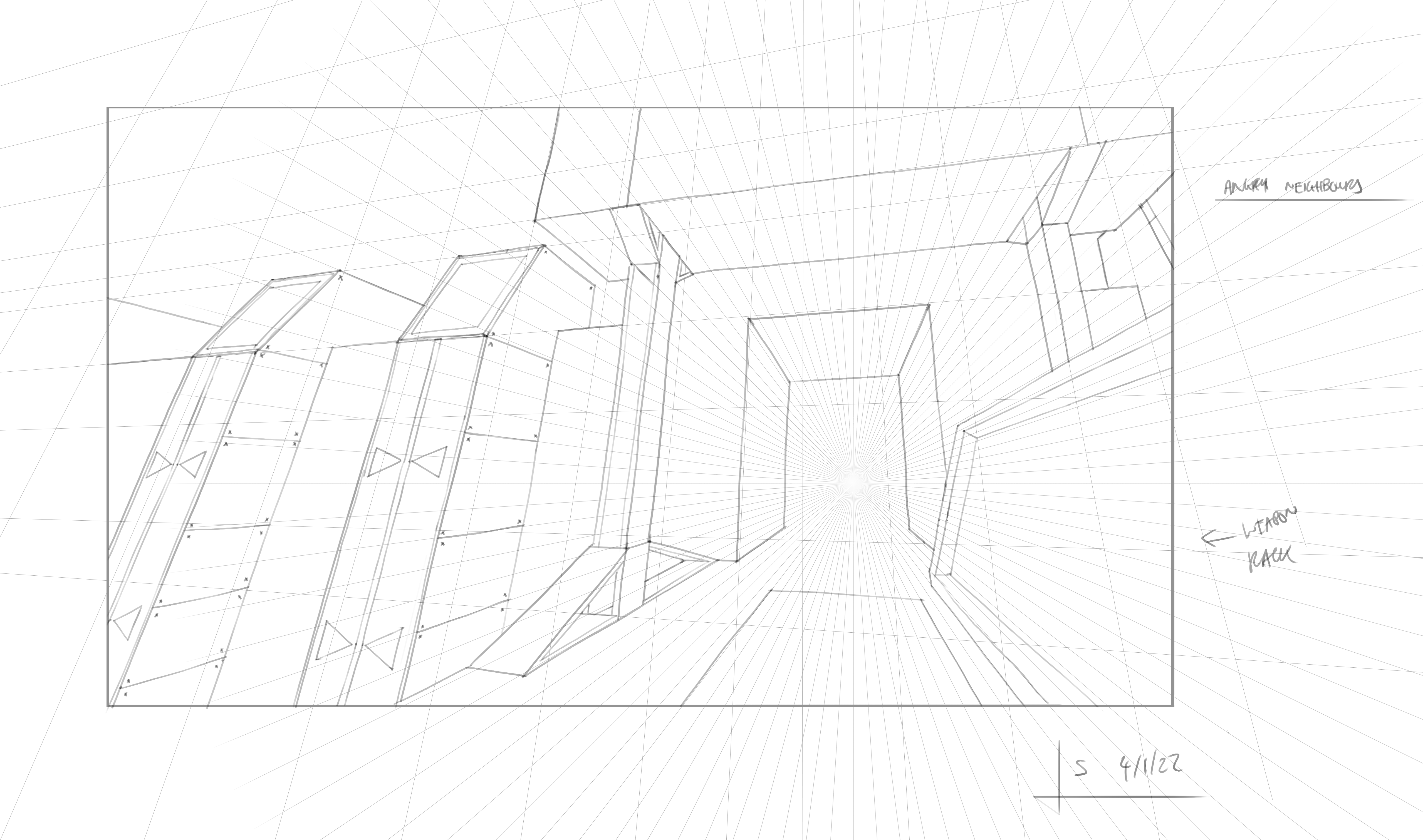
First go at the wall assignment for Perspective 2. I really struggled to think of ideas, didn't really know how to design a wall.
Thanks! Didn't get much time in today, anniversary is in 2 days! Managed to get a quick hour sketch of a library.

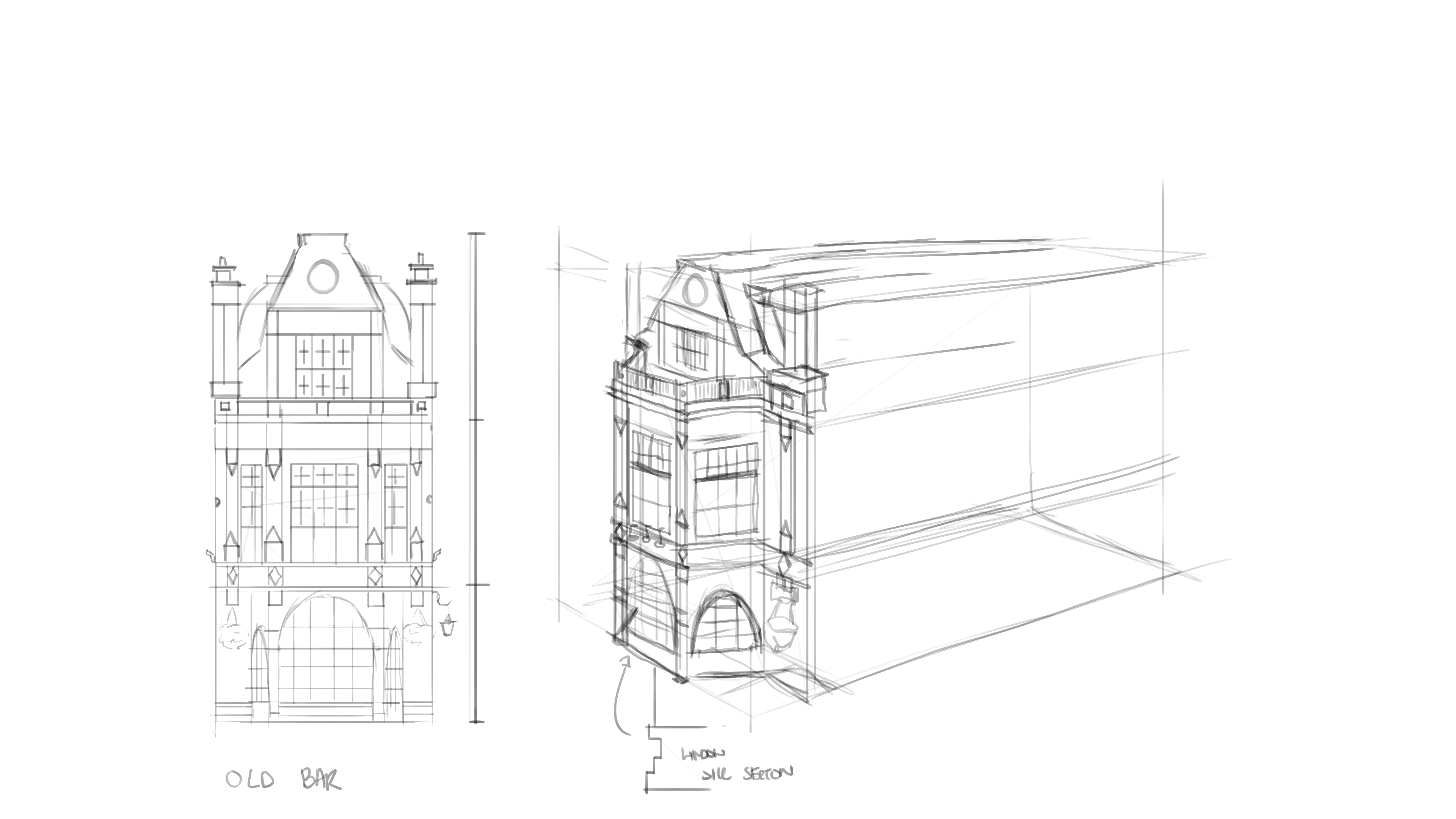
Finished off another sketch for the visual library, this time a french restaurant. Decided to change the angle and rebuild the front from the reference and then design my own side using elements from the reference.

Then I made some progress on the second wall design. This one is for a more militarised city, they are very industrial and use a lot of metal and stone in their architecture.