

Some eyes from imagination and an Environment Study from reference I worked on the past few days, tried to get a better feel for how values interact with saturation so I could be more free with my colours
Some eyes from imagination and an Environment Study from reference I worked on the past few days, tried to get a better feel for how values interact with saturation so I could be more free with my colours
these new studies look super nice ryan!

I don't make or want to make a habit of posting WIP's however the line work which I put into this killed me, had to learn new things just to get this standard and its thanks to my own personal bully squad big shootout to user @Vonschlippe for being an amazing role model to me, like I said its not done I still have lots of rendering cheese to add but I am hopeful this will be one for the scrapbook!
This is gonna be awesome! 

I still suck at clean rendering but pushing on about 3 days I don't like
taking too long on projects so I stopped myself and just published what I had, honestly my goal here was just to understand 3 point perspective better and I already achieved that with my sketch so this was just pure fun!
Nice colours

It has been a long long time since I attempted any sort of Fanart, simply too overwhelmed with Studies but I found the time to make the Reg from Made in Abyss, was really happy to paint this using new techniques I picked up in the week!

Spent my day from start to finish doing a colour study, I feel like I scuffed the values however I do feel like this was a bit closer then my last attempts and my control is definitely building so many elements to work with was challenging by very fun! I enjoyed working on this
it looks very nice ryan! good job! her facial expression looks good too
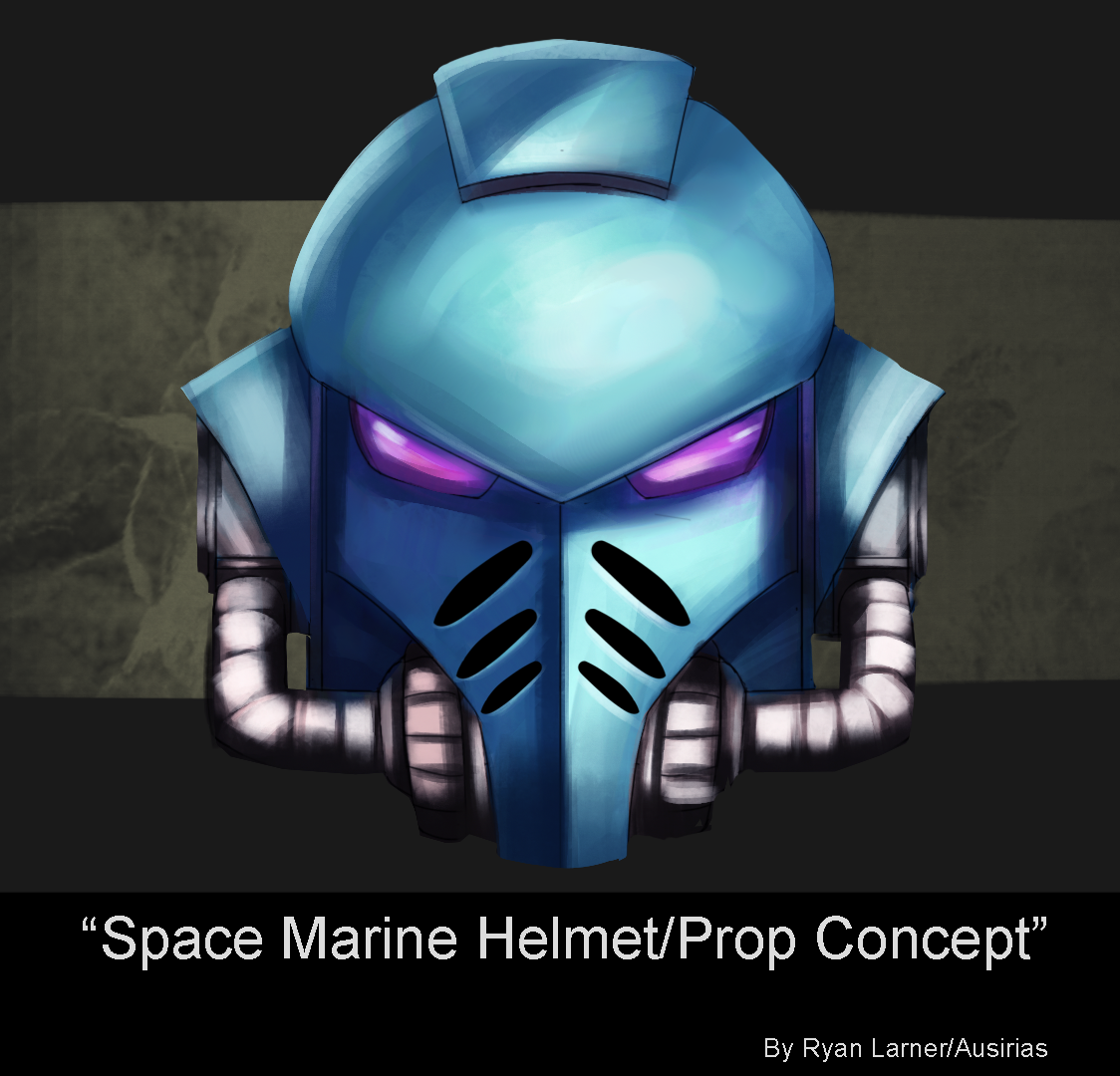
Currently stuck learning 3D to improve workflow, been chipping away at some nice metallic work in the meantime bonus that I got to work on a prop from my favourite Sci-Fi Universe
15 days later


Completely forgot to update this, here is some work from the past few days, been diving heavily into 3D and using workshops but also keeping things fun with some portrait work, enjoying the journey.
17 days later

Annnnd done, this piece was waaay above my current level and I've learned my lesson definitely want to unwind a bit do a few studies and such to cool down, my hand feels liks its on fire

Been in a huge art slump recently so been trying to build new momentum by taking on bite-sized projects, decided on some Drapery from Term 3 as a subject of study for today, hopefully I will be able to build off of this.
Hey Ryan! The folds in your drapery are really well defined. The edges on the upper two pieces are too sharp, but I think you nailed it with the third - it's really nice.
Saw this on Discord! Like everyone said, the black one is amazing! I feel like you did a great job balancing had and soft edges as well as keeping the values in check. The white one looks nice too, but I think it's too bright in some areas. The bottom part is almost, if not as bright as the top part. Since the light is coming from above the bottom part shouldn't compete with the top. If you darken that area a bit and sharpen the edges more between the highlights and shadows it'll level it up. Hope this is helpful!
Thank you so much for the Critique Lesley, I am most proud of the black one for sure it felt like I had complete control over the reference. I will certainly clean it up because these are going into a University Portfolio, I've been recommended studying the drapery of Greek Statues next so plenty of opportunities there I think