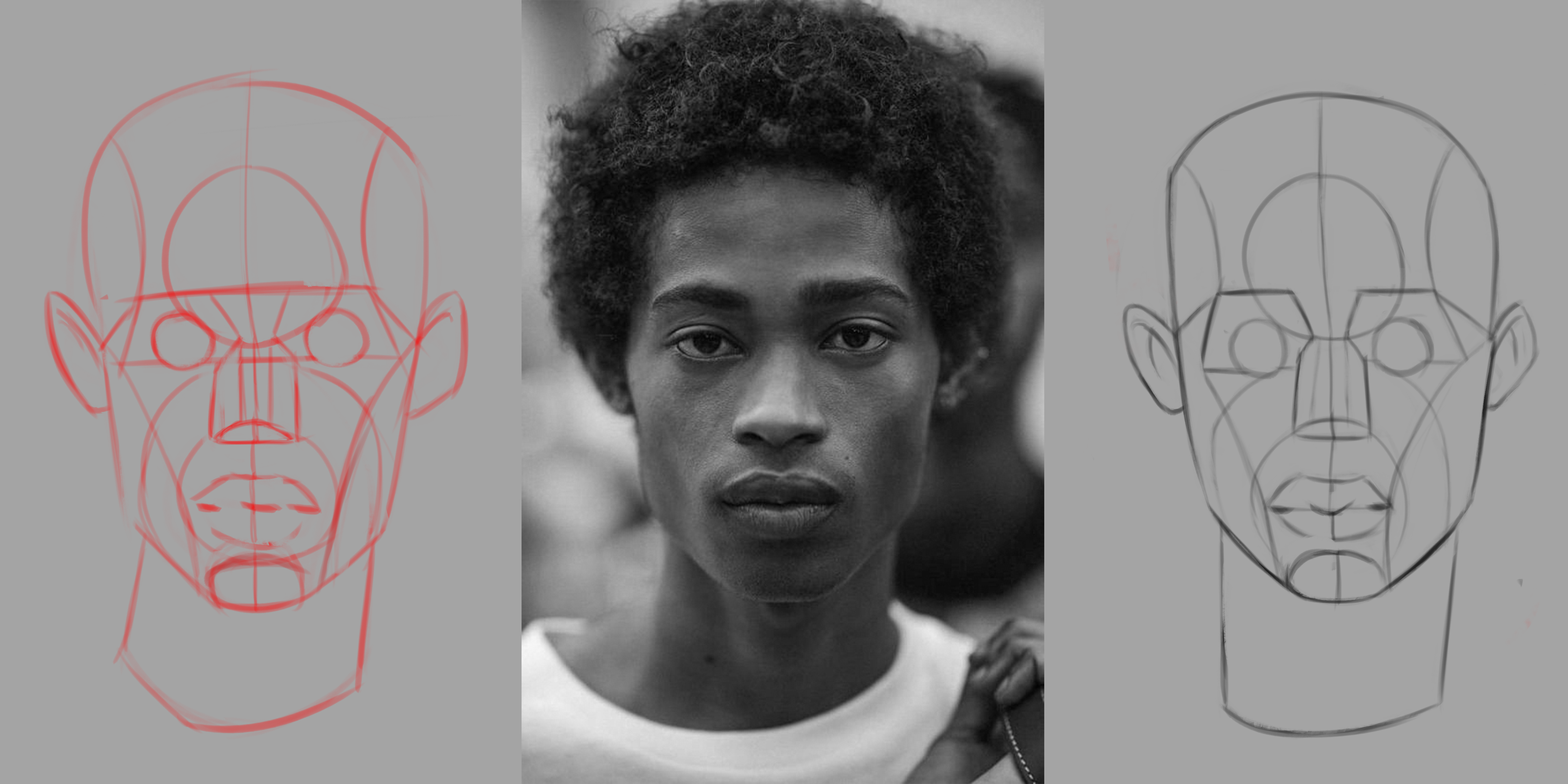
Saw this on Discord! Like everyone said, the black one is amazing! I feel like you did a great job balancing had and soft edges as well as keeping the values in check. The white one looks nice too, but I think it's too bright in some areas. The bottom part is almost, if not as bright as the top part. Since the light is coming from above the bottom part shouldn't compete with the top. If you darken that area a bit and sharpen the edges more between the highlights and shadows it'll level it up. Hope this is helpful!
Thank you so much for the Critique Lesley, I am most proud of the black one for sure it felt like I had complete control over the reference. I will certainly clean it up because these are going into a University Portfolio, I've been recommended studying the drapery of Greek Statues next so plenty of opportunities there I think
27 days later

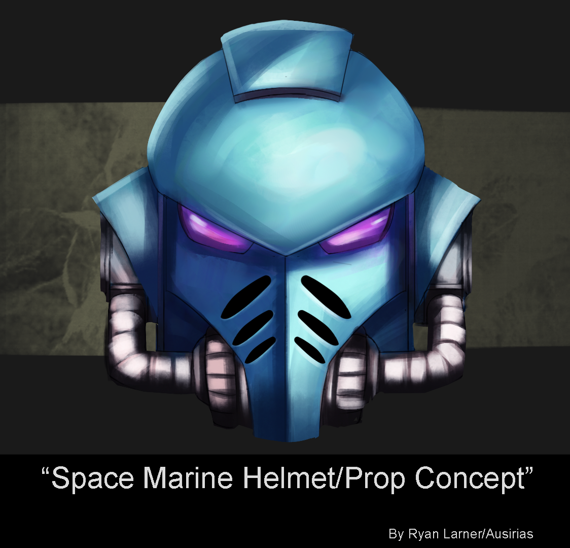
Been really busy lately with my new mentorship although I had some time to sit down and get some metal rendering done, I followed a tutorial for this one and thought I came pretty close although with my art there seems to be certain traps and pitfalls I keep falling into need to stay aware of those if I want to improve


 will be building back up to interior design


