All these are looking much better! Shadows, proportions, linear, it's all looking much better!
If there is any feedback I can share, is to look into folds a bit more into detail, to try to imagine them as a mesh affected by the body volume gravity and tension and not just shadows on fabric.
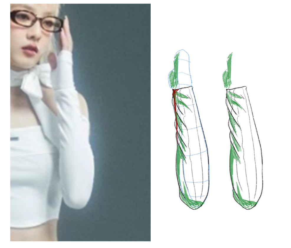
As usual, I have a hard explaining with words, so let me use a small example here, with one of the sleeves:

If you can visualize the cloth like a "3d Mesh" over the body, and try to see how it's being deformed by the tension points and volumes (the black line), the blue lines represent the body underneath, and the red line the tension strenght. It'll be easier to see where the shadows go (the green lines), since you can then just place shadows following the 3D mesh object.
Hope that makes sense. I think Marc once explained "shadows are there just to give a hint of volume to the objects", so it's all about the shadows properly following the 3D volume and light source.
For me at least this was the most challenging part, getting the volumes and the mesh to look right, since it's imaginary 3D space. That's also why the 3D figrues exercices are so important. If you get those right, the shadows just follow the object.
Take a quick look at this video, I think Marc explains it better here:
However I would advice to take a peek at your first piece and compare it with these last ones, there's HUGE improvement already!
On regards to the zoom in question, I'm also learning myself, but I can share what I've learned so far:
Try to use 300 dpi, that gives you a reasonable pixel quality.
For resolution size, it depends on where you intend to publish it (print, instagram, etc), but for most of us, a resolution of A6 is fine for exercices, A5 for something with a bit more quality, and A4 if you REALLY want to make a high quality, high resolution piece. I forgot the width/height those represent, but most softwares have these by default. Basically, A4, A5, A6, the higer the number, the lower the resolution.
Something I learned recently which I still have to try, is to start with a low resolution, say, A6. Do your drawing without much detail, just the outline, basic colors and so on. When you want to "zoom in" to add more detail, change the canvas resolution to a higher one, this allows you to "zoom in" more and pack in more detail that would normally wouldn't be possible due to the fixed resolution. Resolution is not a "one time" set and that's it. You can keep increasing as needed, so start at A6, then increase it to A5 if you need to add more detail, and so on.
I noticed the brush you use has a lot to do with the detail you can pack in. Download and try Marc's "legendary" sketch brush (not sure if it can be imported into procreate... I asume you can). It's basically a sketch-like brush, good to do basic drawings, usually zooms in pretty well since it has low opacity.
Still, your lineart also shows improvement, so the effort is paying off.