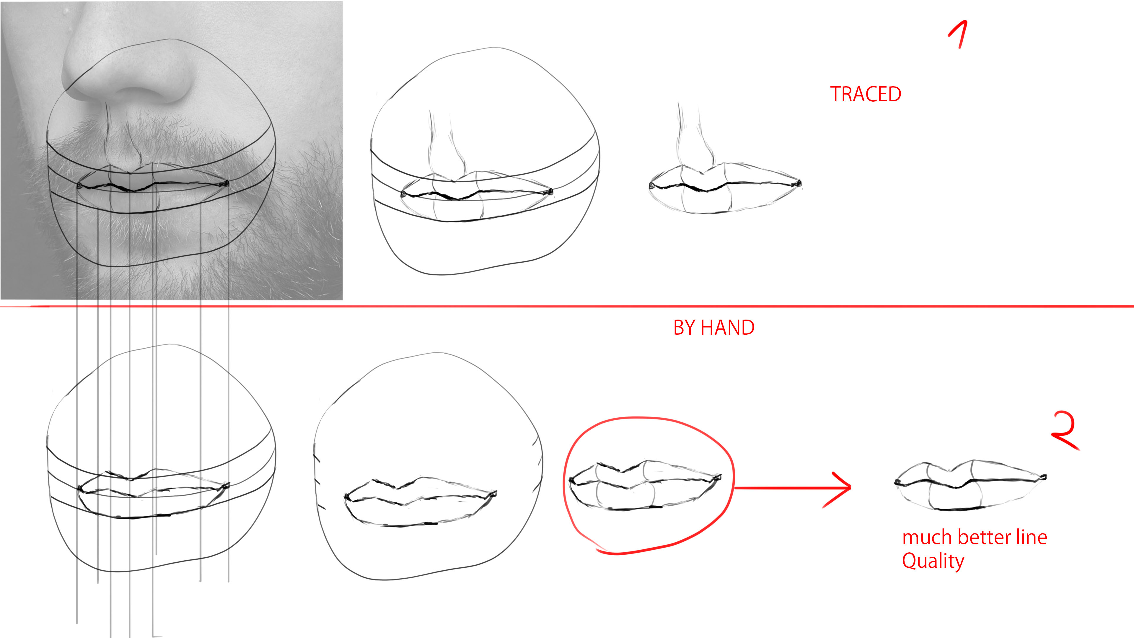
This wasn't meant to be a direct response to your post, it's just a line tutorial. I meant to do this earlier, but I decided to use your most recent reference since you were currently asking about the structure.
I also wanted to show my process and what I meant about emphasizing curves in my comment a couple of days ago.
But getting back to the structure, even in the earlier stages I think it's a good idea to have looser and longer lines. Try to get the gesture and angles down of the reference.
I'd say the third one is actually more accurate compared to the rest. It has good volume and follows the shape well. If you make the upper lip curve more at the end it will enhance it more. But with all of these they feel a little stiff and tight. I would try to be more fluid in the beginning and explore the bumps and grooves of the reference. Then try to add more solidity to them at the end.