Good work!
I have the impression that you were trying to draw what you think is there for the right hand of the model, but this exercise is about drawing what you see, so maybe if you try to be more conscious about it it will help next time.
Thanks!
Ye, alright, i think i get what you mean. But i would say that it is definetly harder to draw something if you have no idea how it's constructed. Well, at least for me.
Love the detail your getting on those smaller objects and your line weight is really good at driving the perspective.
If I was to add anything, I think you need some objects in the foreground. It would really add to composition and make it seem like the camera isn't so far away and the room wouldn't feel as empty too.
Either way looks like a very solid foundation - your other work is great so I'm looking forward to seeing what you do with it!
Alex
Hey, Alex!
I will definetly work around foreground and the ceiling area :>
Thanks a lot for the support 
I keep adding details slowly, rounding the corners and all. It gets harder for me with every second because i am not really good with making up interiors (at least i dont think so) and I am more a minimalistic type of person, haha 

Nice! I like the changes you've did. It seems like it will turn out to be a pretty cool room


Aww come on now, that turned out quite decent!
And its important to not filling images with everything under the sun, give the eye some resting space, I would say that you actually obeyed the thirds system with this layout.
If you want to put in a little more, maybe just cut a doorway onto the wall on the far right of the image, like show that a hallway is there or something, that is the only spot that looks unused.
Maybe try pumping up the light cast in by the window on a separate layer, like the sun is just coming up and it is throwing a hard beam into the room. That might be fun.
Its a fun image that shows you nailed the perspective.
If you're intersted into doing more you can always check out interior magazines or websites. There's a lot of really cool ideas for layouts and prop design to found in those.
Another idea is to imagine how would you decorate and arrange this place if you were living there. Like, if you like to read, putting in a cabinet with books, a cozy chair and a lamp for when it's dark could be cool. Or if you'Re the kind of person who likes hanging stuff their wall, just add some of that to your drawing. Or you can also do the same by creating a character in your head and go through the same process, but from the perspective of that character instead of yours.
But as @PeterH mentionned, you also don't necessarely always need to fill the whole place either. I think it already works well as it is overall.
As for the shading, I think you just need to push the darks a little bit more to create a better contrast. Something a little bit like this maybe? 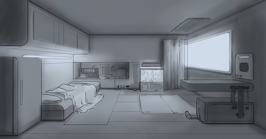
A lot of what I did was darkening the areas where objects meet (like where walls corner and where the furniture touch the ground). I think it's called occlusion, but don't quote me on that. I also darkened the closer planes facing us as the light from the window wouldn't affect them as much.
But otherwise, I'd say good job! That's a pretty good perspective job

I didn't have much time to properly work on it tbh but yours advices (@cedricgo and @PeterH) are very helpful indeed!
I tried to push darks as much as i htought it would work out..
I do see now where i could add more details and I have a bit of an idea now.. but unfortunetly I will have to leave this as is for now.

I'm glad that I was of some help
As for the changes you've done, I think you did a very nice job. It looks pretty good to me. Good job!
Wow, it is nice to see the evolution of the piece, and that it came out so well! I really like the idea and the results!
I think the only little details to work, would be the folds of the blanket, and that thing on the right wall (I'm sorry, I don't know what it is), that seems a little bit out of perspective. But they really are very minor details.

Oh, very nice! I see you've followed Marc's suggestions. I think it all works really well. My only very minor nitpick is that I feel that the little cabinet on the right, the one on top of the desk thing, calls a little bit much attention to itself. Maybe darkening it just a bit would help make it blend a little bit better with every thing else.
But other than that, it looks really cool
Ye, i will definetly darken it up.
thanks

Suggested Topics
| Topic | Category | Replies | Views | Activity |
|---|---|---|---|---|
| Zack-Art School Journey | Art School | 11 | 1.4k | Oct '23 |
| TERM 1 - assignments | Art School | 2 | 1.5k | Nov '17 |
| Nathaniel - Art School Journey | Art School | 22 | 4.1k | Oct '23 |
| Emrys’s Art Journey :)) | Art School | 10 | 1.6k | Dec '22 |
| Triplexxor - Art School Journey | Art School | 9 | 622 | Jun '24 |