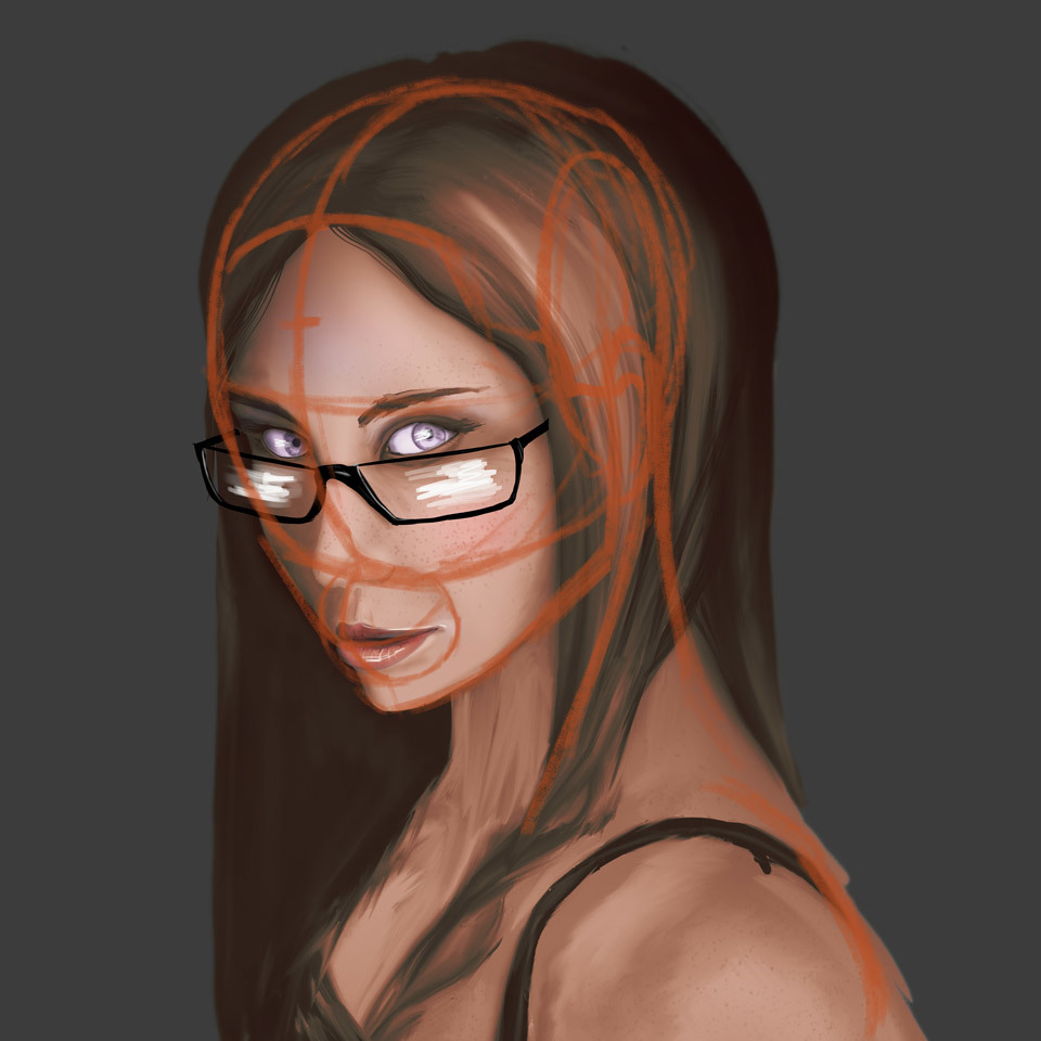
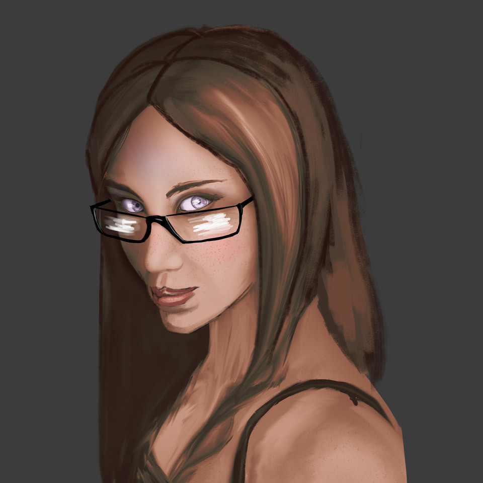
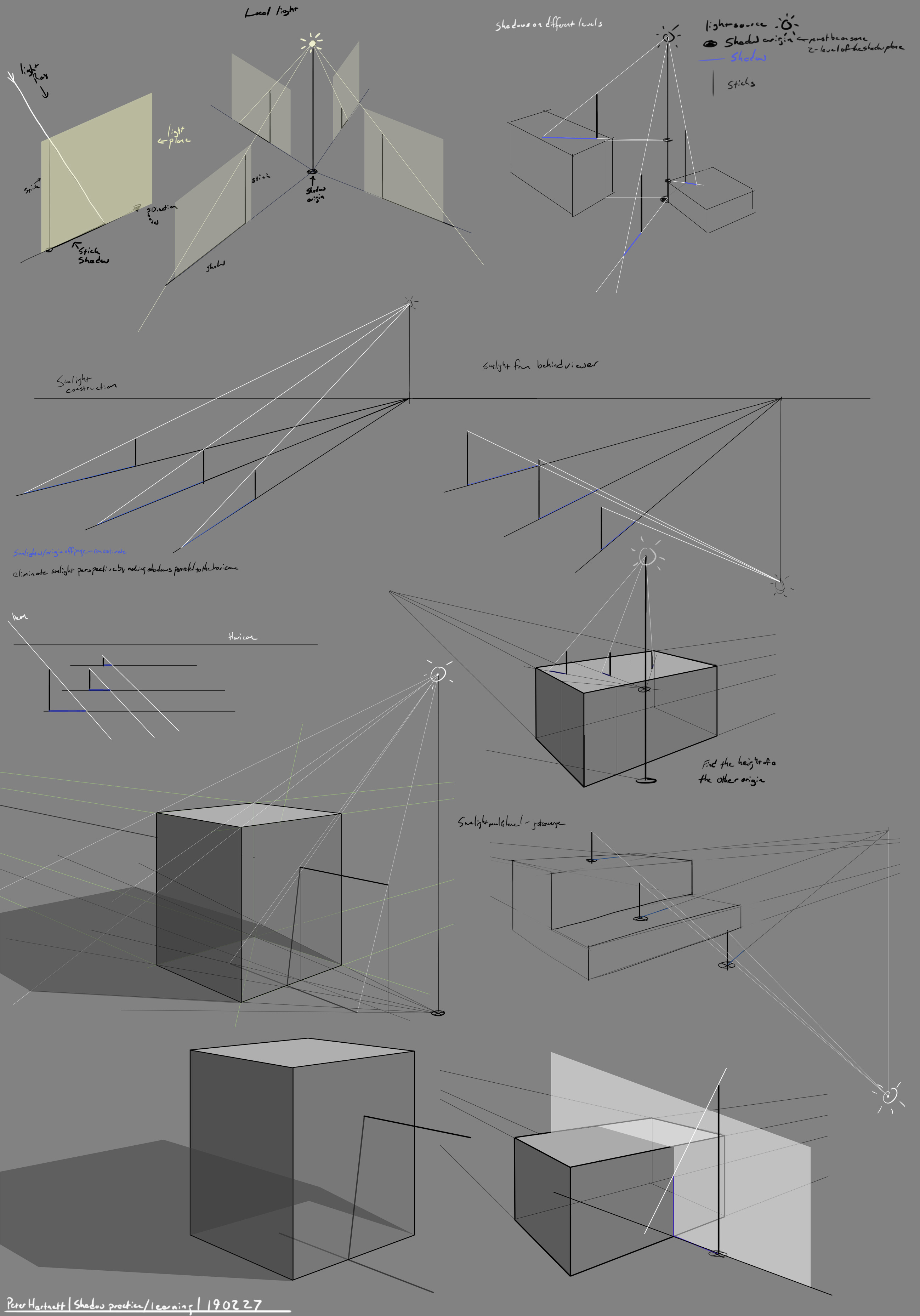
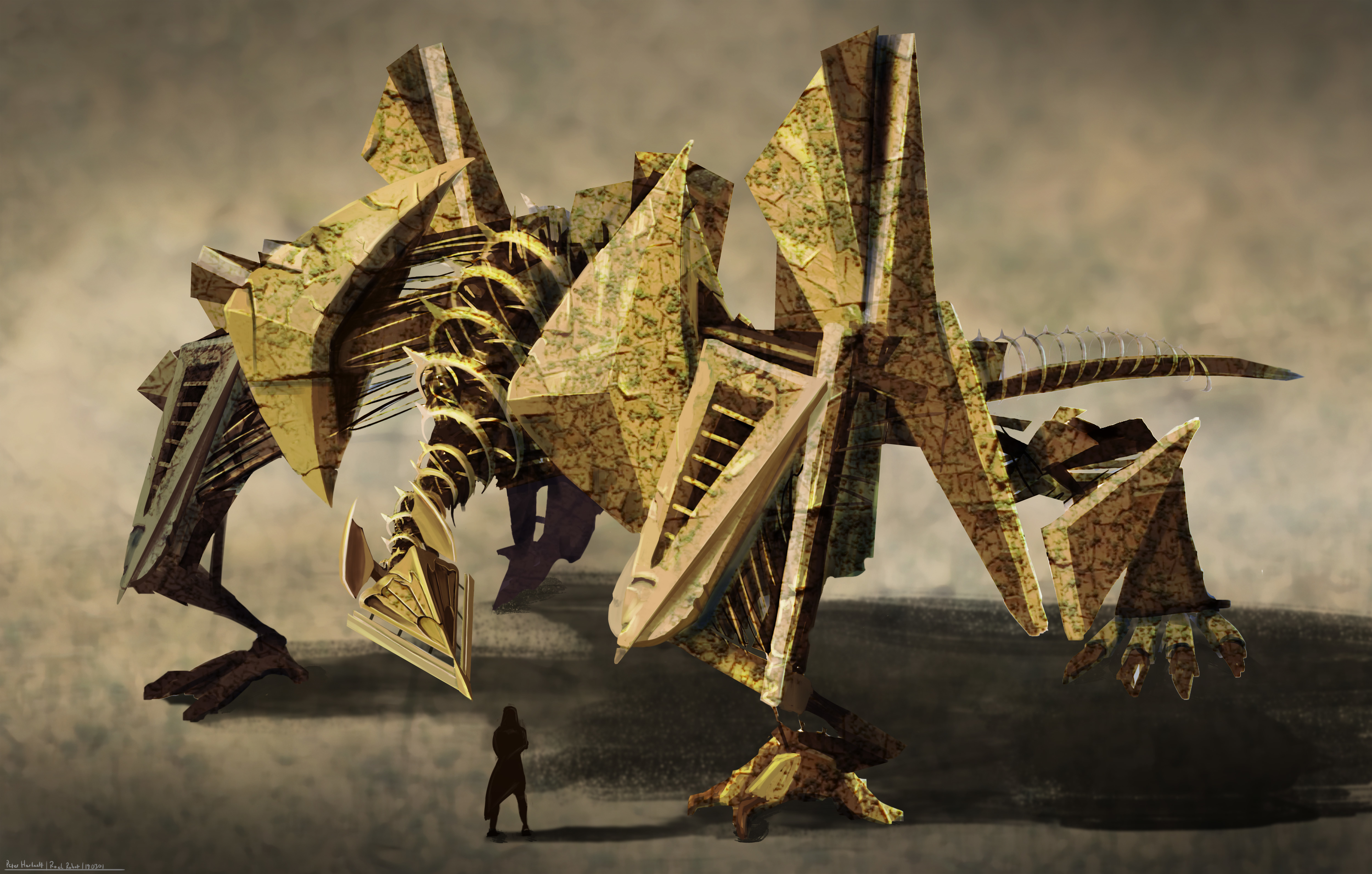
I realized while working today that I havn't posted any work from term 6 because I was focused in on ArtWar and integrating things from the term into that project, and I never circled back around to it. Anyways, I am working at it and will be posting the relevant things here while bouncing to term 7 as well which I am constantly thinking about and messing with ideas for.

And actually as I look through my archive, I think I will dl all the assignments and make sure I have actually done them, I get so distracted just painting and doing things. :stuck_out_tongue:

Step one of the color and light, basic shadows on complex items, color and bounce lights tomorrow..... unless I get distracted again hehehe

And a composition post, trying to focus on proportions, so a landscape sketch seems best.

Hey Peter, first off, I just want to say that the robots design is really cool. I really love the overall look of it.

Now, in regards to the focus, my attention was drawn to the shoulders when I first looked at the piece, and then the head as I followed the neck design.
I think it's because the shoulders are bigger than the head and lit as brightly as it that my attention was drawn there first.

I'm not sure if it would help, but perhaps adding a secondary smaller light source that is primarily hitting the head might help draw focus there instead (Perhaps the small person is holding a flashlight and shining it on the face). Or maybe adding another color to the head to catch viewers attention. Maybe even just lowering the current light source and casting the shoulders in a bit more shadow would help.

Thanks Katari, I think that is correct. In stream today Marc said as much. I think I have a habit of going a bit too subtle with my value differences. I appreciate the insight, thank you.

So going off of what Marc and katari have said I tried again today, still working the composition angle, trying to get the value contrast and the emphasis to work. This time I am trying to include color along side the detail levels and value levels. Any thoughts on if this worked? I rather like this one.

12 days later

Constructed a grey box 1point perspective exterior in 2d. Takes a good amount of time to get it accurate, I will compare it to doing the same thing in blender and see the difference... pretty sure I know it will be about 10x faster at least. But doing it this way is certainly fun and I seem to learn some new trick every time I do things like this. Digital sketch book has a ton of this sort of thing in it now.

Going to be applying the color 2 lessons to this and actually detailing it shortly.

11 days later

Another color experiment with face work, it was an attempt at a character design but that part failed, didn't fill the requirement at all. The colors are probably to grey, I should push a focus color more.

Actually as I look at it posted up, it looks pretty good at this saturation level.

hey! nice one! rare purple eyes! :DDD
the only thing that stands out to me mainly is the perspective of the glasses. I am not sure what is the actual shape you were going for coz oh god there are plenty of unique glasses shapes out there :wink:
but it looks to me like it could've been based of of the rectangular.
glasses may be slightly more plorongated at their front part (coz i def made em too small for the face :sweat_smile:)
but hopefully it gives you and idea. Occlusion around areas where they touch the skin will be pretty pronounced and dark, so you can push that too.
ps. sorry for cropping it weirdly, i have very tiny laptop and scrolling down on it is a bit of a pain :>

Oh yeah, those are much better, god only knows what I was doing with that lens magically wrapping around her head. Having an amazingly difficult time putting glasses on people, so I am going to keep at it and pay more attention.

Thanks!

you are welcome :smiley:
glasses are indeed very hard accessory to paint :>

Nice portrait! Love the purple eyes :smile: I mostly don't really mind the colors actually. Not everything needs to be made of crazy colors.

Beyond the glasses, which were already mentionned, I think that the mouth area and the hair are the only area that bother me a little. For the mouth, normally the upper lip should overlap on top of the lower one. On yours it seems like the lower lip is sticking out forward. I think it helps to properly draw it thinking of the mouth area as a partial sphere, where the mouth and lips wrap around (if that make sense) Also, I think she could use more chin :smiley: Maybe just moving the mouth up a little could help with that.

As for the hair, I think it's mostly that they seem too thick on the right side considering where her skull should be. So she just needs to lose some thickness there and I think it would be fine.

Sorry for spamming with a lot of images, but I wasn't sure how to explain without them. It's not perfect, but hope this helps you!

This one works better for the project, still just a sketch, ill fix up her shoulder and render things next.

This is the random contest if anyone else wants to go give it a shot, randomly noticed it, and I rather enjoyed unbreakable. https://www.deviantart.com/go/journal/Glass-Heroes-vs-Villains-Contest-789186779

Its kind of a boring setting compared with the stuff people come up with here, but Shamalan is really big on color and the stuff that Marc talks about.