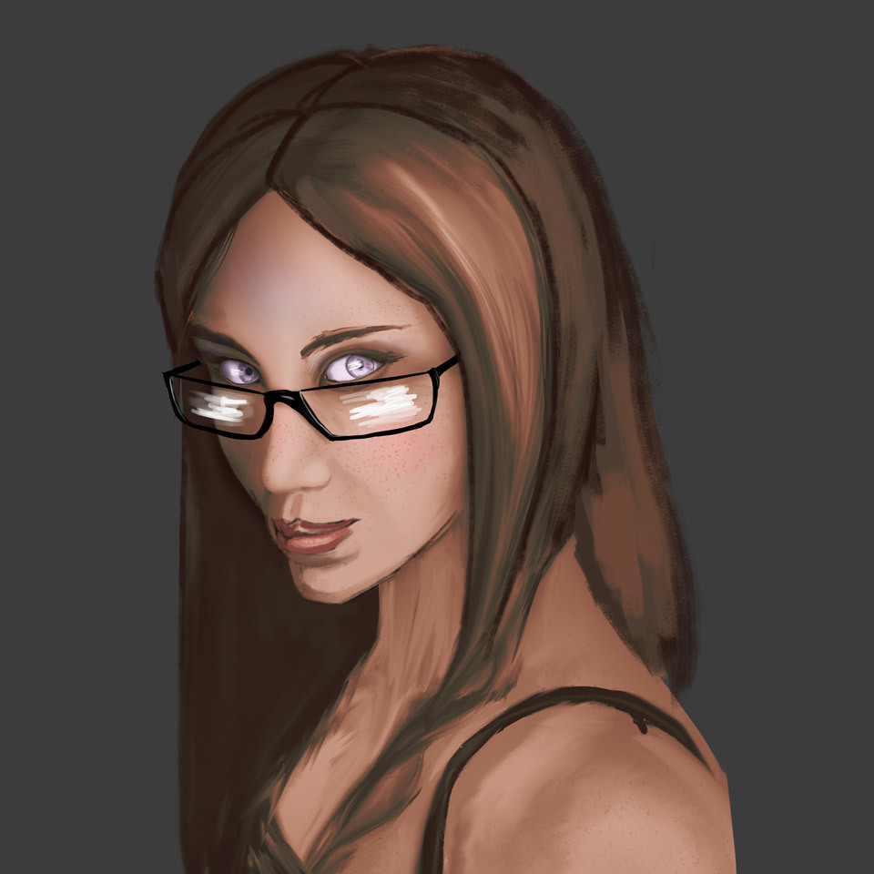
Nice portrait! Love the purple eyes  I mostly don't really mind the colors actually. Not everything needs to be made of crazy colors.
Beyond the glasses, which were already mentionned, I think that the mouth area and the hair are the only area that bother me a little. For the mouth, normally the upper lip should overlap on top of the lower one. On yours it seems like the lower lip is sticking out forward. I think it helps to properly draw it thinking of the mouth area as a partial sphere, where the mouth and lips wrap around (if that make sense) Also, I think she could use more chin  Maybe just moving the mouth up a little could help with that.
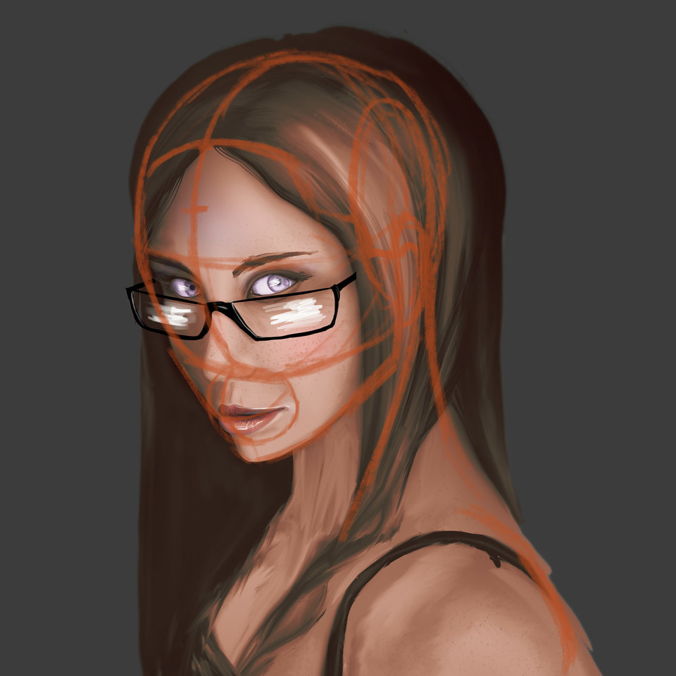


As for the hair, I think it's mostly that they seem too thick on the right side considering where her skull should be. So she just needs to lose some thickness there and I think it would be fine.

Sorry for spamming with a lot of images, but I wasn't sure how to explain without them. It's not perfect, but hope this helps you!


 )
)


