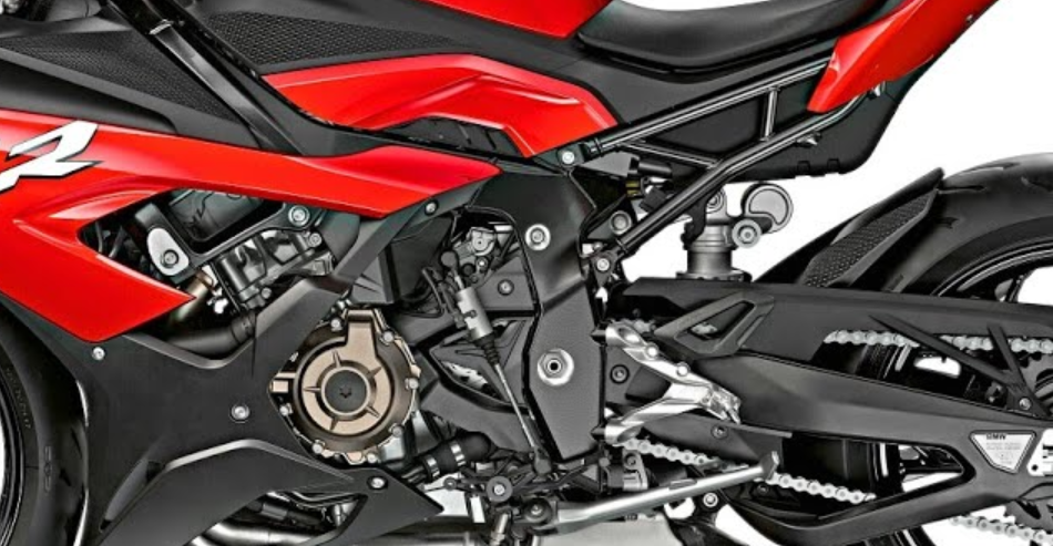
I suppose I'm winging it - this does not look like any design I've ever done on engineering CAD software 
In all likelihood, engineering has exposed me to looking at a lot of mechanical details, but you could say the same if I were a car mechanic or an elevator repairman. If you start a pinterest board and fill it with modern "superbike" motorcycle parts, you'll be able to emulate the repeating patterns, machining features, material changes, and interesting shapes you see. Reference is key once again!

Look at this. It's a modern motorcyle - it looks like noise to my untrained eyes, but it's the look of perfectly integrated parts that I want to capture for sci-fi machinery. There's no way I would remember this from memory, either.
Notice how there are no right angles, there's a lot of "empty space" to contrast the super high density areas, and how certain features come back everywhere:
1 - the various circular bolt heads against a black background peppered everywhere
2 - most corners and angles are either very wide, or if they're narrow they're all about 30 degrees and rounded
3 - there is a flow and overlap to the parts that suggests movement and keeps the eye busy, and a preferred line angle that is about 10 degrees above and below horizontal.
The shape language here is smooth polygons contrasted by smaller, round features. A different manufacturer would have a different approach, but you must make such decisions on your own designs to keep them looking consistent, i.e. designed by a single entity.

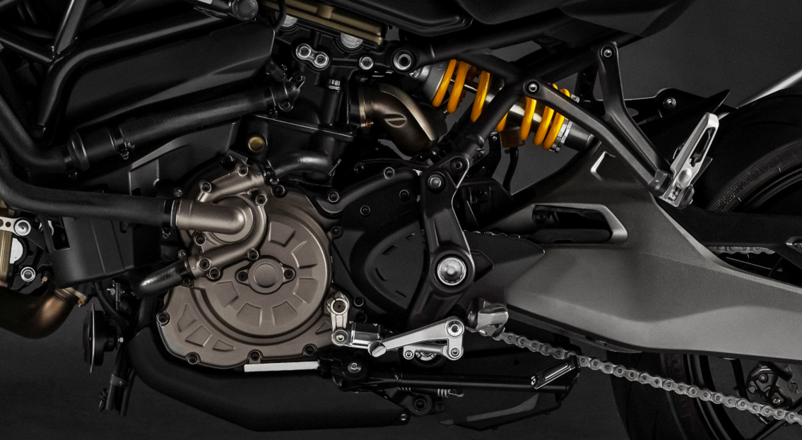
Another example, with a different set of features and a curvier set of lines, along with spokes on certain large round shapes.