For me, none of the stores around me do this either they have them available to buy in some stores but not for you to try out unless its an iPad or something similar
Which screen tablet are you using now?
I am between a Kamvas Pro 16 (4K) , Kamvas Pro 24 (4K), or possibly going all out on the Wacam MobileStudio Pro to completely replace my Surface.
It's unfortunate not being able to experience what it is like to use these firsthand, it's a lot of money for an unknown difference.
Term 1 - Photoshop For Digital Illustration - Assignment 3 - Combining Images

I wasn't very passionate about the "dream house/castle" idea... so I went a different direction with it while still being about "combining images".
Choosing artwork with varying art styles and different lighting directions made it so I had to do a bit more than just image adjustments and spot healing. I had to repaint lighting on the bike and the girl to fit them into the scene better.
The final result isn't perfect (why did I leave the birds in the sky while it's raining? where are the clouds? lol) but if you don't pay too close attention to it, it looks pretty neat.
I really want to skip these basic photoshop things (I have used these tools before) and get to anatomy and gesture... but I am trying to be diligent about the class. I paid for all of it, after all.
I am using a Huion Kamvas 22 plus, but if you want to 4k go for it. I don't really see it as much as a difference it's fundamentally the same experience but its a change of how the screen feels to draw on imo as well as color accuracy. I would go for something based on desk size I made mine fit because I have a very large desk so think about the space that you have to spare. I also feel like you could the same or a better experience with a Huoin or XP-Pen in terms of quality compared to a Wacom(price wise), but I would go for an external display tablet so that if one thing breaks in the tablet you don't have to throw away or fix a whole computer. try watching reviews on each one you are thinking about before buying to get a sense of how they are.
I know you brought the full course but If you want to get to anatomy and gesture you don't have to go in order or watch all of the videos in the program. You can skip to where you want to go and come back to the earlier terms or lessons if you need to polish up on your fundamentals that's what the course is built for. It also can work as building fundamentals until you get to the stuff like anatomy and color slowly so that you have a solid base which makes the rest of the later stuff easier to grasp. I would still recommend watching the relevant videos though just to see if you can get any tips or pointers from them. I spent a day or two on the skeleton exercise in term 1 because I was used to drawing forms in 3d somewhat, so if you know things already you can skip those if you want to get to the stuff you don't know yet. Its your course you brought with your money use it how you want
Term 1 - Photoshop For Digital Production - Assignment 4 - Selections, Liquify, and Heal Stamp


For the last two exercises I tried going the opposite direction of what was shown in the demonstration video, making the older picture look younger and trying to make the girl have the proportions of the alien (nightmare fuel!)
Term 1 - Nude Figure Drawing - Practice
Drawing Skeletons over photos.

Term 1 - Nude Figure Drawing - Practice
Proportions
 .
.
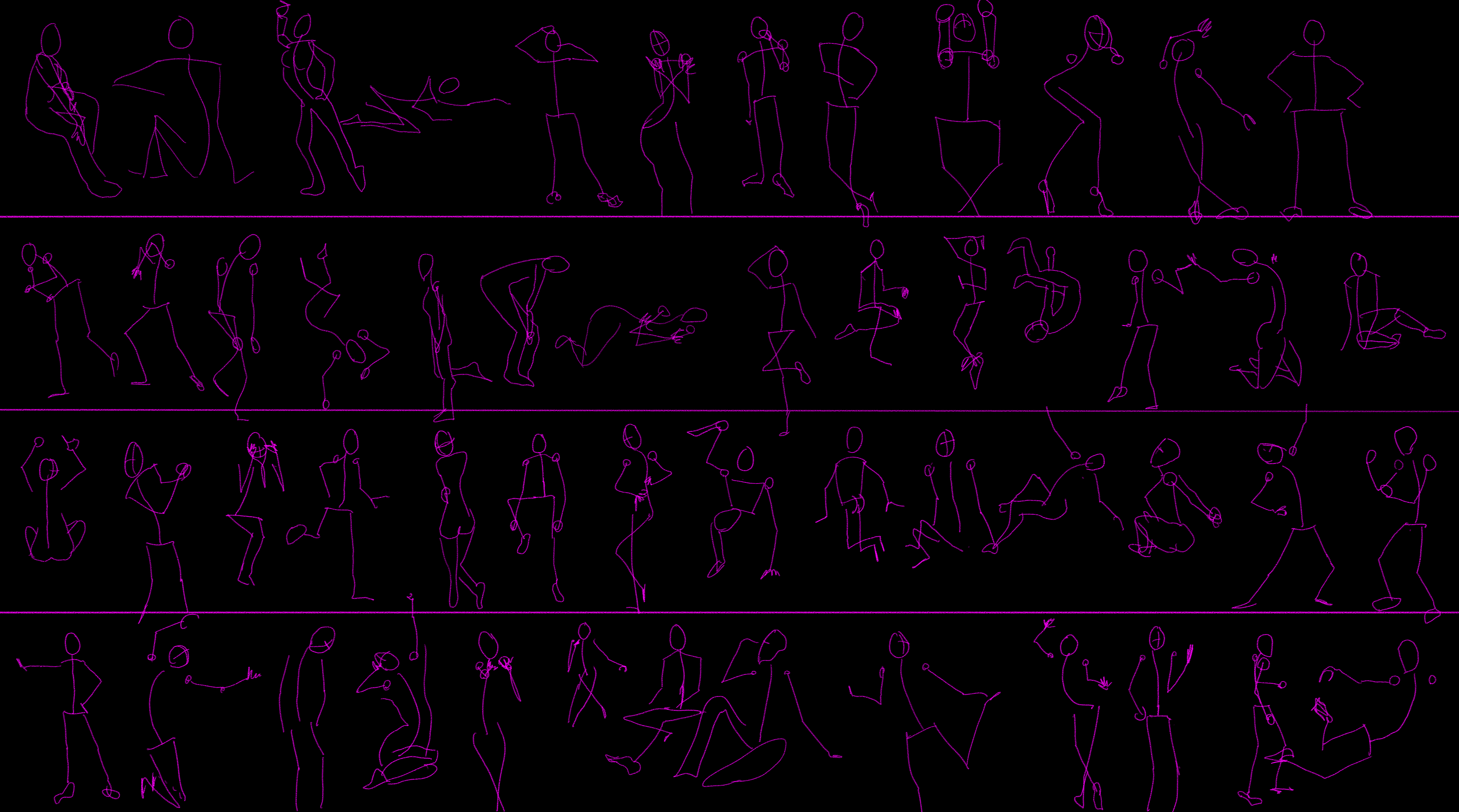
Term 1 - Nude Figure Drawing - Practice
30 Second Gesture

This exercise was infuriating 
I had to restart a few times at the beginning because I'd have less than half the figure represented by the time the time was up. I could easily spend 30 seconds analyzing the pose before even beginning to draw...
Many of the poses were beautiful, it was crushing for the image to flip to the next one while I just had a mis-proportioned stick figure on paper, leaving all the beauty behind.
I do not feel that the majority of these sketches represent the pose/gesture very well. Clearly I have a lot of opportunity in this area to get better.
I will likely do another 30-second session before trying the 60 second. If I were to do 60 now I don't think I will have cemented the lesson that I REALLY need to observe, abstract, and sketch much more quickly than I am used to.
Term 1 - Nude Figure Drawing - Practice
More 30 Second Gesture
60 Second Gesture
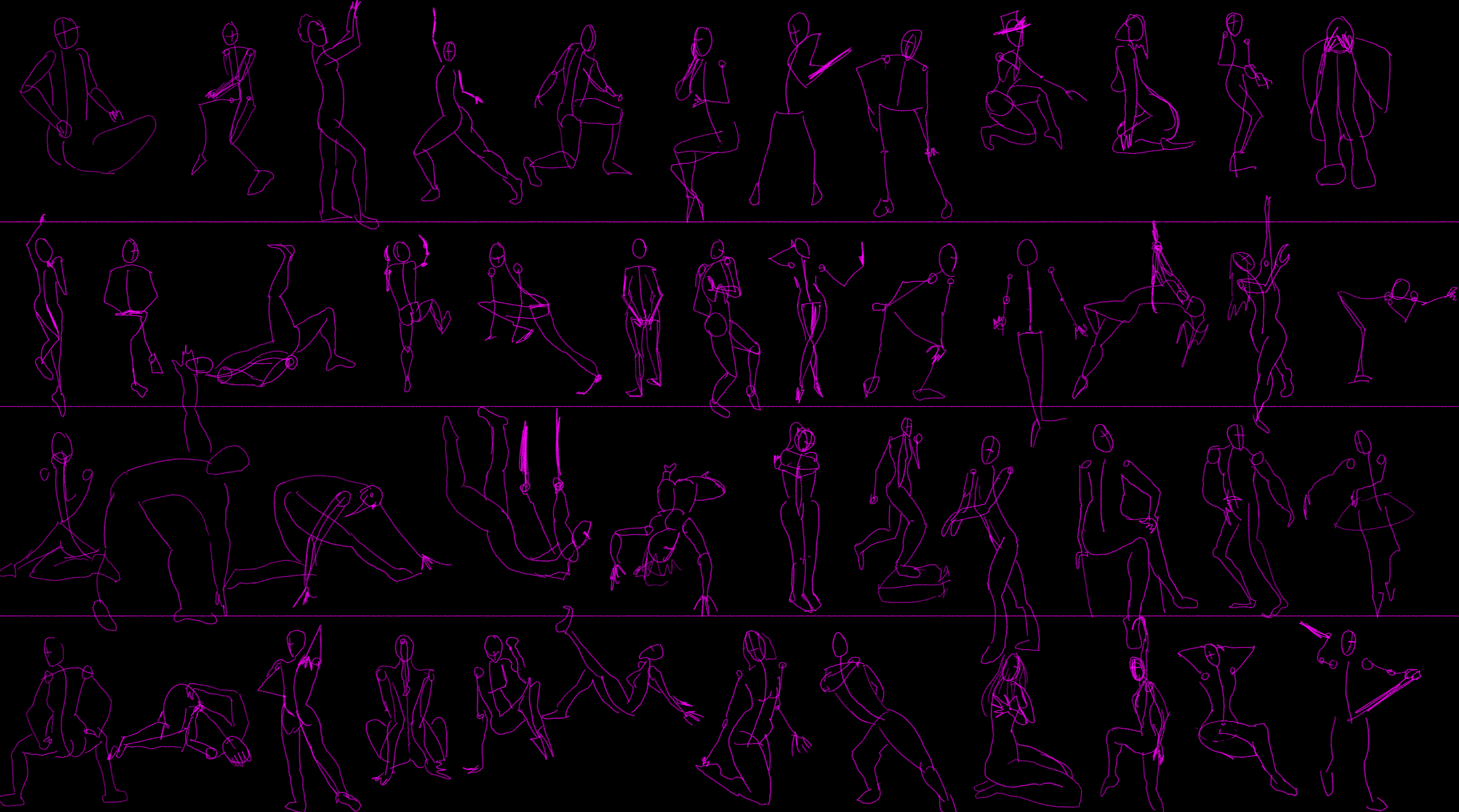
I still don't like 30 second gesture 
A stick figure for me is not enough to represent which limbs are in front/behind to be able to be sure of the pose being represented.
With the 60 second sketches I sometimes had the time to outline a volume instead of a line, which helps show front/behind and perspective.
I still think I am very focused on basic construction... my understanding is gesture supposed to capture flow and energy. I am just not there yet. Plus many of the poses that I have used look relatively static with little energy in them (though I suppose I could exaggerate the pose to try to fabricate energy).
I see plenty of opportunity here: proportions, balance of the pose, and grounding are all areas that could use improvement. More practice required.

Term 1 - Nude Figure Drawing - Figure from Reference
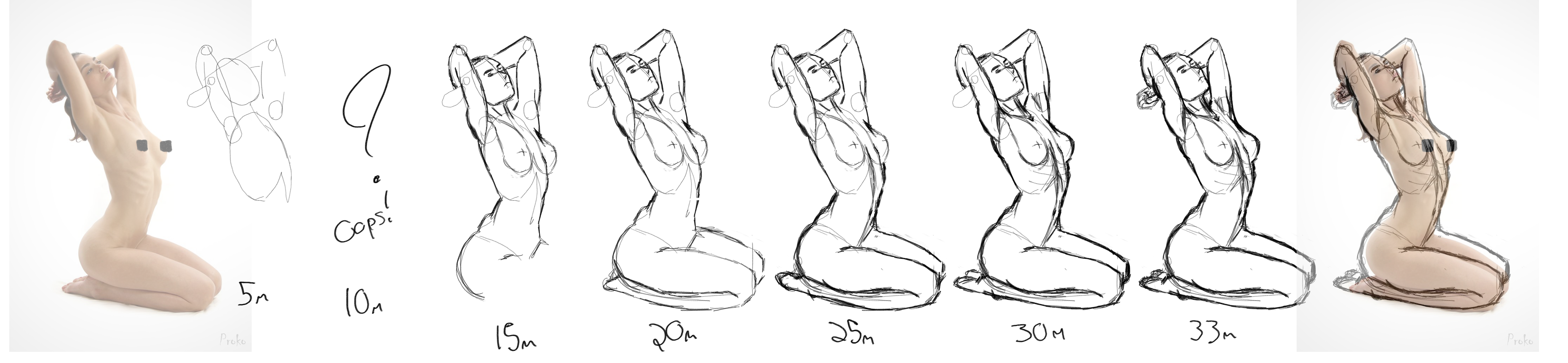
For this first reference drawing of this journey, I wanted to snapshot every 5 minutes of the drawing to show how I progress through the sketch. I am hoping I can get faster at getting to a point equivalent to my current 20 minute mark.
The final result looks pretty good to me, despite being a bit different from the reference in a few places. The main thing that I see that I would rather be closer to the original is the thickness of both arms, the closer arm should be a bit bigger and the further arm a bit smaller to really sell the perspective/depth.
If it helps you do a basic skeleton like you start with the line of action and then place your ribcage and pelvis circles and then connect your arm and legs. That's what I did for my first time doing 30 second gesture and most of the 30 second gesture is there to get your brain to focus on the important parts of the pose and exclude the details so that you can do the same thing for say 1 min. or 2 min. gesture. I think your poses look fine, but if you want more people to see it and give feedback I would join the discord if you haven't already a lot more people are active on there during the day.
Oooh you did really great on this drawing! I think you really nailed the overall shape and volumes!
For the 30 sec gesture drawings a tip: for me a thicker brush / pen worked better, it gave me more freedom and lightness. (But keep whatever works for you  )
)
2 years later
Thats a cool chibi Susi chasing Feng
pretty good job so far ! keep it up n__n
Suggested Topics
| Topic | Category | Replies | Views | Activity |
|---|---|---|---|---|
| Shimoe - Art School Journey | Art School | 1 | 108 | Feb 4 |
| ScareCrowMoth - Art School Journey | Art School | 4 | 344 | Oct '24 |
| Jons Art Progress Blog | Art School | 27 | 5.5k | Jun '21 |
| Andrumations - artschool journey | Art School | 5 | 618 | Apr '23 |
| Cedric’s - Art School Journey | Art School | 4 | 798 | Feb '23 |