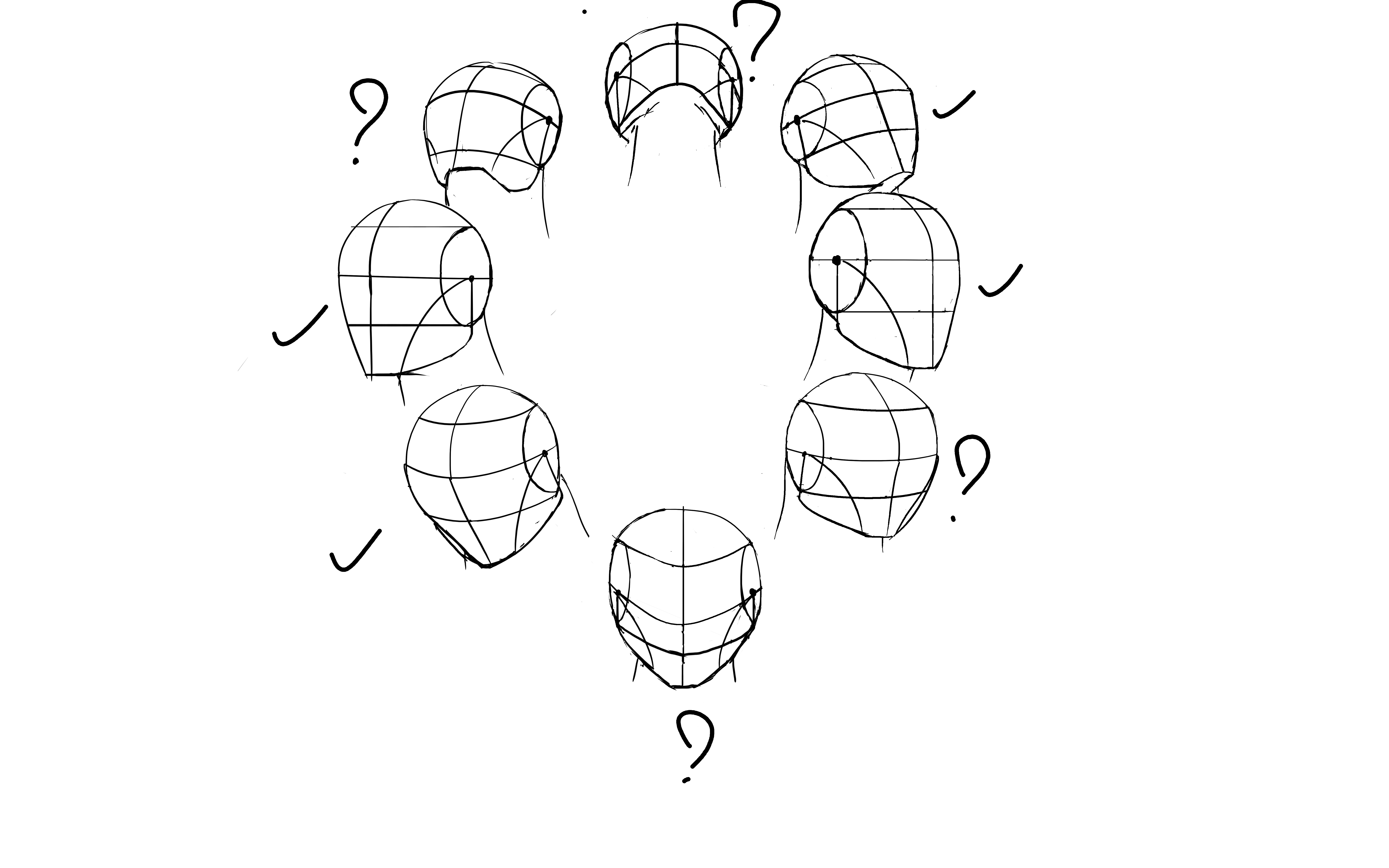
Hello everyone :smile:

Lately i tryed to do assignments 1 and 3 of Term 2 Photoshop,
but nothing i may do pleased me, so i just move on Anatomy assigments, and returning later on.


Pretty cool, now i see my lineart need to be more worked,
i also have doubt on every faces with a "?", i don't know if i'm on the right way to make them in those axes and more on last faces up and down.

tomorrow i'm going to fix it and do some face parts.

thx for any feedbacks, they are welcome :grin:

Hey there!

Immediately I think there's a lot of work to be done in terms of shading on the examples you posted above. Shading is directional and strongly associated with planes of a surface - the way you shaded the cylinders and volumes above is very arbitrary and does not follow proper light/shadow behavior in real objects.

I recommend you do a lot of observation of simple geometric volumes to understand how light is affected by changing planes, THEN move on to trying to cast shadows and interactions between several forms.

It's alright to use references when making these, too!

Thanks !
i've not thinked about references, my bad :sweat:

9 days later

Hello there,

i've worked on face parts, and in particular on nozes

I realy like Dishonored desing, facial features are pretty exaggerated, cool thing for learning,
i think i finded a good process (3rd try) but if you have any advices, there are welcome :grinning:

thanks in advance

18 days later

Hello there,
I've not post here since a long time, i still working on the face, no one of my full face results please me, so i continue to try

here an little assembly of my works on ears and my first try on lips

8 days later

Hi everyone,

I finally have good results on my face assigment,

the 1st model is a full copy of Marc one, but for the 2nd i used random ref, exept the shading, it's the same than 1st model

now it go on my weekly prog, and work on regularly

I think you did great on the copying of the top head. The bottom one has a slight issue of the facial features being placed off the structure of the head itself. Very slight rotation of the face helps. Maybe something like this?

1 month later

Hello everyone,

I don't post regularly recently, and between, freetime week, restart the assigment and Christmas (I hope you had good holidays), time flies fast,
but there i am, working on perspective -2- assignment

whene i strated this assignment i already knew it's something from warcraft i wanted to make, so i strated to draw the wall between Sinfall and the rest of Revendreth from World of Warcraft Shadowlands, but i quickly feel i took no pleasur to do it,
and finally i saw the work of Vonschlippe on Blackrock mountain door, his work on and the rock all around the door, gave me the want to make the Iron Forge main door,

so i'v make this screen for reference

and here i am

tommorow i'm going to work on the rock, i never do something like this,
it's gonna be a discovery for me, and after add some snow and props :smile:

Hi xefline,

Some of the perspective is a little bit off on your gate, it's especially noticeable with the decorative things on either side of the anvil insignia since they don't line up with each other.

If you are using photoshop I'd recommend setting up a simple perspective grid(if you haven't already) or doing your rough sketch on a smaller scale so you can fit the vanishing points onto the canvas before up-scaling the image and doing your final line work. If you are using clip studio it has a built in perspective rulers/grids which is really handy for stuff like this.

22 days later

Hello and Happy new year !
I finished my assignment today

i took pleasure to work on it, but idk, something bothers me, lineart, composition, work on rocks... i will ask to Mark advices in the next livestream, i should have answers at my questions.

Hey Xefline,

This turned out really great! There are still a couple of perspective issues and I think that is probably what is bothering you. The stairs and the interior of the keep seem to have a totally different perspective than the exterior. The steps should be following the same perspective as the other major horizontal lines going down towards the vanishing point on the lower right side. The inside of the keep is also implying that the horizon line is somewhere in the middle of the canvas since we can see the floor on top of the steps as though we were looking down at it while the rest of the image implies that the horizon is somewhere below the bottom of the canvas.

I don't really know if i'm explaining this very well so I made a little diagram that will hopefully do a better job.

I hope this helps and makes some amount of sense...

Hey hyoi,

Thank you very much for the explanations, it took me some time, but i understand and i'm working on now

I've took lines on my ref and find the problem, the horizon line is not at the right place,

So i've transposed approximately the horizon, make new lines, and use perspective tool to correct a big part in one time,
after that, i select the interior and rescale it, so that the top of the stairs is not visible, and "give more sens" to the perspective.
Now i need to review some lines in the bottom of the canvas, apply manual corrections,
and finally it should be good :smile:

Hey,

i've normaly fixed all my lines :grinning: