Hello my name is Ahmad Jammoul , i am currently an architecture student aspiring to enter the concept art world .
Email: Ahmad.Jammoul.321@gmail.com
Instagram : https://www.instagram.com/ahmadjmmoul/

This my first time participating in a competition ,i really like the theme of this year and i am personally on team water , because , water has a lot of personality to it ' gentle, calm ,turbulent..' and this something i aimed to reflect in my character Lian Min , Goddess of Life and Mercy ... i was inspired in my design by a number of elements, the main one being the half-moon beta fish, the reason is that i had a general idea of what my character would feel like, that is having lots of flowing fabric and a warm color palette , in contrast to the cold water , giving the piece some visual interest and a main focus.
i also wanted to give my main character a sidekick , so i searched for some mythical sea beasts , the kraken was fitting but i didn't want my character to be derivative of Illaoi ,so i went with a sea serpent that was equally as cool as the kraken , and of course i aimed to incorporate in its design the same design language as the goddess.
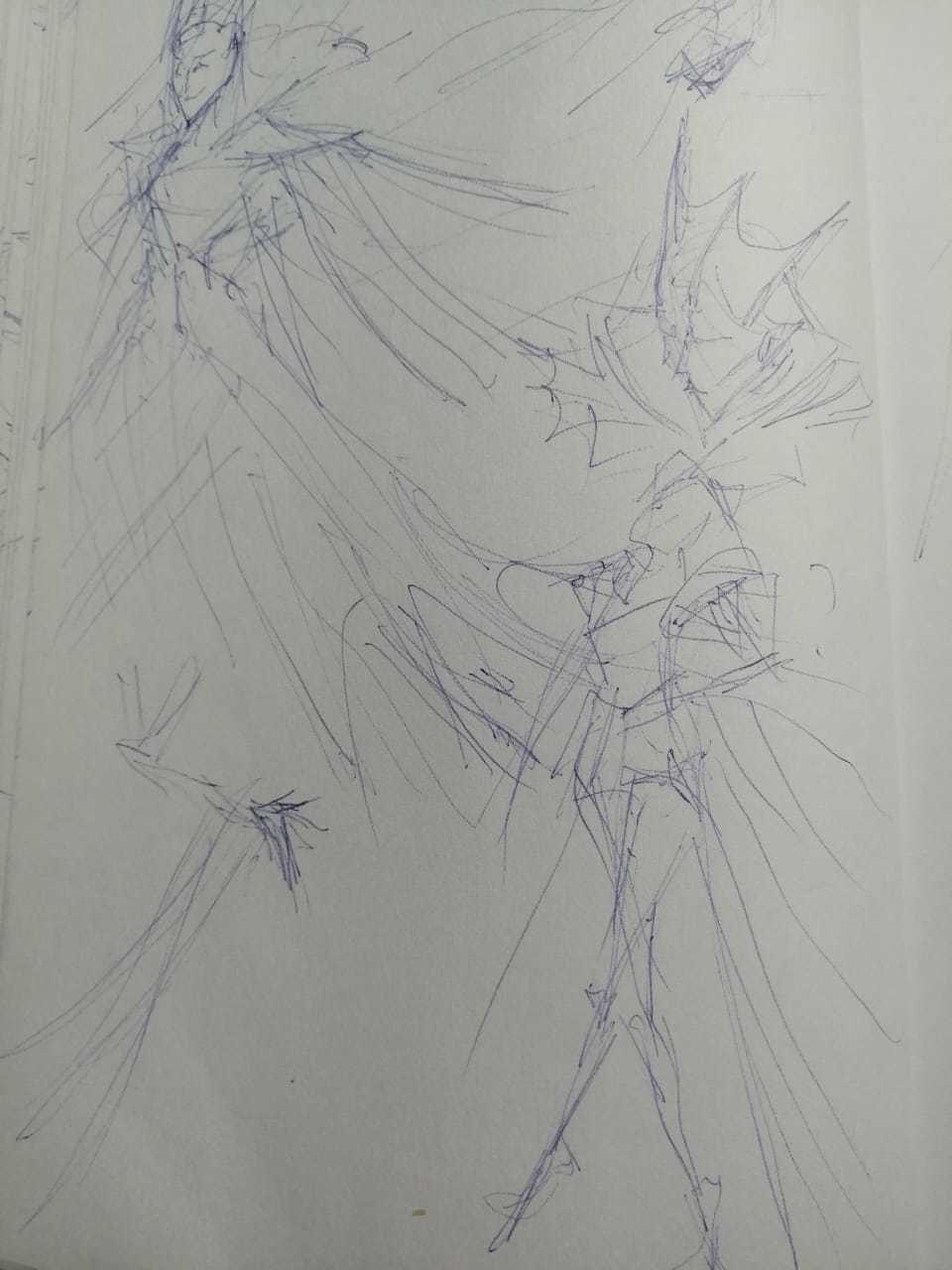
sketches

i usually like to start traditionally , btw these were done during a really really boring class

at the beginning of my design process i like to start by establishing the feel of a character and so this is why i like to begin with a general setup like an intimate moment between the goddess and her serpent friend , in a sens they can be considered as thumbnails

after knowing how my character is going to feel like i began designing iterations for outfits this step is more like brain storming , i am not trying to make it detailed or refined ,simply getting any idea out , i will later redo this step digitally..
however this is when i realized that i dont exactly know how to draw that complicated fabric ..oops!
A few studies later and these came out


here i was practicing the flow of fabric i know they're rough but i like to start losley

keeping the design of the half-moon beta fish in mind i experimented a bit with alterations of fabric ,skin and scales , only i was drifting towards a generic princess silhouette until this happend: Rapunzel
that's when i decided to take some different approaches like giving her some humanoid aspects and playing around with he personality to a slightly more mischievous character


although it would have been interesting to make her an evil queen i didn't feel like it fit the themes and references i was looking for , so returned to my original ideas and came up with this design

when had the general traits and aspects of my characters figured out , i went and scribbled some iterations for the final composition , i wanted to fit in as much as possible without loosing any details from the design

I like how you wrote about your thought process. I'd advise to keep it simple, you can get really powerful compositions that way.

thanks man i appreciate it , you see the problem of her being a goddess forces her to be at the center of the composition and not doing some very organic and complex gesture otherwise she'd loose some of her grace and divinity ... i will soon upload my iterations when i start the digital phase and i would love to hear your opinions. :smile:

it's been a busy week but i managed to finally start working digitally .
i tried the different iterations i had planed on paper , ive decided to go with the final one ,cz it showed all the elements and the mood i wanted to incorporate , without them feeling too cramped together , it basically shows the goddess in the center , the giant snake in the wave behind her and a drowning fire demon in the foreground .
it is still loose but i would love to hear your opinions guys !

It's nice, central composition like this are great for this kind of character. The giant snake feel a lot more menacing this way so I think it's a cool progress :smiley:

so i was blocking some colors and playing around with the mood , and these two are the ones that i think reflect the theme best , i personally like the first one .
wich one do you prefer and why ?
also some pepole liked the vertical orientation in 5 more than the landscape , i wold love to hear what you think !

These are looking nice!! Personally the second one is my fav, I think that green highlight in the wave comes through a lot more! Can't wait to see how this turns out

13 days later

Sooo the last couple weeks were straight from hell ! way to many submissions at once and they just keep on coming .. the good thing is , all this time away gave me some distance from my painting ,this helped me realize all its weaknesses ,this happened when one time i was scrolling through Instagram and i saw the work of the amazing artist Peter Mohrbacher ,and i said to myself ,if this guys was to participate in this competition i would have absolutely no chance of wining cz he is on a whole different league ! However , instead of being discouraged , i saw it as an opportunity to study his work and step outside of my comfort zone , and this are the results


i know they are very rough i was just figuring out the composition and colors that i was goining to use
i decided to go with 2

Quick update on this week's progress ...welllll nothing really changed cz for the last few weeks we were bombarded with submissions and finals ,we haven't finished still , and im looking at the submissions and i see that im waaay behind , at this rate im not sure ill even finish in time!! i still have about 2 days though , so wish me luck !