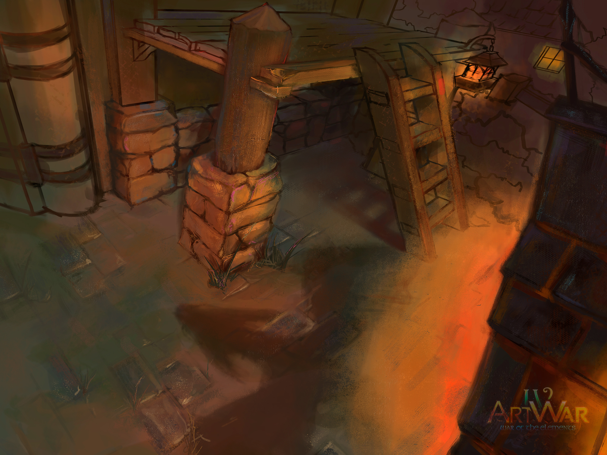
Yo! Thanks! By the way, the reason why the perspective feels so weird is probably because of the 3 point perspective, where the Y point is located beneath the character. Thanks to that, there are some areas, like the legs of the platform that look a bit deformed. Do you think I should let my eye to the work here, or should I keep everything fixed to the perspective?
3 point is a really difficult perspective to draw. And it's recommended you have each point far off on the horizon so you don't get warping, you have warping here. Here, I drew over your piece to show you what I mean, one of the inconsistencies was that if your perspective is below the character then the angles of your environment aren't reflecting that, and a lot of your furniture is on a different plane from each other as well
Here's also just an example of what I mean by having the vanishing points off to the side so far as well, with one and two points you can get away with having them relatively close but three point does get quite a bit more complex
Yeah xD And you have two weeks in any case! My main concern with your piece is that while the warping does distort the view of it a little, the girl also is not on the same plane as the environment. I based my over sketch of your girl on the perspective she is in, so I modified the environment, you're going to have to distort your character a lot more to fit in the perspective you have currently! take it with a grain of salt though, and if you do want to work on the perspective so everything fits it's always better to do it in the early stages as it'll save you a lot of grief and wasted time later down the line when you actually come to fixing it 
Ahh you have such a beautiful variety of colours here, the greens and slatey blues in those stones are really stunning! I am a little confused with that arrow head shadow on the floor though, that must be a really strong light source - but that light isn't showing on the rest of the piece yet (aside the shadows from it, although the pedestal is missing it) Unless you just haven't painting that on yet and I'm impatient lol
Oh yeah, thats going to be tricky. 
I actually have a very good technique to add realistic lights to darker scenes and therefore drasticly changing the mood. The only things I need for that are some adjustment layers, some light rays made with point blur and lastly some ambient light.
But to use these, I'd first need to finish the overpainting which will happen in the upcoming days c:


