I am doing the same thing now since we only have a short time left and probably need to figure out how to display the character's abilities and strengths.

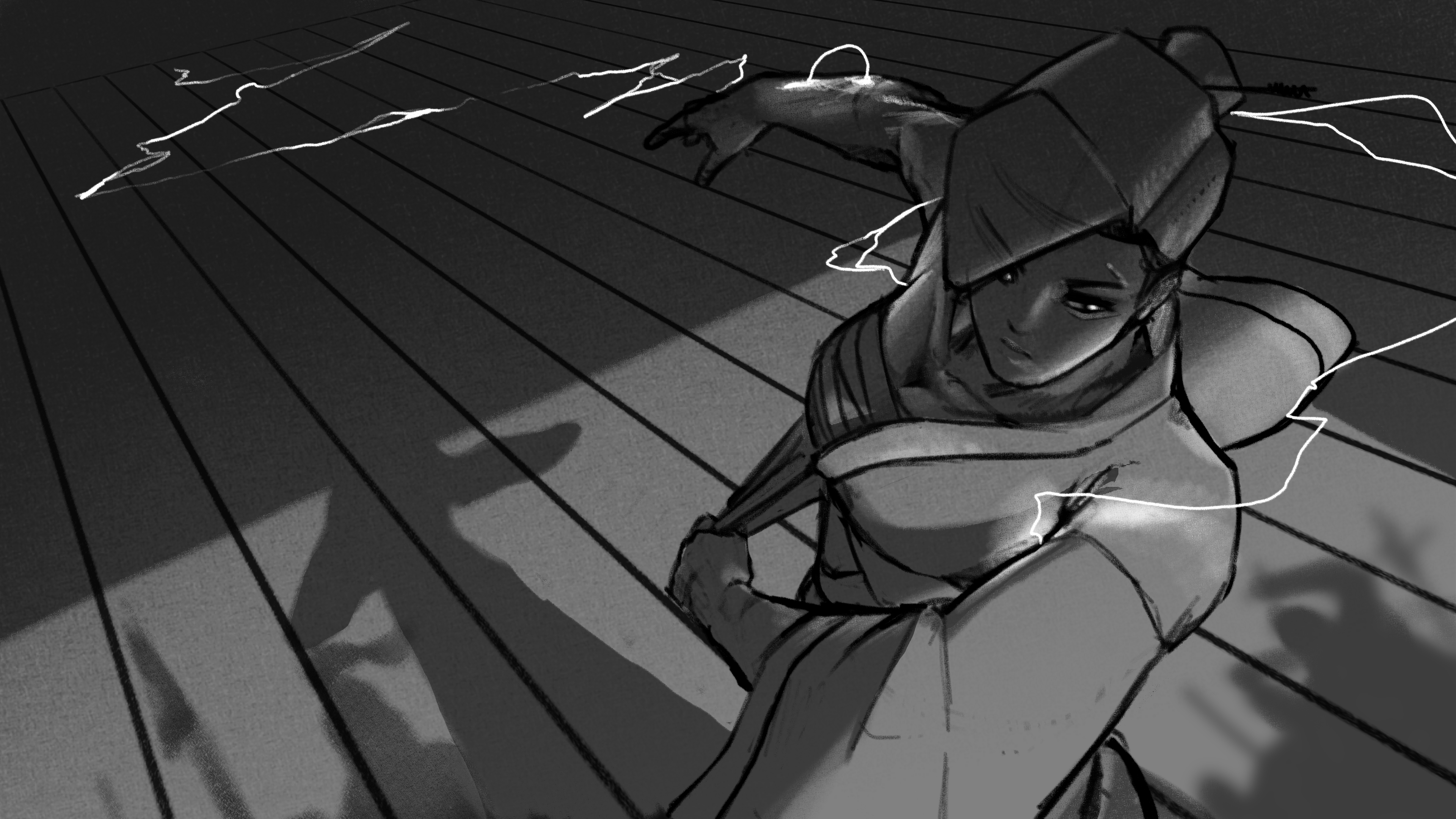
I like #4 because I think it kind of shows how strong she is like "Look at all the people she defeated with a few punches" or something like that. Like she has finished her mission but still needs to continue to the next level. At least that is what the composition tells me.

I still have a bit of lore I'd like to explore but yeah, that's kinda my problem : I take a lot of time to polish everything even these concept arts that are supposed to be kind of basic.

Yeah #4 kinda won in my mind. The more I think about these compositions, the more I realise that I'm just thinking about #4 :grin:

Another update before I work on that final illustration (even if, as I said above, I'd like to draw and write a bit of lore).

So I worked a bit on the outfit of Nariko. (First time in color, Yay!).

As you can see I was inspired by the japanese thunder divinity : Raijin (as Narijo is the thunder child :smirk: ).
But it wasn't really supposed to be SO inspired in fact. At first I just wanted to represent his sash/scarf around his shoulders as an electric arc going around Nariko's shoulders as she prepares to fight.

But as I was looking for some references of him to remember how it actually looked I found out that the color palette I used for Nariko was almost the same as Raijin's :grimacing:

I intended to try a bit more colors combination but I think this is fate :stuck_out_tongue_winking_eye:

You’ve got a pretty cool design :smiley: as for the composition, I think that the low angle on 3 is great, but I also like how dynamic 4 came out. Have you thought of what setting you’ll draw your character in? I’ll be looking forward to see how this one develops!

Mmmh, I was thinking (based on composition #4) maybe Nariko in a (her ?) dojo. Being attacked, and stepping outside to teach a lesson to those water, earth and fire champions who dared disturb her meditation and training :smirk: .

Little update, I've finally started to work on the final illustration.
I didn't have too much time today so that's just where I am for now. I also started to write a little bit of the lore. I'll post it as soon as I finish it !

Decided to change the light and the shadows because the way it was placed would have mean that she'd be facing the wall while the entrance as well as the ennemies would have been (too far) on her right...

Nice lighting! I also really like the effect you have with the lightning. I think you should do some really cool composition stuff using that lightning in the background if you aren't already set on your current layout. Its basically a free pass to make any shape you want back there

@dreamsequenz Dude. Avatar was sooo good (I miss it).
I see the resemblance to Azula (I hated her, but kinda liked her. That's a strange feeling :grimacing: ) !

@danrob Thank you ! I see what you mean, I'm not that used to make illustrations with that much perspectives and composition-thinking but at least it's a training for me.
I'd like to keep the overall shape of the lightning right because there are elements I want to try adding. But I try to keep my layers organized in case I ever want to change anything at any time :grin: .

Update of the day.
I added the (water) soldiers I initialy drew on the composition sketch.
(Troubling an electric martial artist in her dojo was NOT a smart decision from the water soldiers)

I also started to work a little on the face and chest. A bit flat for now but we will see how it goes with the lightning lights later.

I think I'm done with Nariko for now !
I didn't want to paint to much details on her before putting down my colors but I got carried away.
So now, I want to do that, putting down my colors... And I guess that's where the masks come down : I am freaking scared when it comes to coloring an illustration.

It's one way or the other : Either I start painting with colors and I just can't do anything, OR I start with grayscale and I just don't know how to colorise it. :sweat:

When it come to illustration, I'm self-taught, whenever I have trouble on something I look for the possibles solutions on the web or in my book. But I can't figure that out... I feel like it's always by luck that I make a good coloring ! :joy:

So yeah. It's time to do some experiments I guess

Hi again ! Sooooo...
I've been trying to find a way to colorise it and I tried using the gradient maps.
I'm KINDA satified with it but having your opinion would be greatly appriciated :grin:
(I'm not sure about the skin color, since it's supposed to be in shadow, but at the same time, the lightning glow has to be taken into consideration. It's a pain...)

I also tweaked the perspective a little bit (for the head and the background).

I'm not that satisfied by the lightning going from her hand to the back. It's supposed to show her motion, from one ennemy to another but it makes things kinda messy. I also wanted the floor to reflect the lightning but it also makes the overall background messy...

I think the lightning should illuminate everything in the backround much more and maybe make the lightning streams a bit thicker to show more the concentration?

For the light in the background, I think so too. I will also try a few different ways to position the lightnings in the back ground maybe.

About the thickness of the lightning I initially liked it this way. I wanted it to look more like electric arcs, like, Nariko has all that energy mostly inside of her and I didn't want it to be too "over the top", because I want the whole character to be really, simple/sober, including the way her power looks.

But all of that just to say that the fact is : Yes, in the end, it's too thin :sweat_smile:

At least now I have a good base, I'll work on that now.
(But ugh... I really went outside of my comfort zone with this piece : with all these light sources and perspective :weary: )

That's great! Big fan of the warm palette you chose. I think that you could tweak the lighting on face a bit, because it feels too dark for the light setup... Lastly, I'm a huge fan of the light and dark contrast to the composition, but the fallen figures on the back ended up barely visible. It may be a bit too much, but how about moving one of them to be catching some light as well? I think it could be interesting composition wise.
Keep up the great work!

Look great so far! I agree with with the previous two comments about the lighting. so I don't need to add too much, but the figures in the back need to have some soft light on them.

Also, I guess this is just what I noticed, the room in general seems a bit dark for there to be such a bright light shining into the room? Maybe not enough ambient light or bounce light?

Lighting for me can be tricky as well, but I hope I was a bit helpful! I think the other two comments properly explained a lot better than me anyway XD

Really, really like this. I agree with the lighting advice you’ve already been given and as you’ve said I think thicker lightning would be the way to go. I’m looking forward to seeing you implement it! 😊

@vasge_ Thank you for the advices, I'll try moving the closest one a little
@clarief Thanks ! Indeed it looks dark, I wanted it this way at first, to have this strong contrast but, the more I look at it the more it bothers me now :laughing:
@HollyRose Thank you ! I'll work on that

And now, I guess I know what I have to start working on ! :muscle: