I think I'm done with Nariko for now !
I didn't want to paint to much details on her before putting down my colors but I got carried away.
So now, I want to do that, putting down my colors... And I guess that's where the masks come down : I am freaking scared when it comes to coloring an illustration.

It's one way or the other : Either I start painting with colors and I just can't do anything, OR I start with grayscale and I just don't know how to colorise it. :sweat:

When it come to illustration, I'm self-taught, whenever I have trouble on something I look for the possibles solutions on the web or in my book. But I can't figure that out... I feel like it's always by luck that I make a good coloring ! :joy:

So yeah. It's time to do some experiments I guess

Hi again ! Sooooo...
I've been trying to find a way to colorise it and I tried using the gradient maps.
I'm KINDA satified with it but having your opinion would be greatly appriciated :grin:
(I'm not sure about the skin color, since it's supposed to be in shadow, but at the same time, the lightning glow has to be taken into consideration. It's a pain...)

I also tweaked the perspective a little bit (for the head and the background).

I'm not that satisfied by the lightning going from her hand to the back. It's supposed to show her motion, from one ennemy to another but it makes things kinda messy. I also wanted the floor to reflect the lightning but it also makes the overall background messy...

I think the lightning should illuminate everything in the backround much more and maybe make the lightning streams a bit thicker to show more the concentration?

For the light in the background, I think so too. I will also try a few different ways to position the lightnings in the back ground maybe.

About the thickness of the lightning I initially liked it this way. I wanted it to look more like electric arcs, like, Nariko has all that energy mostly inside of her and I didn't want it to be too "over the top", because I want the whole character to be really, simple/sober, including the way her power looks.

But all of that just to say that the fact is : Yes, in the end, it's too thin :sweat_smile:

At least now I have a good base, I'll work on that now.
(But ugh... I really went outside of my comfort zone with this piece : with all these light sources and perspective :weary: )

That's great! Big fan of the warm palette you chose. I think that you could tweak the lighting on face a bit, because it feels too dark for the light setup... Lastly, I'm a huge fan of the light and dark contrast to the composition, but the fallen figures on the back ended up barely visible. It may be a bit too much, but how about moving one of them to be catching some light as well? I think it could be interesting composition wise.
Keep up the great work!

Look great so far! I agree with with the previous two comments about the lighting. so I don't need to add too much, but the figures in the back need to have some soft light on them.

Also, I guess this is just what I noticed, the room in general seems a bit dark for there to be such a bright light shining into the room? Maybe not enough ambient light or bounce light?

Lighting for me can be tricky as well, but I hope I was a bit helpful! I think the other two comments properly explained a lot better than me anyway XD

Really, really like this. I agree with the lighting advice you’ve already been given and as you’ve said I think thicker lightning would be the way to go. I’m looking forward to seeing you implement it! 😊

@vasge_ Thank you for the advices, I'll try moving the closest one a little
@clarief Thanks ! Indeed it looks dark, I wanted it this way at first, to have this strong contrast but, the more I look at it the more it bothers me now :laughing:
@HollyRose Thank you ! I'll work on that

And now, I guess I know what I have to start working on ! :muscle:

Alright! The deadline is coming but unfortunately, it's been hard to find time to work on it...
But I manage to work on these lightnings and light so here is the result.
What do you think?

But I was thinking... What if the guys in the background where actually midair... To show the speed of Nariko and add a little me dynamism? Like, she's so quick that they don't even have the time to touch the ground that she's already taking steps toward the next ennemies! I feel dumb to think about it only now... Crunch-time I guess :sweat:
At least I haven't gone to far in the details of the ennemies yet :sweat_smile:

The lightning reflection is a good idea. I think you could have some variation of dirty/clean spots on the floor. That way some areas have a clearer reflection and others fade/blur it. Also The lightning up close should be thicker than the lightning in the background to push that perspective. You are doing it a little bit but not enough in my opinion.

Keep it up. We only have a few more days left :smile:

Yeah the floor is far from finished, same goes for the wall in fact. :smile:
As for the lightnings I'm still struggling to make it visible enough but not too much because, as I said, I don't want it to be too over the top.

Update ! So I changed the changed the guys in the background :no_mouth:
I think that I spent too much time detailing them since these details will not be THAT visible after post-processing and all :grimacing:
Tomorrow I'm going to put the patterns on Nariko's kimono, and work a little on the background walls. After that ? Just some details, tweakings and post-processing, to add some movements and all.
I'm close (yet so far) to finally finishing it. I don't know if I'm happy with it, I guess I am , I think I've just stared at it for too long ^^

Sure she is different but her strength/muscle make me think of Makoto from Street fighter.
Really lots of details on the poor electrified guys !

No idea if someone pointed this out but the shadow on the floor, those on the front, seems off no ? (or just placeholders maybe for the moment ?)

By those on the front, do you mean the bottom left corner or the right corner ? If the right, would it be because I forgot to draw part of their shadow being projected on her kimono ?

Her shadow and the dudes closest to her shadows' were better lighter, you've taken away depth by darkening them although in the newest update the lightning across the floor is super appealing to look at, and you've painted the texture of the floor so well! The floor itself though could do with something to make it a little less perfect, the lines between the boards are so perfectly straight and unbroken, and it could benefit from having horizontal slats as well

Thank you!
Woops ! I didn't even notice these shadows were this dark :scream:
It must be an old layer I enabled by mistake (I failed at keeping them organized :grimacing:)

Now that you mention it, I think you are right about the floor being too perfect, I'll work on that

So, hello again.
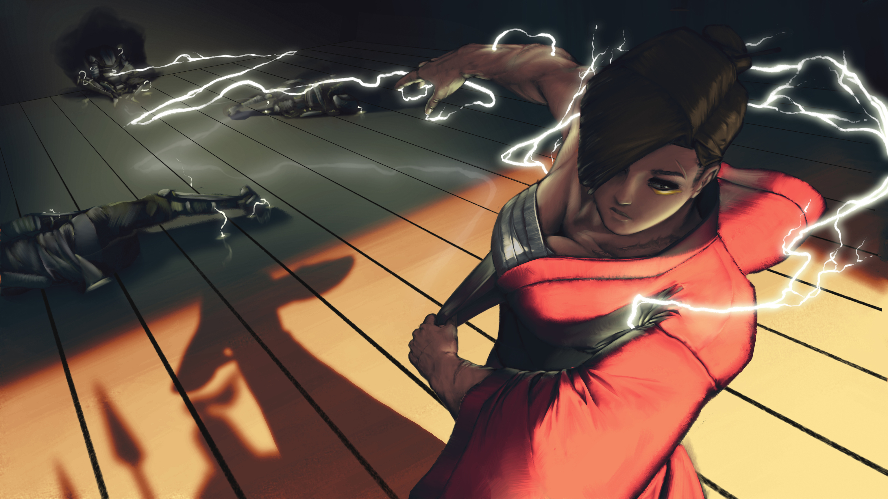
Here's what I've been doing today. As I planned yesterday, I worked on the walls and applied the cloud patterns on Nariko's kimono (That. Was. A. Pain. In. The. ***) I also tried to work on "unperfecting" the floor :grimacing:
(Please dont mind thoses orange dots in the lightning area, I juste painted as place holders and will make it look better later.)

There is still a lot I have and want to do : Putting the lightning emblem on her kimono around the shoulder, add some dust particles, light reflections around the hair, etc etc...

ALSO !

Before going even more in the details I wanted to check real quick what the final illustration could look like with some quick post-precessing. And I need an opinion on that ^^
Here are 2 versions of it.

So here's the thing I initially wanted to add motion blur and other to add a little more depth to the illustration. Thats's what I did here :

BUT I believe that, as I gain in depth, I lose in details, so I tried without the blur :

And I can't make a choice... What do you think ? I Think that, either way, I will keep the motion blur on the first 2 water soldiers to show the impact but I don't know about the rest of the scene...

Ahh this definitely looks a lot better! I'm really loving the shadows and reflective light on the boards in the back, and the extra details really does ground the piece. It looks fantastic! I quite like the motion blur but I think either work, maybe have the middle one crisp as he's sitting next to the wall and the other two blurred? But maybe with a little less blur though it's quite harsh.

Another thing I wanted to mention is that you have a powerful light source coming from the top right, but none of it is touching her head, yet the cast shadow from her head isn't reaching that cast at the back so it doesn't make sense her head is in shadow. Other than that though it's looking really good, the lightning is painted so nicely

Thank you ! I'm gonna try every options after I'm done painting the final details :grin:

As for the shadows, I'm not sure to understand what you mean exactly (I still have some trouble with english) but I scribbled something real quick to explain the way I casted the shadow.

I've always had troubles with lighting and shadows so I might have done something wrong here. :confused: