


I love all the colors lol! I can’t decide XD

 Thank you! I finally cleaned that up. Meanwhile started 3 more ..I have a habit of taking too long to finish a piece, then I lose interest in it and just start something else. I found 8 from recently i started and abandoned, that are decent enough to not delete, but not finished. There’s also been a number of drawings I felt I “outgrew” - became better before I finished them, and it would be easier to start from scratch than fix them. Anyone else thinking that?in24.5k
 Lady Death Fanart Collectible: Part 6 Polypaint and base Hi, it’s time to share with you another part of the process to create this fanart piece. Polypaint As this is my first collectible fanart I didn’t have previous experience with polypaint so I tried my best and played a bit with it.I wanted to give a ghostly and eerie look to Lady Death, she is beautiful and deadly, but at the end of the day she is a woman that died and was reborn at hell as an avenging spirit, that’s why I gave her skin tone a bluish very cold tone.As you will see I gave myself some creative freedom to deviate from the traditional color scheme that this characater has in comics and illustrations.To add a bit of sensuality by painting some freckles on the face and the chest. The dark nature of this character was the perfect excuse to gave her a kind of goth make up, very dark shadows around the eyes, blue lips and fingernails. I know that the original character includes sexy red lips but I wanted this girl to have a sexy but at the same time creepy look, that’s why we can see some thin veins emanating from her eyes. The biggest chromatic change I did for this character is at the hair. Lady Death has a characteristic white weavy hair but in my fanart I decided to gave her a very saturated blue color.The reason behind this wasn’t only an aesthetic choice. I want that the face area strongly pulls the attention of the viewer so this area needed a stronger contrast. Another reason is that I want her to have a more modern look, as I mentioned before, I’m strongly attracted to women with goth/punk look. I gave myself half an hour or more to analyse the work of experienced sculptors that create collectibles and I discovered that the use of darker values on the skin is often applied to create a greater sense of volume and three-dimensionality. I found that areas with heavy ambient occlusion are the perfect places to paint with darker colors in order to increase the separation between different forms. Even though she has a bluish skin tone, I used a bit of warmer hues in areas that, in real life, tend to go towards red and pink, this is very obvious in the nose, cheeks, and knuckles. Thinking with a logical mind it’s completely absurd to have warmer tones on the body of a zombie like creature but I didn’t want to limit myself by using only blue tones, it looks boring and artificial. In real life these colors are created by blood vessels in areas where the skin is very thin. ** Scythe **for her weapon I applied a cool gray with some warmer variations, this color scheme is influenced by the work of H.R giger. Base I’d like to talk about the design for the base which, to be honest, I forgot to develop along with the character.My main idea with the base is to show that Lady Death inhabits a very sterile and arid land, at the end of the day she is at hell.You can see a that she walks over dirt and rocks, a sign that she’s surrounded by death and loneliness. As part of the landscape we can see some bones and skulls to reinforce the idea of lack of living creatures, yet we can see three hands that try to reach her legs.This hands represent that all creatures are subordinated to her power and seek an evil blessing with a simple touch of the princess of the damned.1- The hand with skin burns represents the souls of those who are newcomers to hell, tortured souls that suffer for the sins comitted on earth.2- The hand with greenish rotten skin and pustules is the reminder of the decay that has infected the souls of those who have been trapped and have forgotten their humanity3- Last but not least, the hand of a demon shows that even dark creatures and entities bow before her presence. The cherry on the top, at least in my vision, are the simese twins that emerge from the ground, this malevolent creatures remind us that in hell there’s only perversion and any trace of innocence is lost. Thanks for reading till this pointI’m really happy to be very close to finish this creative journey, last but not least it’s mandatory to talk about splitting the sculpture in several pieces to be printed, this will be my last entry before showing the final rendered images. See yaMay Zbrush be with youin1.5k

 memory 2min gartic phone, used ref 2m gartic, used ref for pose 2min gartic 2min gartic 2min gartic 2min gartic memory memory memory memory study memory memory memorymemory memory memory memory memory memory study memorystudy study stylized left memory, right study study memory memorymemory memory memory memorymemory memory, porportions r offmemory memorystudystudy memorymemorymemory memory memory memory memory memory memory memory, right leg is a bit broken The feeling of only getting 1 - 3 likes on a social media post will never not be discouraging. But nothing is discouraging enough to make me quit drawing. I think the strategy of drawing a lot of stuff and waiting a while to post is good though rather than posting it immediately and then feeling that sadness on the next set of drawingin

 studies studies juri study imagination, how I feel before a speech imagination imagination study something I drew for my presentation also drew this for my presentation, didn't fix the one hand being bigger than the other imagination + study study studies study study, I need to fix the face a bit based on screenshot from anime but in my style study. except for the eye study studies studies study. changed some things tho imagination imagination imagination study studies, except top right samurai based on anime screenshot wolverine studies, changed some of the poses a lil, not very good at all, but first time i drew the character ever. semi study studies study imagination imagination imagination , for first time ever i tried to draw over 3d model for middle pose, I dont like the result tbh, but it makes it much easier than coming up with it from memory.imagination, except right figurestudies imagination + studies, coming up with action poses r hard, these are not dynamic enough, I will redraw better ones in future. imagination , imagination imagination study, except for eye imagination imagination imagination doodles except for the two chrollos imagination storyboard thumbnail, idk if i ever shared this. my storyboards end up being a little detailed since i usually just draw in one layer.in22.4k

 Hello! My name is Vithor, I am from Brazil, studied Design at a local college worked as an illustrator for more than 10 years. I took a time off around 3 years ago and am trying to get back in my art shape and maybe become professional again. Here are some recent pictures: You can find timelapses for most of them on my instagram: www.instagram.com Vithor Albertim (@vithor_albertim) • Instagram photos and videos 123 Followers, 638 Following, 19 Posts - See Instagram photos and videos from Vithor Albertim (@vithor_albertim) Comments and critiques are always welcome.Cheers!in813

 Thank you @daceronine! If I remember I save in google cloud, I will have to stick a note to do it more often. Lamp is from life. Poses are from refs but I look at refs for a while and then try to do it myself and look it up if needed. Outfits and rest is from imagination Something went wrong while installing system so we will have to wipe everything again... pc works but something is wrong. We will wait till internet is done and I will save everything on cloud this time Threads came out in eu. It's been 3 days and I had more engagement than after half a year on instagram. It feels really nice I hope it stays this way A portrait of old dude. It's the same character I posted a while ago. Inspired by Bayard Wu work. At first I thought of him as a bear but I named him Fenrir and I think wolf suits him better. Eye gave me a bit of hard time but I think it is fine now. I focused on face and forgot about area below. The way I draw hair clashes with greying hair. I had the same problem while doing Lohse's white hair. Does it looks like it is greying here? I love how desaturated red looks blue there. I keep lying to myself that I will use different color scheme but It all comes down to this blue and yellowish one it is just flipped this time Have a great day!in49.1k
Yeah that was my problem too, but I had to make a choice (even if it still can be changed as things progress) 
Little update. I decided to take a small break from the whole charadesign of Nariko to put on "paper" some compositions I had in mind for the final illustration.

Initially, composition #3 was the one that came to me as soon as I started working on the contest. I think the low-angle perspective shows the power and stature of the character.
I still love it but I know that I'll have some problems working in this perspective... Especially with the face 
In the meantime, #4 started to really grow on me.
Sooooo... I'm a bit lost. What's your opinion about it ?
I am doing the same thing now since we only have a short time left and probably need to figure out how to display the character's abilities and strengths.
I like #4 because I think it kind of shows how strong she is like "Look at all the people she defeated with a few punches" or something like that. Like she has finished her mission but still needs to continue to the next level. At least that is what the composition tells me.
I still have a bit of lore I'd like to explore but yeah, that's kinda my problem : I take a lot of time to polish everything even these concept arts that are supposed to be kind of basic.
Yeah #4 kinda won in my mind. The more I think about these compositions, the more I realise that I'm just thinking about #4 
Another update before I work on that final illustration (even if, as I said above, I'd like to draw and write a bit of lore).

So I worked a bit on the outfit of Nariko. (First time in color, Yay!).
As you can see I was inspired by the japanese thunder divinity : Raijin (as Narijo is the thunder child  ).
).
But it wasn't really supposed to be SO inspired in fact. At first I just wanted to represent his sash/scarf around his shoulders as an electric arc going around Nariko's shoulders as she prepares to fight.
But as I was looking for some references of him to remember how it actually looked I found out that the color palette I used for Nariko was almost the same as Raijin's 
I intended to try a bit more colors combination but I think this is fate 
 as for the composition, I think that the low angle on 3 is great, but I also like how dynamic 4 came out. Have you thought of what setting you’ll draw your character in? I’ll be looking forward to see how this one develops!
Mmmh, I was thinking (based on composition #4) maybe Nariko in a (her ?) dojo. Being attacked, and stepping outside to teach a lesson to those water, earth and fire champions who dared disturb her meditation and training .
Little update, I've finally started to work on the final illustration.
I didn't have too much time today so that's just where I am for now. I also started to write a little bit of the lore. I'll post it as soon as I finish it !

Nice lighting! I also really like the effect you have with the lightning. I think you should do some really cool composition stuff using that lightning in the background if you aren't already set on your current layout. Its basically a free pass to make any shape you want back there
@dreamsequenz Dude. Avatar was sooo good (I miss it).
I see the resemblance to Azula (I hated her, but kinda liked her. That's a strange feeling ) !
@danrob Thank you ! I see what you mean, I'm not that used to make illustrations with that much perspectives and composition-thinking but at least it's a training for me.
I'd like to keep the overall shape of the lightning right because there are elements I want to try adding. But I try to keep my layers organized in case I ever want to change anything at any time .
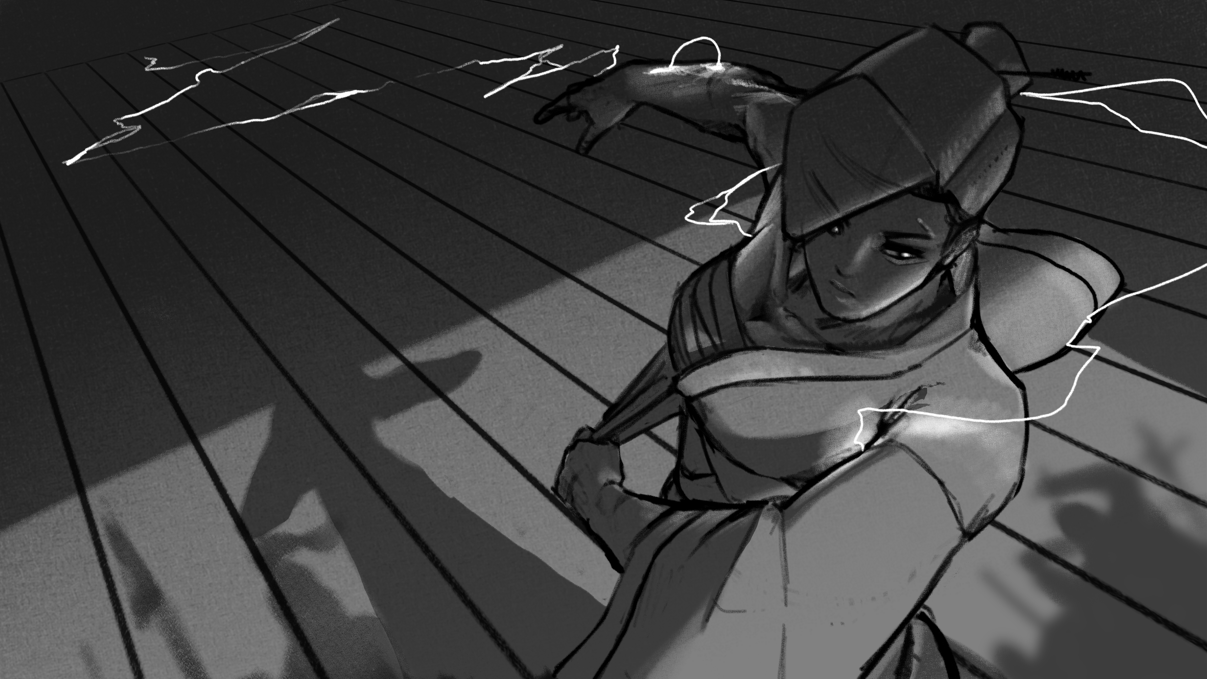
Update of the day.
I added the (water) soldiers I initialy drew on the composition sketch.
(Troubling an electric martial artist in her dojo was NOT a smart decision from the water soldiers)
I also started to work a little on the face and chest. A bit flat for now but we will see how it goes with the lightning lights later.


I think I'm done with Nariko for now !
I didn't want to paint to much details on her before putting down my colors but I got carried away.
So now, I want to do that, putting down my colors... And I guess that's where the masks come down : I am freaking scared when it comes to coloring an illustration.
It's one way or the other : Either I start painting with colors and I just can't do anything, OR I start with grayscale and I just don't know how to colorise it.
When it come to illustration, I'm self-taught, whenever I have trouble on something I look for the possibles solutions on the web or in my book. But I can't figure that out... I feel like it's always by luck that I make a good coloring ! 
So yeah. It's time to do some experiments I guess

Hi again ! Sooooo...
I've been trying to find a way to colorise it and I tried using the gradient maps.
I'm KINDA satified with it but having your opinion would be greatly appriciated
(I'm not sure about the skin color, since it's supposed to be in shadow, but at the same time, the lightning glow has to be taken into consideration. It's a pain...)
I also tweaked the perspective a little bit (for the head and the background).
I'm not that satisfied by the lightning going from her hand to the back. It's supposed to show her motion, from one ennemy to another but it makes things kinda messy. I also wanted the floor to reflect the lightning but it also makes the overall background messy...

I think the lightning should illuminate everything in the backround much more and maybe make the lightning streams a bit thicker to show more the concentration?
For the light in the background, I think so too. I will also try a few different ways to position the lightnings in the back ground maybe.
About the thickness of the lightning I initially liked it this way. I wanted it to look more like electric arcs, like, Nariko has all that energy mostly inside of her and I didn't want it to be too "over the top", because I want the whole character to be really, simple/sober, including the way her power looks.
But all of that just to say that the fact is : Yes, in the end, it's too thin
At least now I have a good base, I'll work on that now.
(But ugh... I really went outside of my comfort zone with this piece : with all these light sources and perspective  )
)