


That's great! Big fan of the warm palette you chose. I think that you could tweak the lighting on face a bit, because it feels too dark for the light setup... Lastly, I'm a huge fan of the light and dark contrast to the composition, but the fallen figures on the back ended up barely visible. It may be a bit too much, but how about moving one of them to be catching some light as well? I think it could be interesting composition wise.
Keep up the great work!

 BLOG May 17th, 2025 Werds I have had a work schedule change which has been nice and will have more time to draw and paint. I hope to get some more focused work towards projects - to see them get off of the ground. Looking at some old art of mine I wanted to redo them with some of the stuff I had recently learned. Art Dump 2025-5-9.jpg2098x5000 2.39 MB 2025-5-16.jpg2098x5000 2.23 MB Tain22.4k
 Back with works from the month of May Some studies: I have finished "The Guiding Crystal" piece! I'm pretty happy with how the whole thing came out, thanks to things I've learned here! I'm currently trying to figure out something to make environment-wise that would be cool.I've been toying with this illustration, but I'm not convinced it's good enough. To remedy to that, I've been learning some blender to make some sense of it and to supplement my drawing process I'll make another post once I have something more substantial! 'til next timein279

 imagination imagination imagination imagination ref used for the 3 full body figures, rest imaginaton imagination imagination imagination except the girl in middle studies except for bottom head imagination imaginationimagination imagination imagination imagination imagination imagination imagination imagination fanart/imagination imagination imagination imagination , semi ref'd sonics poseimagination imagination studies imaginationimagination imagination imagination imagination studies imagination imagination imagination imagination imagination fanart/semi ref'd pose imagination imagination imagination imagination fanart imagination, updated imagination imagination imagination imagination imagination imagination study study and imagination studies study used ref for torso/arms semi ref'd poses semi ref'd poses ref'd fullbodies, imagination small doodlesstudies imagination imagination imagination imagination imaginationstudies studies studystudy studypose semi ref'dimagination studies studyimagination studies semi studystudiesstudy studies and imaginationimaginationimagination fanart fanart fanartfanart imagination studies left study, right imagination studies except for grey one with glasses imagination study study studies ive been drawing very badly past few days, might take a small-medium break, it's very frustrating when spend whole day drawing and nothing comes out good.in24.6k
 Thanks @gregorya! Do you mean to say there is another way of getting a berry in one’s stomach (yeah it does look a bit odd) I’m discovering the wonders of still life and how much easier it feels to paint something that is not the thing your brain most easily finds issues with (human faces). So far very satisfying Also a marble guy I painted last week, I think he’s famous or somethingin26.2k

 Thank you! I finally cleaned that up. Meanwhile started 3 more ..I have a habit of taking too long to finish a piece, then I lose interest in it and just start something else. I found 8 from recently i started and abandoned, that are decent enough to not delete, but not finished. There’s also been a number of drawings I felt I “outgrew” - became better before I finished them, and it would be easier to start from scratch than fix them. Anyone else thinking that?in26.2k
 Lady Death Fanart Collectible: Part 6 Polypaint and base Hi, it’s time to share with you another part of the process to create this fanart piece. Polypaint As this is my first collectible fanart I didn’t have previous experience with polypaint so I tried my best and played a bit with it.I wanted to give a ghostly and eerie look to Lady Death, she is beautiful and deadly, but at the end of the day she is a woman that died and was reborn at hell as an avenging spirit, that’s why I gave her skin tone a bluish very cold tone.As you will see I gave myself some creative freedom to deviate from the traditional color scheme that this characater has in comics and illustrations.To add a bit of sensuality by painting some freckles on the face and the chest. The dark nature of this character was the perfect excuse to gave her a kind of goth make up, very dark shadows around the eyes, blue lips and fingernails. I know that the original character includes sexy red lips but I wanted this girl to have a sexy but at the same time creepy look, that’s why we can see some thin veins emanating from her eyes. The biggest chromatic change I did for this character is at the hair. Lady Death has a characteristic white weavy hair but in my fanart I decided to gave her a very saturated blue color.The reason behind this wasn’t only an aesthetic choice. I want that the face area strongly pulls the attention of the viewer so this area needed a stronger contrast. Another reason is that I want her to have a more modern look, as I mentioned before, I’m strongly attracted to women with goth/punk look. I gave myself half an hour or more to analyse the work of experienced sculptors that create collectibles and I discovered that the use of darker values on the skin is often applied to create a greater sense of volume and three-dimensionality. I found that areas with heavy ambient occlusion are the perfect places to paint with darker colors in order to increase the separation between different forms. Even though she has a bluish skin tone, I used a bit of warmer hues in areas that, in real life, tend to go towards red and pink, this is very obvious in the nose, cheeks, and knuckles. Thinking with a logical mind it’s completely absurd to have warmer tones on the body of a zombie like creature but I didn’t want to limit myself by using only blue tones, it looks boring and artificial. In real life these colors are created by blood vessels in areas where the skin is very thin. ** Scythe **for her weapon I applied a cool gray with some warmer variations, this color scheme is influenced by the work of H.R giger. Base I’d like to talk about the design for the base which, to be honest, I forgot to develop along with the character.My main idea with the base is to show that Lady Death inhabits a very sterile and arid land, at the end of the day she is at hell.You can see a that she walks over dirt and rocks, a sign that she’s surrounded by death and loneliness. As part of the landscape we can see some bones and skulls to reinforce the idea of lack of living creatures, yet we can see three hands that try to reach her legs.This hands represent that all creatures are subordinated to her power and seek an evil blessing with a simple touch of the princess of the damned.1- The hand with skin burns represents the souls of those who are newcomers to hell, tortured souls that suffer for the sins comitted on earth.2- The hand with greenish rotten skin and pustules is the reminder of the decay that has infected the souls of those who have been trapped and have forgotten their humanity3- Last but not least, the hand of a demon shows that even dark creatures and entities bow before her presence. The cherry on the top, at least in my vision, are the simese twins that emerge from the ground, this malevolent creatures remind us that in hell there’s only perversion and any trace of innocence is lost. Thanks for reading till this pointI’m really happy to be very close to finish this creative journey, last but not least it’s mandatory to talk about splitting the sculpture in several pieces to be printed, this will be my last entry before showing the final rendered images. See yaMay Zbrush be with youin1.8k

 memory 2min gartic phone, used ref 2m gartic, used ref for pose 2min gartic 2min gartic 2min gartic 2min gartic memory memory memory memory study memory memory memorymemory memory memory memory memory memory study memorystudy study stylized left memory, right study study memory memorymemory memory memory memorymemory memory, porportions r offmemory memorystudystudy memorymemorymemory memory memory memory memory memory memory memory, right leg is a bit broken The feeling of only getting 1 - 3 likes on a social media post will never not be discouraging. But nothing is discouraging enough to make me quit drawing. I think the strategy of drawing a lot of stuff and waiting a while to post is good though rather than posting it immediately and then feeling that sadness on the next set of drawingin

 studies studies juri study imagination, how I feel before a speech imagination imagination study something I drew for my presentation also drew this for my presentation, didn't fix the one hand being bigger than the other imagination + study study studies study study, I need to fix the face a bit based on screenshot from anime but in my style study. except for the eye study studies studies study. changed some things tho imagination imagination imagination study studies, except top right samurai based on anime screenshot wolverine studies, changed some of the poses a lil, not very good at all, but first time i drew the character ever. semi study studies study imagination imagination imagination , for first time ever i tried to draw over 3d model for middle pose, I dont like the result tbh, but it makes it much easier than coming up with it from memory.imagination, except right figurestudies imagination + studies, coming up with action poses r hard, these are not dynamic enough, I will redraw better ones in future. imagination , imagination imagination study, except for eye imagination imagination imagination doodles except for the two chrollos imagination storyboard thumbnail, idk if i ever shared this. my storyboards end up being a little detailed since i usually just draw in one layer.in24.6k
Look great so far! I agree with with the previous two comments about the lighting. so I don't need to add too much, but the figures in the back need to have some soft light on them.
Also, I guess this is just what I noticed, the room in general seems a bit dark for there to be such a bright light shining into the room? Maybe not enough ambient light or bounce light?
Lighting for me can be tricky as well, but I hope I was a bit helpful! I think the other two comments properly explained a lot better than me anyway XD
@vasge_ Thank you for the advices, I'll try moving the closest one a little
@clarief Thanks ! Indeed it looks dark, I wanted it this way at first, to have this strong contrast but, the more I look at it the more it bothers me now 
@HollyRose Thank you ! I'll work on that
And now, I guess I know what I have to start working on ! 
Alright! The deadline is coming but unfortunately, it's been hard to find time to work on it...
But I manage to work on these lightnings and light so here is the result.
What do you think?
But I was thinking... What if the guys in the background where actually midair... To show the speed of Nariko and add a little me dynamism? Like, she's so quick that they don't even have the time to touch the ground that she's already taking steps toward the next ennemies! I feel dumb to think about it only now... Crunch-time I guess 
At least I haven't gone to far in the details of the ennemies yet 
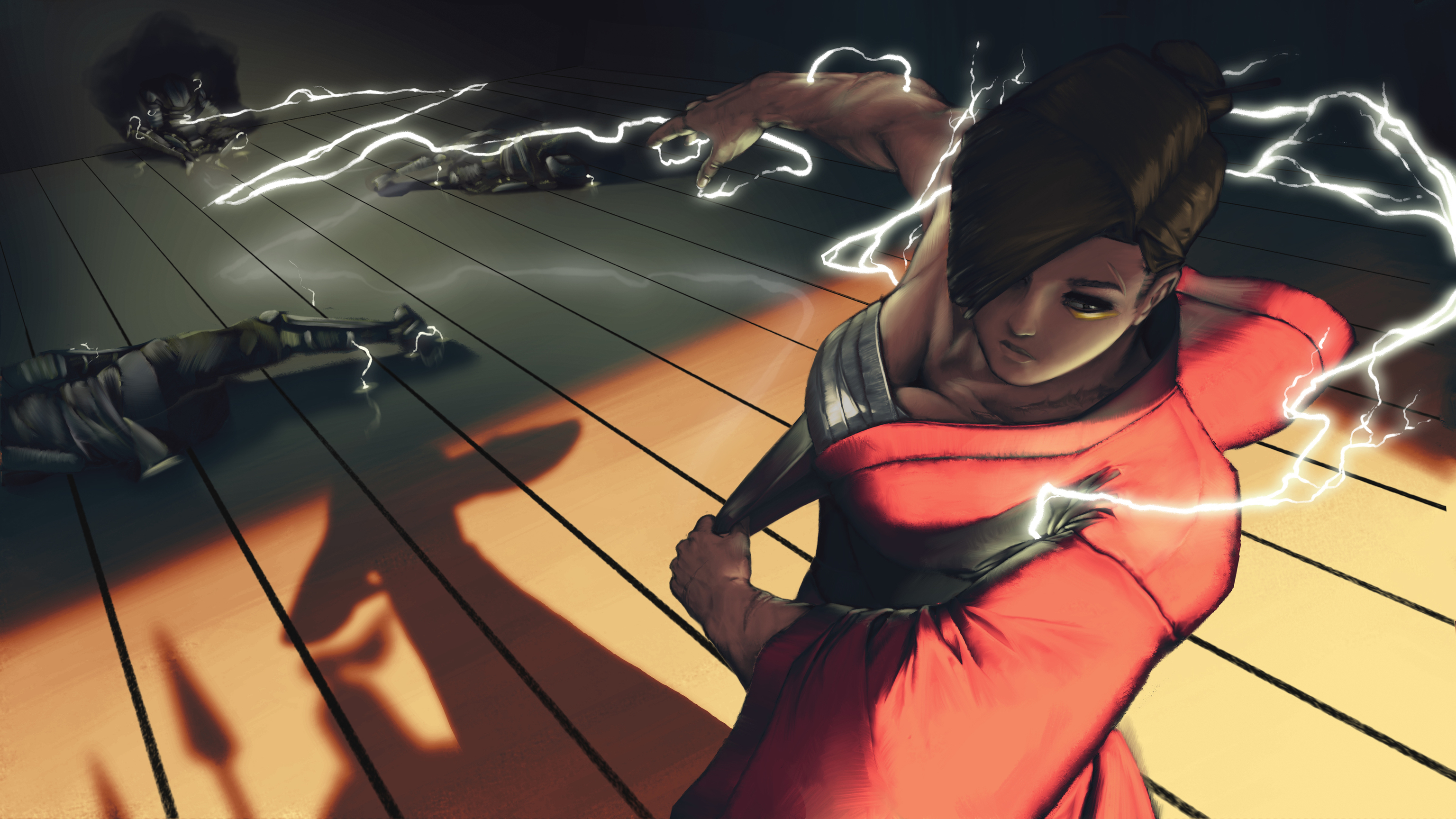
The lightning reflection is a good idea. I think you could have some variation of dirty/clean spots on the floor. That way some areas have a clearer reflection and others fade/blur it. Also The lightning up close should be thicker than the lightning in the background to push that perspective. You are doing it a little bit but not enough in my opinion.
Keep it up. We only have a few more days left 
Yeah the floor is far from finished, same goes for the wall in fact.
As for the lightnings I'm still struggling to make it visible enough but not too much because, as I said, I don't want it to be too over the top.
Update ! So I changed the changed the guys in the background 
I think that I spent too much time detailing them since these details will not be THAT visible after post-processing and all 
Tomorrow I'm going to put the patterns on Nariko's kimono, and work a little on the background walls. After that ? Just some details, tweakings and post-processing, to add some movements and all.
I'm close (yet so far) to finally finishing it. I don't know if I'm happy with it, I guess I am , I think I've just stared at it for too long ^^

Sure she is different but her strength/muscle make me think of Makoto from Street fighter.
Really lots of details on the poor electrified guys !
No idea if someone pointed this out but the shadow on the floor, those on the front, seems off no ? (or just placeholders maybe for the moment ?)
By those on the front, do you mean the bottom left corner or the right corner ? If the right, would it be because I forgot to draw part of their shadow being projected on her kimono ?
Her shadow and the dudes closest to her shadows' were better lighter, you've taken away depth by darkening them although in the newest update the lightning across the floor is super appealing to look at, and you've painted the texture of the floor so well! The floor itself though could do with something to make it a little less perfect, the lines between the boards are so perfectly straight and unbroken, and it could benefit from having horizontal slats as well
Thank you!
Woops ! I didn't even notice these shadows were this dark 
It must be an old layer I enabled by mistake (I failed at keeping them organized )
Now that you mention it, I think you are right about the floor being too perfect, I'll work on that
So, hello again.
Here's what I've been doing today. As I planned yesterday, I worked on the walls and applied the cloud patterns on Nariko's kimono (That. Was. A. Pain. In. The. ***) I also tried to work on "unperfecting" the floor
(Please dont mind thoses orange dots in the lightning area, I juste painted as place holders and will make it look better later.)
There is still a lot I have and want to do : Putting the lightning emblem on her kimono around the shoulder, add some dust particles, light reflections around the hair, etc etc...

ALSO !
Before going even more in the details I wanted to check real quick what the final illustration could look like with some quick post-precessing. And I need an opinion on that ^^
Here are 2 versions of it.
So here's the thing I initially wanted to add motion blur and other to add a little more depth to the illustration. Thats's what I did here :

BUT I believe that, as I gain in depth, I lose in details, so I tried without the blur :

And I can't make a choice... What do you think ? I Think that, either way, I will keep the motion blur on the first 2 water soldiers to show the impact but I don't know about the rest of the scene...
Ahh this definitely looks a lot better! I'm really loving the shadows and reflective light on the boards in the back, and the extra details really does ground the piece. It looks fantastic! I quite like the motion blur but I think either work, maybe have the middle one crisp as he's sitting next to the wall and the other two blurred? But maybe with a little less blur though it's quite harsh.
Another thing I wanted to mention is that you have a powerful light source coming from the top right, but none of it is touching her head, yet the cast shadow from her head isn't reaching that cast at the back so it doesn't make sense her head is in shadow. Other than that though it's looking really good, the lightning is painted so nicely
Thank you ! I'm gonna try every options after I'm done painting the final details 
As for the shadows, I'm not sure to understand what you mean exactly (I still have some trouble with english) but I scribbled something real quick to explain the way I casted the shadow.

I've always had troubles with lighting and shadows so I might have done something wrong here. 
ohhh I didn't see it like that at all, I thought that shadow was her hand 
dude, the textures and patterning look great! I think the odd thing with the shadow is that it might be a tad small? Kind of nitpicky. I don't necessarily think it should change.
@nesokaiyoh Ahahah ! O no
@danrob Thanks ! Yeah, I wanted to make it long since I wanted to have that kind of "sunset" light but shadows are part of my "prespective-newbie" problem
I think I can finally call it done now !
There are a few things I wanted to keep working on (like her face, something's bugging me, I just stared at it for a whole hour in my bed last night trying to figure it out... I just can't be as satisfied as I am with the faces concept illustrations I made when I started ) but unfortunately I won't be home until saturday evening, and since I don't know the hour when the contest is officially over I am going to stick with this final illustration !
EDIT : NEVER MIND i just checked the contest page, i'll be able to fix it in time I think
It was such a challenging contest ! It made me go beyond my comfort zone and it allowed me to discover some amazing artists ! THANK YOU !
(I still want to make a little animation of this illustration, I might post it here  )
)

good frame, nice work!