So, hello again.
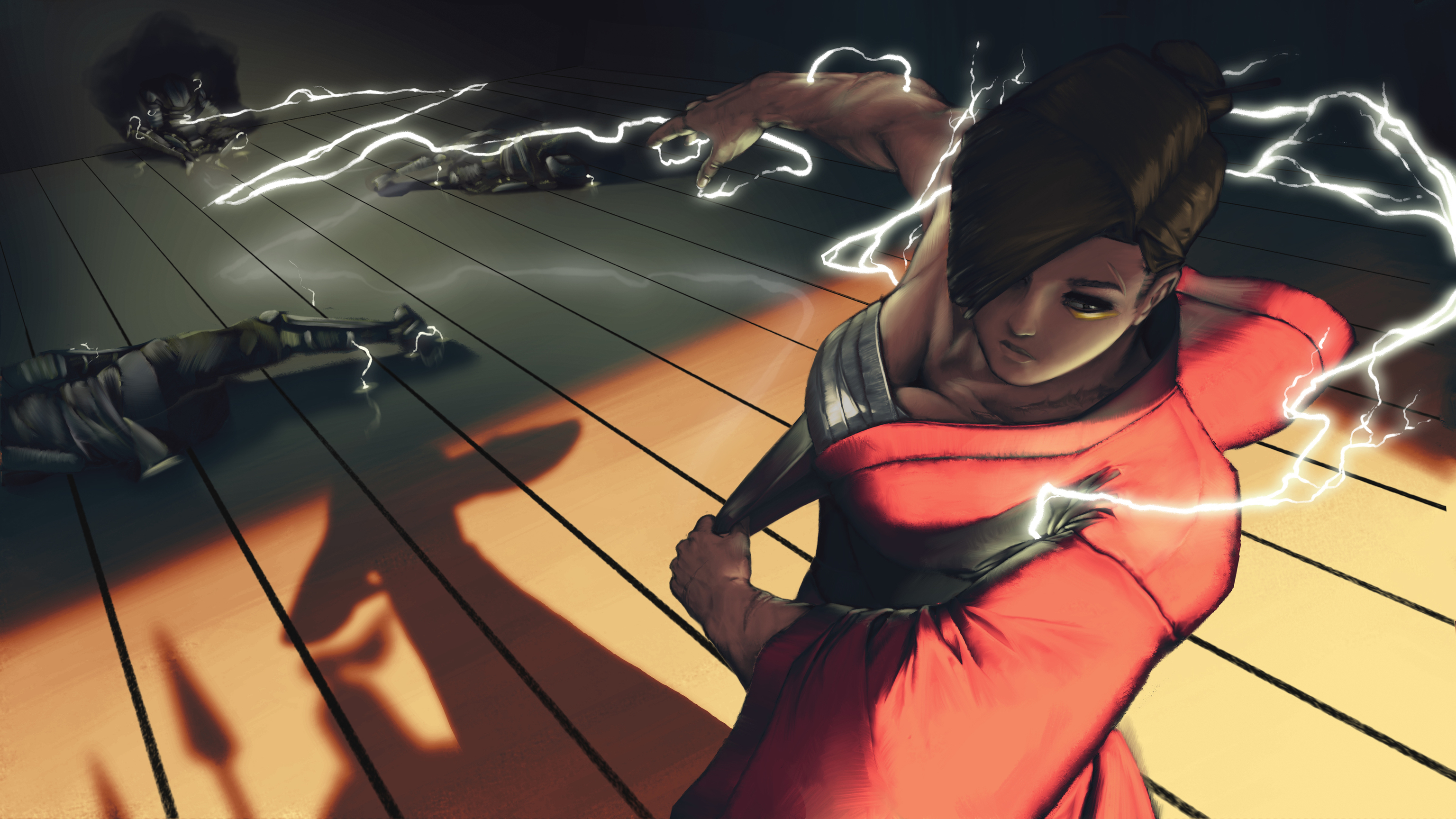
Here's what I've been doing today. As I planned yesterday, I worked on the walls and applied the cloud patterns on Nariko's kimono (That. Was. A. Pain. In. The. ***) I also tried to work on "unperfecting" the floor 
(Please dont mind thoses orange dots in the lightning area, I juste painted as place holders and will make it look better later.)
There is still a lot I have and want to do : Putting the lightning emblem on her kimono around the shoulder, add some dust particles, light reflections around the hair, etc etc...

ALSO !
Before going even more in the details I wanted to check real quick what the final illustration could look like with some quick post-precessing. And I need an opinion on that ^^
Here are 2 versions of it.
So here's the thing I initially wanted to add motion blur and other to add a little more depth to the illustration. Thats's what I did here :

BUT I believe that, as I gain in depth, I lose in details, so I tried without the blur :

And I can't make a choice... What do you think ? I Think that, either way, I will keep the motion blur on the first 2 water soldiers to show the impact but I don't know about the rest of the scene...


 )
)
 and all the little details everywhere !