Still searching but here some composition research. I was inspired a lot by Godzilla and Pacific Rim.

I think the two comps on the right are the strongest ones. Love the detail of the boat on top of her head.

Need to choose one of those composition now ! :dizzy_face:
I played some Heroes of the Storm today and found some inspiration in the loading screen illustrations when entering a game.

For me, it's III and II. Both of them have the best balance between the human in the foreground and the monster. III has a great sense of movement, compared to the others.

in my opinion the most successful perspective and composition is option 2, it has more epic

Hey ! I've completely missed your post until now, but your design is really cool, I love it !
My favourite compositionis the 3' but the 2 is really great too. They have a really nice sense of scale and are very dynamique.
Keep up the good work :smile: !

I love III and II as well, really dynamic and impressive looking!

You've done so much that's really neat. I love your colour pallet.
But if I can give you some advices. It's kinda weird for me that we don't see her second leg at all, you should try to make some natural holes in the algae skirt.
I'm not sure the relation between the glowy petals and her as clearly define as it should be. But I really enjoy the extra dynamism bring to the piece.
But the impact is clearly soften by the expression of the fire monster who is just chilling in the water without caring so much about them. If I could read his mind I could imagine something like "oh .. yeah .. here we go again".
But that's a really strong piece anyway I love it :smiley:

Haha, yeah I can completly imagine the fire monster thinking that right now x)
Thanks a lot for these feedbacks ! I'll try to implement them :blush:

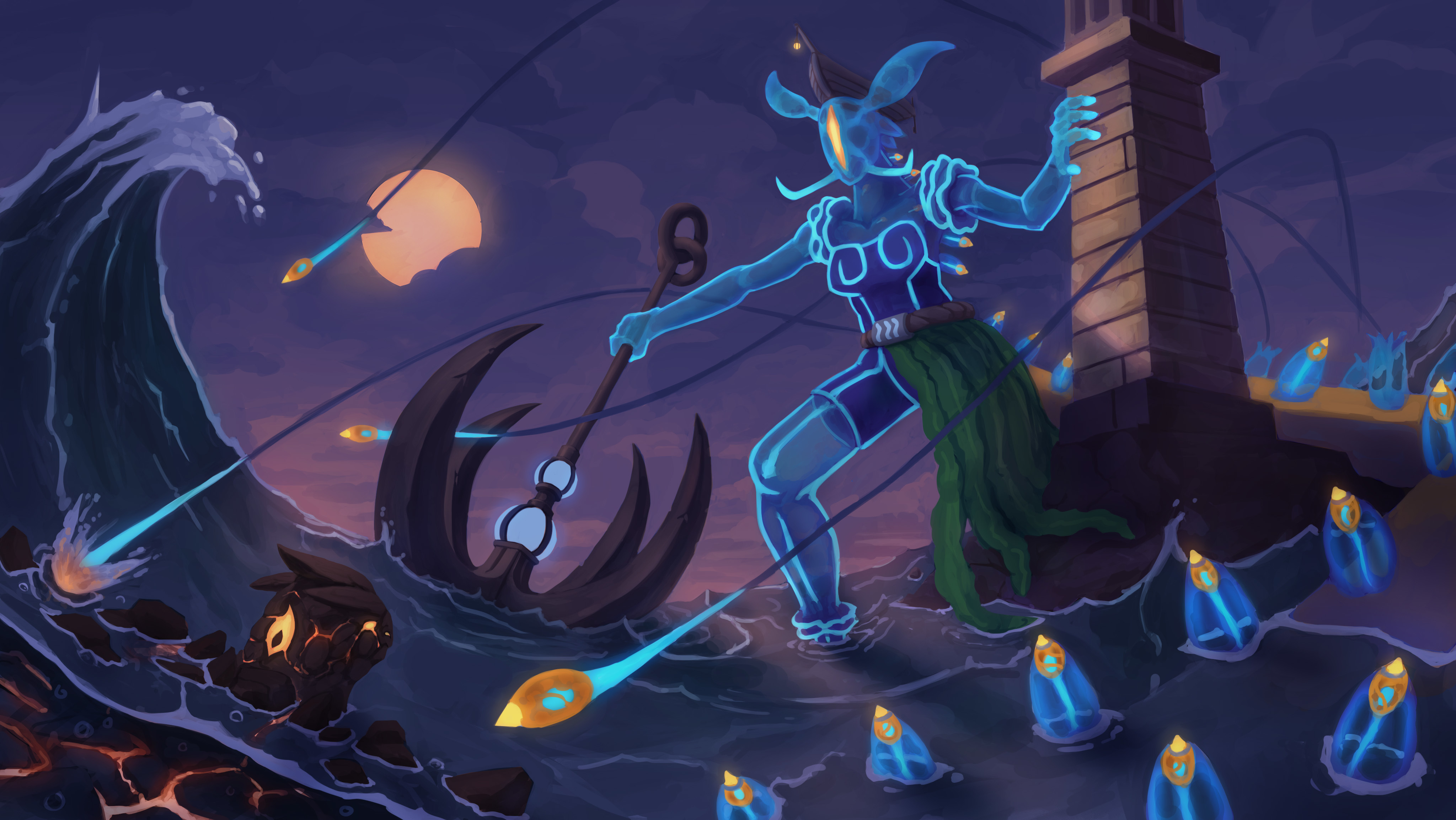
First of all really cool character! I love how the moon looks in the sky but it caught my attention more than what's happening in the scene. I think you can focus a bit more on atmospheric perspective as everything kinda looks flat right now. Also, your character's knee looks a bit funny, kinda bigger than the thigh, maybe look at some reference for that, good luck!

What would help with your depth and scale is the ocean drawn to the horizon, the shape of it means it looks very 2D and doesn't fit on the same plane as the lighthouse

Yeah not to worry, you have so much time left! if you felt like you wanted more practice with the character you could even do a different version xD

I love the concept and the color scheme. To take this to the next level just spend some more time on the water.

The colors of the sky are pretty and the shapes are nice.