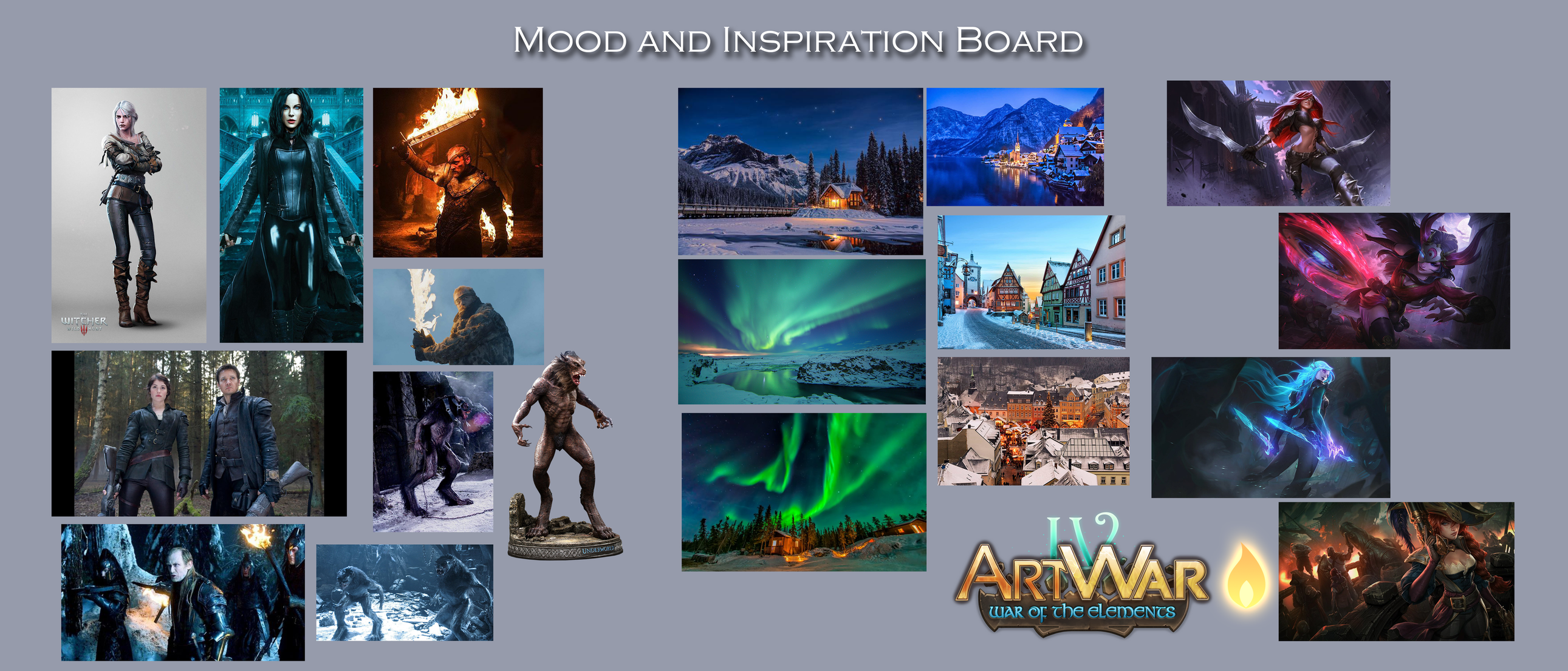
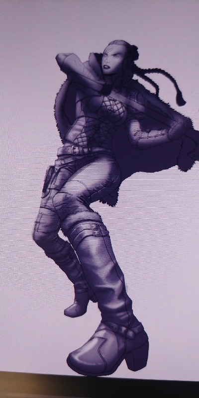
I spent a lot of time over the past week mentally creating my hero, lore and final image. The hard part is doing it all physically. Haha. My element is fire, and I plan to depict a strong female warrior fighting against werewolf/wendigo-like beasts, in an snowy and cold arctic environment.
Much of my visual influence and mood comes from recently watching The Witcher, as well as being a fan of the Underworld films (well, the first two anyway), and even Hansel and Gretel: Witch Hunters.
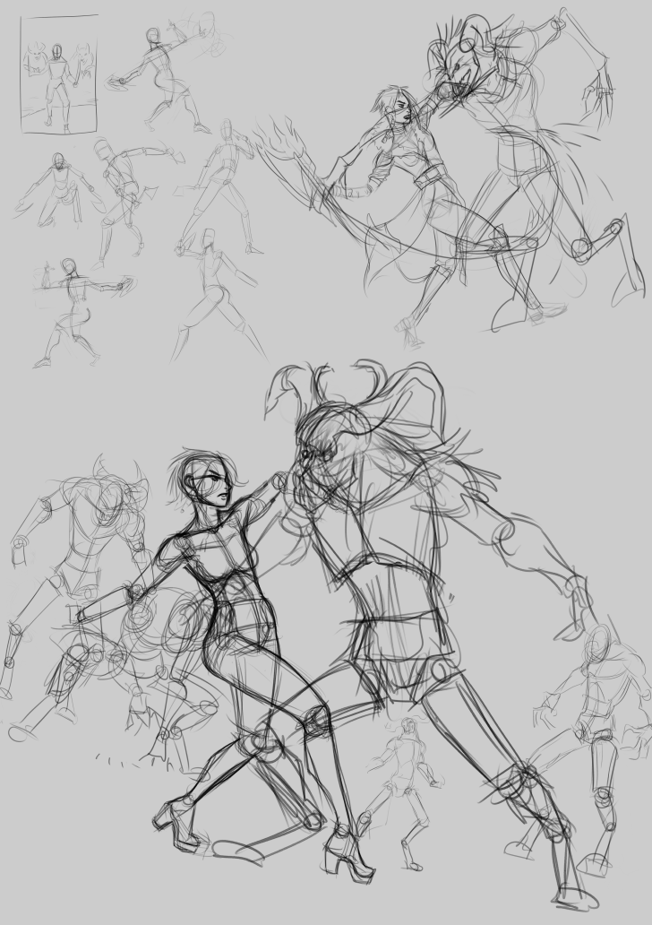
I added my mood board, and hopefully soon I'll start adding some sketches and WIPs.
Also, I want my final image to have the type of style and vibe seen in League of Legends splash art. Anyway, I have my work cut out for me.