10 days later

I spent a lot of time over the past week mentally creating my hero, lore and final image. The hard part is doing it all physically. Haha. My element is fire, and I plan to depict a strong female warrior fighting against werewolf/wendigo-like beasts, in an snowy and cold arctic environment.

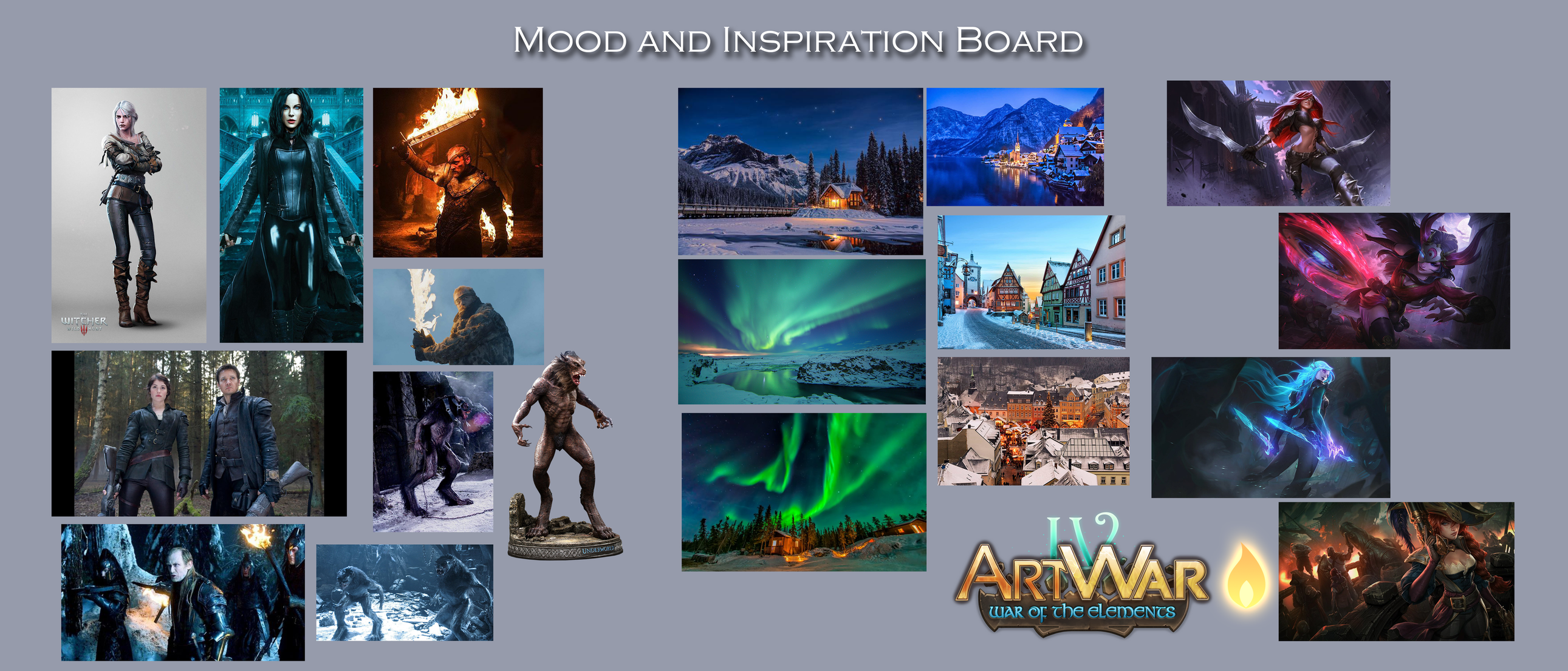
Much of my visual influence and mood comes from recently watching The Witcher, as well as being a fan of the Underworld films (well, the first two anyway), and even Hansel and Gretel: Witch Hunters.

I added my mood board, and hopefully soon I'll start adding some sketches and WIPs.

Also, I want my final image to have the type of style and vibe seen in League of Legends splash art. Anyway, I have my work cut out for me.
I've been trying to continue working on my submission in lieu of the holiday craziness. I didn't spend a lot of time on Solveig's appearance, as I designed her appearance mentally about 75%. I did a few pose sketches for the final image, as how I wanted to portray her using her abilities to fight her enemies. I have some changes/tweaks to her appearance I'll show in the final image that fit more inline with her backstory...which I'll add in detail at that time.

I don't have a whole lot of time during the weekday to draw or post, but hopefully I will try to add more interesting stuff as I work on the main illustration. Thanks for watching.

These are two test renders of Solveig. Basically my purpose is to figure out what's the most efficient way to color the final, while acheiving the desired look/style. I still have much more to do.

She does look very witcher-esque (amazing show btw I watched all of it in two days) and the final thumbs look promising. If you were to lower the camera just a bit to really make it seem like she's winning a losing battle, that could really add to the suspense of it O:

Thanks! Very, very wise advice. I started on the background over the weekend and was struggling, and went with a lower angle. Still have things to work out, but I like that "winning a losing battle". I'm trying to portray a small mountain village overrun by these creatures, and she's in the thick of it.

Ahh I'm glad youre going that way with it and I'm super excited to see what you do with the idea :smiley:

So, after browsing various artworks from professional illustrators, my idea for the setting of the image started to come together. My previous image of the snowy creek wasn't 'doing it' for me. Lol. I had an image in my head of my hero fighting off these creatures in castle ruins up in a mountain, kind of representing where they dwell. Therefore, I hope to make the image more intense by suggesting Solveig is surrounded in enemy territory. I suck at making step-by-step images, but i tried to include my initial thumb, and a few shots of how I got to where I am now. A lot was trail and error so I really didn't have a method I was using, just seeing what works.

*excuse the slightly blurred final background, I was testing how much blur to use while still allowing the details to be shown.

Oh this looks wonderful. Certainly better than the older environment too, which lacked a lot of depth and structure. The colours are also far better (including the aurora which was a nice addition)

Thanks for the encouraging words, it helps to know I'm leaning in a better direction. I need to really get cooking on the character and creatures though!

19 days later

Sorry I haven't added more progress shots on my entry. Below are some mobile phone shots. I ended up making some changes to the character pose, and the background as well. While I liked the northern lights look, it didn't seem that menacing of an environment, so I made it a bit darker and foggy, and threw in some trees and bushes to give it a bit more life.

as for Solveig, I changed her design a bit with some better detail. I decided to render the shadows in greyscale(multiply layer) , then add color flats below. The further along I go I merge layers and add some more detail. it's been fun so far.

Here's one more, closer to the end...

Ahh glad to see you back! The perspective on the character is so good, the details and everything, looks fantastic! The foot closest to us is a little warped though, a bit too thick from the top of the shoe to the bottom but either way the whole piece is really coming along :smiley:

Thanks for your feedback nesokaiyoh! Yeah, something has been bugging me about that forward leg. Since I still have a bit more time and haven't flattened all the layers, I should be able to make minor adjustments. This has been fun to do, as it's helping me push my art further instead of rushing to get stuff done in a weekend. Lol.

Full Name: Edwin Jones
email: styluszer0.art@gmail.com
Artstation: styluszero.artstation.com
Twitter: twitter.com/StylusZer0
Instagram: instagram.com/styluszero

ARTWAR 4 FINAL SUBMISSION

I guess I'll go ahead and call this done! There are some things I wanted/should have tweaked or changed, but if I nitpick every little thing I think is flawed, I'd end up starting over. Lol. I think I did pretty good based on my prior artworks, so I'm happy. There's always room to improve, but that's for the next piece.

Special thanks to @shrineheart and her custom Clip Studio Paint brushes. Check out her store if you use CSP. I've purchased a few brush packs in the past and used them in this piece. Also special thanks to @nesokaiyoh for positive feedback on my progress on this submission. Please go check out her's if you haven't yet. Also thanks to all the people who have given me a like!

There are so many good submissions out there, I wish I had time to look at them all, but now that I'm done I'll make sure I do! Seems like everyone put in a lot of hard work!

Good luck!

Wow this final one looks amazing! I'm glad you got it finished in the end, was a bit worrying when you disappeared for nigh on a month early on there! I love the muted colour palette you went with, and just the foreshortening and everything is looking so good! If I did have some feedback for this final piece it would mostly be that the fire could benefit with a range of oranges, reds and whites rather than just the one yellow you have although it's a little beside the point as it also suits your style of painting and this piece in particular. The hand in the top right creates a bit of an awkward tangent too, but again it's not incredibly important and the piece works well enough already regardless.

Congrats on finishing I've really enjoyed seeing all the process since starting!

Thanks a lot. Oddly enough, I seem to be having an issue with the file on my PC vs. how it looks on here. It's much more saturated in general, but when I upload it, it becomes washed out. I'm trying to figure that out before I officially submit it. :sweat_smile:

I tried to correct the front-most leg with some distorting an repainting. It was trickly, but it shows the importance of getting the anatomy right in the early stages. I see your point with the hand, considering the angle of the axe.

I have the problem of that being reversed, but also I noticed, depending on whether you save PNG or JPEG too.. When I save the images in PNG they come out usually too dark or saturated, with a really strong base blue tone?? With JPEG nothing changes. So that's kinda weird