• Gave myself 5 days to do something. This is what I managed to do. I'm trying to get better at illustrations, but I have patience to work on something for 3 days maximum :( Splash_Process.jpg5000x3140 2.21 MB Splash_Process-6.jpg3896x2429 2.83 MB concept list char copy.jpg5388x3000 1.7 MB
    20.4k
  • Did a character concept for a course.https://www.artstation.com/artwork/P6gm3y - more:) list1.jpg3541x1920 2.82 MB
    20.4k
  • Day 4: Star Wars May The 4th =] Queen Padmé Amidala in my art style! First time drawing her and I really enjoyed making this one! Used watercolours, ink pen, acrylic markers and gold paint for accents on my Canson mix media sketchbook. I hope you like it!
    80.7k
  • A creature design from a while back
    by
    6.5k
  • Here is some more recent stuff, I need to make more body studies
  • It's been a while and god, it is so cringe to go through all previous messages xDmy study.
    20.4k
  • Thank you! I finally cleaned that up. Meanwhile started 3 more ..I have a habit of taking too long to finish a piece, then I lose interest in it and just start something else. I found 8 from recently i started and abandoned, that are decent enough to not delete, but not finished. There’s also been a number of drawings I felt I “outgrew” - became better before I finished them, and it would be easier to start from scratch than fix them. Anyone else thinking that?
  • Lady Death Fanart Collectible: Part 6 Polypaint and base Hi, it’s time to share with you another part of the process to create this fanart piece. Polypaint As this is my first collectible fanart I didn’t have previous experience with polypaint so I tried my best and played a bit with it.I wanted to give a ghostly and eerie look to Lady Death, she is beautiful and deadly, but at the end of the day she is a woman that died and was reborn at hell as an avenging spirit, that’s why I gave her skin tone a bluish very cold tone.As you will see I gave myself some creative freedom to deviate from the traditional color scheme that this characater has in comics and illustrations.To add a bit of sensuality by painting some freckles on the face and the chest. The dark nature of this character was the perfect excuse to gave her a kind of goth make up, very dark shadows around the eyes, blue lips and fingernails. I know that the original character includes sexy red lips but I wanted this girl to have a sexy but at the same time creepy look, that’s why we can see some thin veins emanating from her eyes. The biggest chromatic change I did for this character is at the hair. Lady Death has a characteristic white weavy hair but in my fanart I decided to gave her a very saturated blue color.The reason behind this wasn’t only an aesthetic choice. I want that the face area strongly pulls the attention of the viewer so this area needed a stronger contrast. Another reason is that I want her to have a more modern look, as I mentioned before, I’m strongly attracted to women with goth/punk look. I gave myself half an hour or more to analyse the work of experienced sculptors that create collectibles and I discovered that the use of darker values on the skin is often applied to create a greater sense of volume and three-dimensionality. I found that areas with heavy ambient occlusion are the perfect places to paint with darker colors in order to increase the separation between different forms. Even though she has a bluish skin tone, I used a bit of warmer hues in areas that, in real life, tend to go towards red and pink, this is very obvious in the nose, cheeks, and knuckles. Thinking with a logical mind it’s completely absurd to have warmer tones on the body of a zombie like creature but I didn’t want to limit myself by using only blue tones, it looks boring and artificial. In real life these colors are created by blood vessels in areas where the skin is very thin. ** Scythe **for her weapon I applied a cool gray with some warmer variations, this color scheme is influenced by the work of H.R giger. Base I’d like to talk about the design for the base which, to be honest, I forgot to develop along with the character.My main idea with the base is to show that Lady Death inhabits a very sterile and arid land, at the end of the day she is at hell.You can see a that she walks over dirt and rocks, a sign that she’s surrounded by death and loneliness. As part of the landscape we can see some bones and skulls to reinforce the idea of lack of living creatures, yet we can see three hands that try to reach her legs.This hands represent that all creatures are subordinated to her power and seek an evil blessing with a simple touch of the princess of the damned.1- The hand with skin burns represents the souls of those who are newcomers to hell, tortured souls that suffer for the sins comitted on earth.2- The hand with greenish rotten skin and pustules is the reminder of the decay that has infected the souls of those who have been trapped and have forgotten their humanity3- Last but not least, the hand of a demon shows that even dark creatures and entities bow before her presence. The cherry on the top, at least in my vision, are the simese twins that emerge from the ground, this malevolent creatures remind us that in hell there’s only perversion and any trace of innocence is lost. Thanks for reading till this pointI’m really happy to be very close to finish this creative journey, last but not least it’s mandatory to talk about splitting the sculpture in several pieces to be printed, this will be my last entry before showing the final rendered images. See yaMay Zbrush be with you
    1.4k
  • memory 2min gartic phone, used ref 2m gartic, used ref for pose 2min gartic 2min gartic 2min gartic 2min gartic memory memory memory memory study memory memory memorymemory memory memory memory memory memory study memorystudy study stylized left memory, right study study memory memorymemory memory memory memorymemory memory, porportions r offmemory memorystudystudy memorymemorymemory memory memory memory memory memory memory memory, right leg is a bit broken The feeling of only getting 1 - 3 likes on a social media post will never not be discouraging. But nothing is discouraging enough to make me quit drawing. I think the strategy of drawing a lot of stuff and waiting a while to post is good though rather than posting it immediately and then feeling that sadness on the next set of drawing
  • Urban Dragon Girl Wip Urban Dragon Girl_wip1.jpg5000x5000 1.11 MB
  • Long time no see! New artworks produced lately
    6.4k
  • studies studies juri study imagination, how I feel before a speech imagination imagination study something I drew for my presentation also drew this for my presentation, didn't fix the one hand being bigger than the other imagination + study study studies study study, I need to fix the face a bit based on screenshot from anime but in my style study. except for the eye study studies studies study. changed some things tho imagination imagination imagination study studies, except top right samurai based on anime screenshot wolverine studies, changed some of the poses a lil, not very good at all, but first time i drew the character ever. semi study studies study imagination imagination imagination , for first time ever i tried to draw over 3d model for middle pose, I dont like the result tbh, but it makes it much easier than coming up with it from memory.imagination, except right figurestudies imagination + studies, coming up with action poses r hard, these are not dynamic enough, I will redraw better ones in future. imagination , imagination imagination study, except for eye imagination imagination imagination doodles except for the two chrollos imagination storyboard thumbnail, idk if i ever shared this. my storyboards end up being a little detailed since i usually just draw in one layer.
    by
    21.8k
  • Quick fun sketch. CyberFish.jpg2394x3857 674 KB
  • Neon Gambit This is a fan art of my all time favorite character Gambit from the X-Men.I made this a birthday gift (26.04.2024) to myself and honestly I really do like how it turned out in the end =] I hope you like it as well =]
    80.7k
  • Art Blog - April to September 2023 Suffer a little burn out. Look at some memes. Here's some art from in between. critique.jpg1333x5736 1.77 MB
    20.1k
  • And some more! Been painting over them a bit more this time. Some variants I tried for the old guy using mainly the liquify tool. Someohow looking a bit like Owen Wilson (not intended :D)
  • Cafe sketch/color study
  • Hello! My name is Vithor, I am from Brazil, studied Design at a local college worked as an illustrator for more than 10 years. I took a time off around 3 years ago and am trying to get back in my art shape and maybe become professional again. Here are some recent pictures: You can find timelapses for most of them on my instagram: www.instagram.com Vithor Albertim (@vithor_albertim) • Instagram photos and videos 123 Followers, 638 Following, 19 Posts - See Instagram photos and videos from Vithor Albertim (@vithor_albertim) Comments and critiques are always welcome.Cheers!
  • @patrycja.lerch Thank you I created another variant, which might capture the witch look I was going for better
  • Thank you @daceronine! If I remember I save in google cloud, I will have to stick a note to do it more often. Lamp is from life. Poses are from refs but I look at refs for a while and then try to do it myself and look it up if needed. Outfits and rest is from imagination Something went wrong while installing system so we will have to wipe everything again... pc works but something is wrong. We will wait till internet is done and I will save everything on cloud this time Threads came out in eu. It's been 3 days and I had more engagement than after half a year on instagram. It feels really nice I hope it stays this way A portrait of old dude. It's the same character I posted a while ago. Inspired by Bayard Wu work. At first I thought of him as a bear but I named him Fenrir and I think wolf suits him better. Eye gave me a bit of hard time but I think it is fine now. I focused on face and forgot about area below. The way I draw hair clashes with greying hair. I had the same problem while doing Lohse's white hair. Does it looks like it is greying here? I love how desaturated red looks blue there. I keep lying to myself that I will use different color scheme but It all comes down to this blue and yellowish one it is just flipped this time Have a great day!
  • Been bad about posting updates on the forum. I figure I should just throw down stuff. instead of waiting until I finish something.
    14.4k
  • Havent done much this year since I am focusing on learning programming and deving my own Indie Game . But here 's a New Year Piece 2024 , she 's the mascot for my Game Studio - Lucid Realm : Lucid Chan ! LucidChan_v001_sketches.jpg3072x4352 973 KB
  • IMG_0637.jpeg3240x4050 1.6 MB
  • Long Crested Eagle studyI had so much fun making this one and honestly I love that Eagle! It looks so cool! Used for this one high quality watercolours, high quality watercolour sketchbook/ cold press and it was 300 grams paper.I hope you like it!
    80.7k

Just a place for me to share some of the assignments we have to do so I can track my progress over time.

Here is the art I've done so far this year prior to starting the Art School lessons. The first image took me almost one month to do and the second one took a few hours. I'm really hoping to cut down on how long it takes me to draw and color simple illustrations like these:

Welcome to the forums Danielle! Bests of luck!

This is the first lineart study I've done for the week 3 assignment of copying 5 characters from professional artists/shows/hames that I like. I choose to do Tohru Honda from Fruits Basket (2019) since I recently watched it.

I know the lines are horrible but I'm just glad I didn't stop working on it halfway through! For the second study I hope to spend more time on making the lines look more smooth.

Not bad for a first study! You can see a bit of sketchiness in some lines, like you are slowly moving along the line doing a few smaller lines to do a bigger one. For sketches that's fine, we all do it to a big degree, but it helps to then add a new layer on top of the "first sketch" and redraw it, tracing your own sketch with smoother, longer lines using your shoudler and elbow to pivot your hand. Don't be afraid of also doing a lot of "ctrl+z" until you get that "perfect line" or doing a clean line, going over the border and then just coming back to erase the excess.

Thanks! That's exactly what I did for the second one. Of course now there's other issues with the new 😅 but I think I've made progress. (Accidentally deleted my reply)

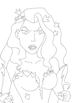
This is the second lineart study I've done for the week 3 assignment for term 1. I did Poison Ivy from DC, because she's great.

I went ahead and made a new layer on top of my "sketchy" one so that the lines would be more smooth. After drawing this I realized I made the head too big, which I think will be recurring theme for me as I am currently working on my third lineart study and the head is bigger than it should be, but oh well. I'll really make sure to watch for that in my fourth one!

Seeing my drawing side by side with the reference I also see the jaw is too wide yet the top of the head is too narrow. Maybe, for the fourth image I'll try having the reference side by side with my drawing and not up on my computer screen.

I'd say the lines already look smoother! I don't see those hints of sketchiness from before.
Another tip that helps to keep an eye on proportions is to have the "flip horizontal" on a shortcut so you can flip every now and then. Flipping forces our brain to see the drawing with a "new eye", makes it easier to spot any glaring proportion out of place. Pros flip all the time when creating the base sketch and lineart.

Eventually you'll get more in depth with lineart weight, quality and so on, for starters these are looking good!

My third lineart study. I felt like this third one took soo long to do yet I also feel like i rushed it. The proportions came out bad in this one and I didn't feel like doing that second layer to get rid of the sketchiness because of how much I jut didn't like this.

However, I'm glad I finished it and I'll be taking the advice of @daceronine of flipping my canvas horizontally when drawing so I can get a better feel for how my next drawing is going. I'll also spend more time on my next one and and do that second layer so I have a more polished result. I may try a smoother brush as well instead of the "pencil" one I've been using.