Welcome back to the critique section @sunguromerr!
I just searched the discord link on the forums here and that was how I found it. Maybe it got taken down I dont know.
The Good Stuff
You have put in some time and effort in rendering transitions from dark to light and midtones and it shows.
Compared to the last post you had in the critique section this technique here has been elevated to not look so blatantly digital. Whatever program you are using has some excellent texture filters and brushes and they are doing some good things for you here. Try to make them a bit more subtle and not so on the nose.
Your values and lights and darks are grouped more clearly and your form is clear and clean.
The Critique
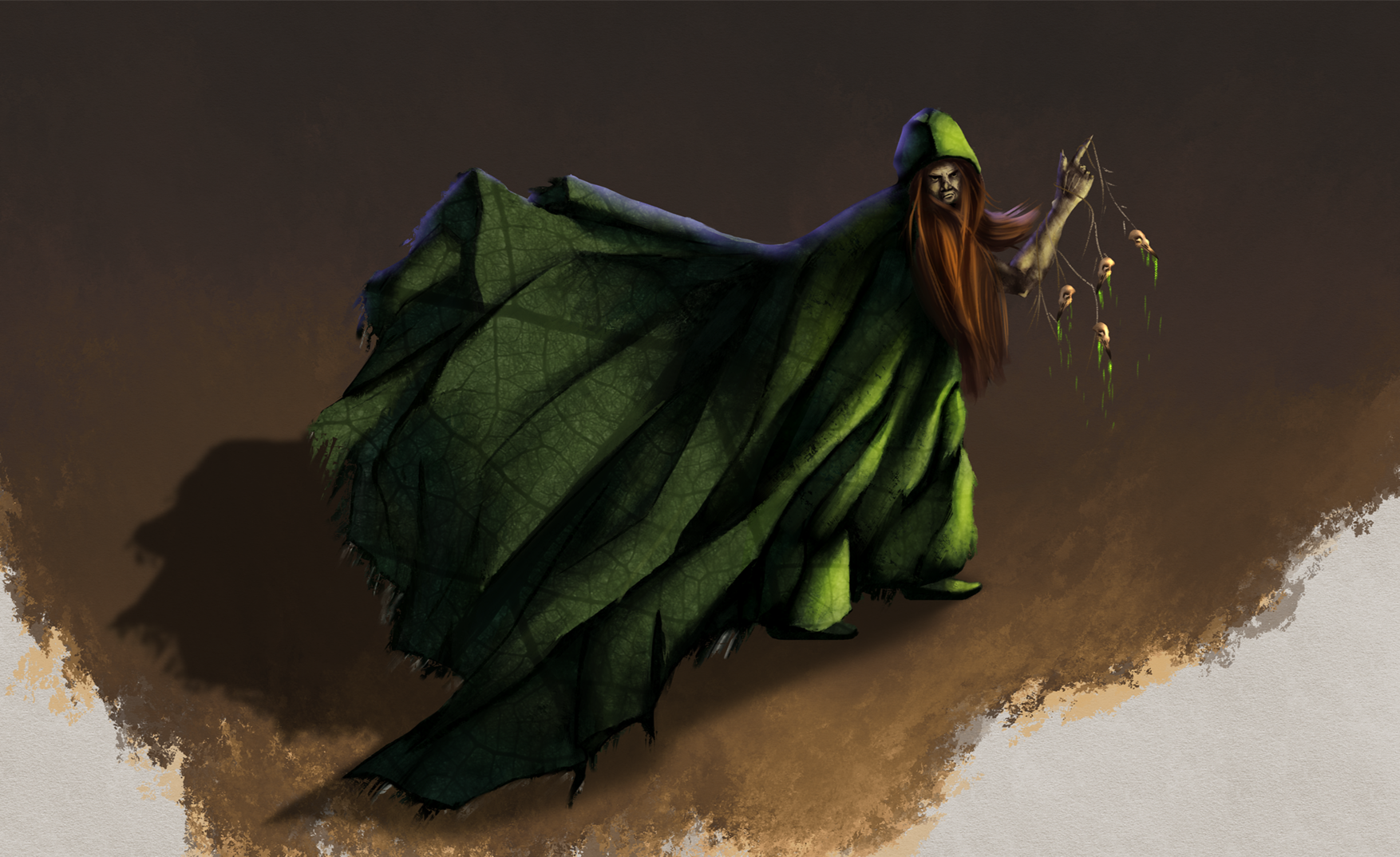
Your values - although more clear, need to be more consistent with the direction of the light sources. See the vines on the face here?

All these yellow arrows are showing different light source directions.
See the body of the figure here as well? I'll point it out.

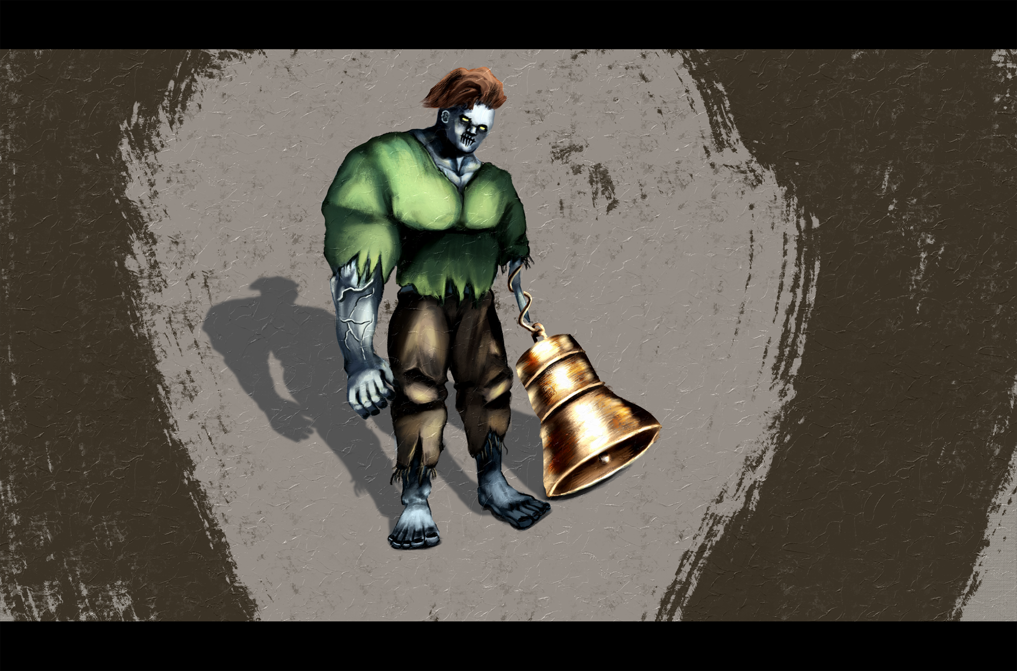
And lastly the light sources on Quasimodo here are inconsistent as well.

For the light sources of classic figure art it is traditional to use one light. For concept art, it is necessary for the DESIGN to be the focus. The belle of the ball if you will. So magazine style lighting or camera photography lighting is also typical for that. Local colors with a multiply layer of shadow is also okay for hashing out designs.
But I have a feeling that you are more illustrative and want to make pictures.
I am focusing on rendering light in these first comments because you spent most of your time rendering and texturing. (edges) You didn't seem to spend much time on the three other fundamentals of picture making - drawing, value and color.
Conceptual design is really just problem solving, and subtracting. Until you get exactly the figure and style and purpose that you need to communicate the product you are trying to sell, or convince an art director with.
But what problems are we solving? What areas do you need improvement in?
.
.
.
1. Well first off its shapes and motion (aka gesture).
I assume that you do not fully understand shape language perhaps so we will go over a couple of things.
What do the shapes of your illustration here really tell the story of? (rhetorical)
Round, square, sharp...what is the essence of the mood of the character you are trying to design? Is it safe? dangerous? sturdy? These are things you will use to simplify your decision making in the future.
I always recommend watching this talk and saving these images to your device for later reference. 2022 Sumo Digital Conference presentation by Micheal Ollerton
This breaks down the history of why we draw things the way we do for animation. But the thing that you should take away from this as an illustrator is the idea of finding the essence of a subject and simplifying it as I mentioned before. Its not bad that he touches on shape design as well for features, bodies and gesture...So that is your free point of reference.
Bookmark it.
.
.
.
2. Second is Value Structure.
There are two types of value structure to consider.
A. Compositional value structure, (value pattern of the thumbnail - and composition overal --ie light subject dark background - dark subject light background etc.
B. Form value structure. (being consistant with your light sources rendering form. lighting of the image and arranging it in light and dark aka NOTAN. )
Composition takes a lot of practice to lay out a good value and involves some understanding of mood and the metrics that control the images value pattern correctly.
The best file I have found for that is by Clint Cearly -
A. Understanding mood chapter 3 composition.
(psssssst, this will also help you with #1 shapes, and explain some theory behind it as well. I use this resource all the time, flip through it and see if I am not thinking about something.)
Painting the form has many digital techniques but you just have to choose one to be constant with a style you want to emulate. That is the process you have to follow along in a tutorial with to learn. Following a video is tedious and imo is good for instruction but not learning step by step. But a books do! in my opinion, because you dont have to scrub the pdf like a video and you can download the file. Here are a bunch of free magazines to peruse the many rendering techniques that artists submit for how to articles for Imagine FX.
But if we are just talking rendering consistency, lets go to the source, and call it what the masters did, 'modeling form'. So read these two pages on how to follow step by step on how to think about rendering the form and not have it be a guessing game. Big to small.
Read the Values and Modeling section, and the Procedure for modeling section.
Charles Bargue - Modeling Form pages.
Great Job
Seriously. Keep working out hard stuff. Study some things and keep failing and you will get better and better. See you around!
Oh and please go and read and like my other critiques I have added to this forum. I try to be very thorough and work hard on them.


 Jul 30, '24
 Apr 5
Apr 5