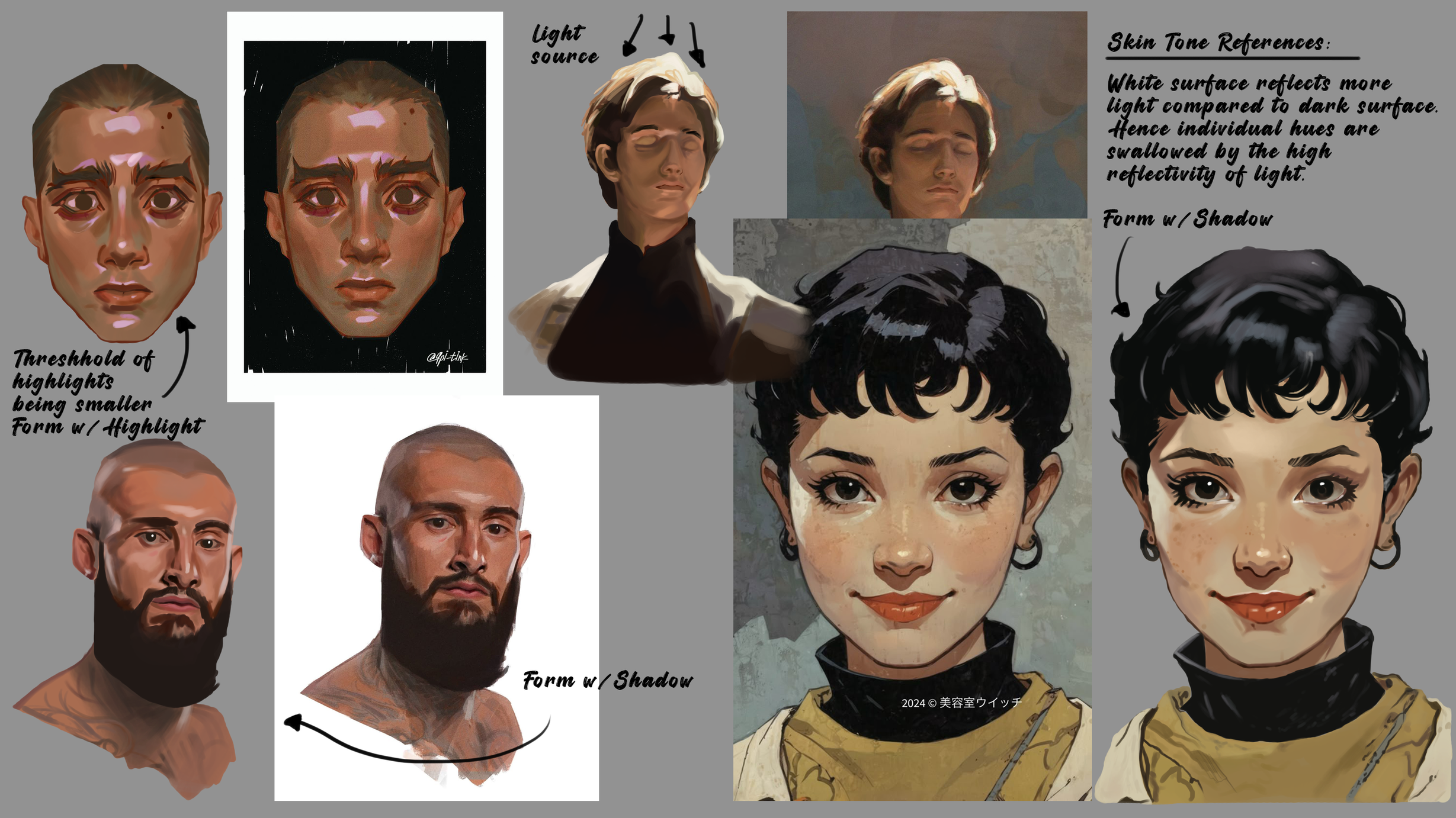
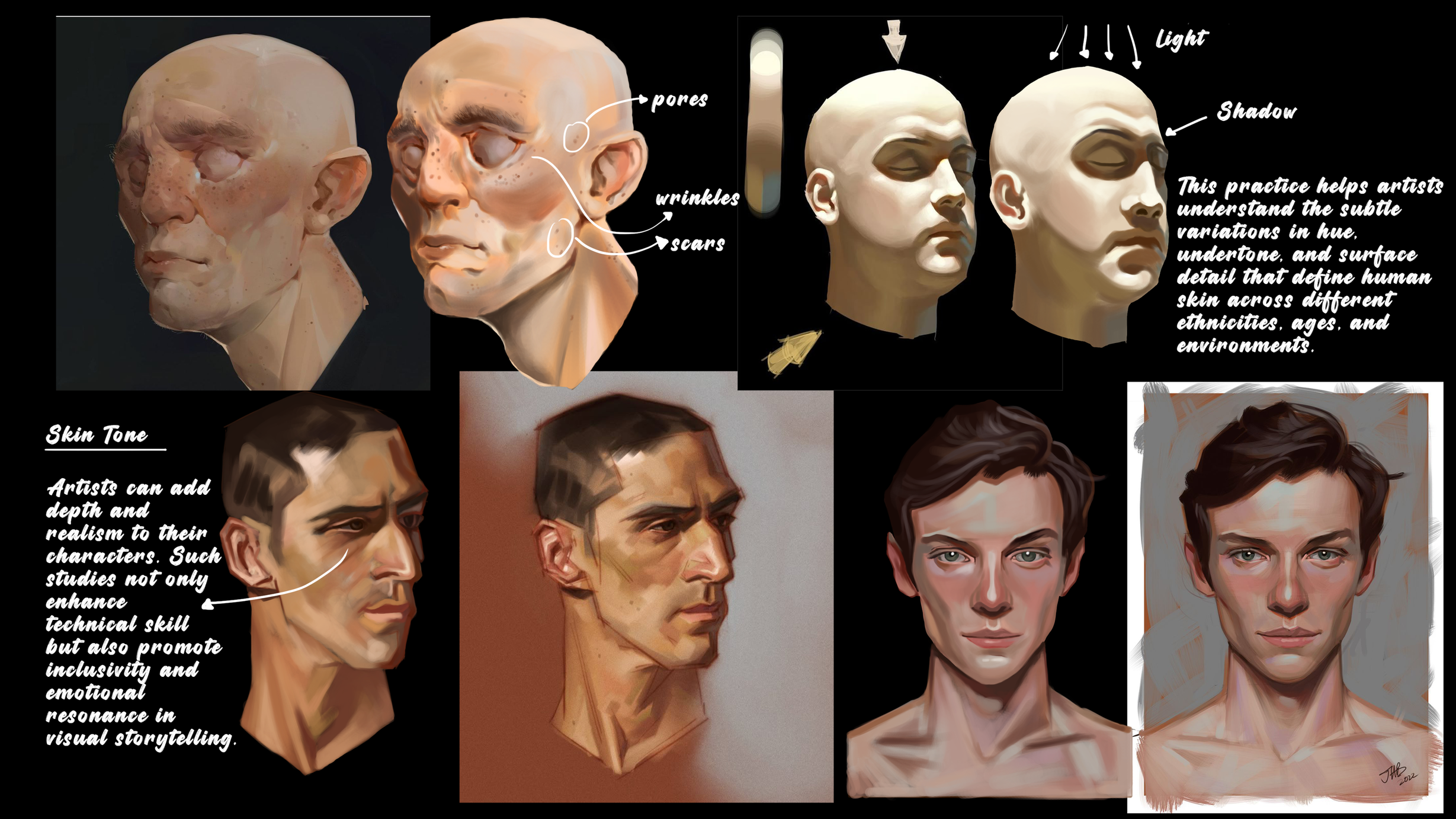
Lately, I've been diving deep into the nuances of rendering skin in my concept art practice. These studies have taught me a lot about how light, texture, and color interact on the human face, and how these subtle variations bring characters to life.
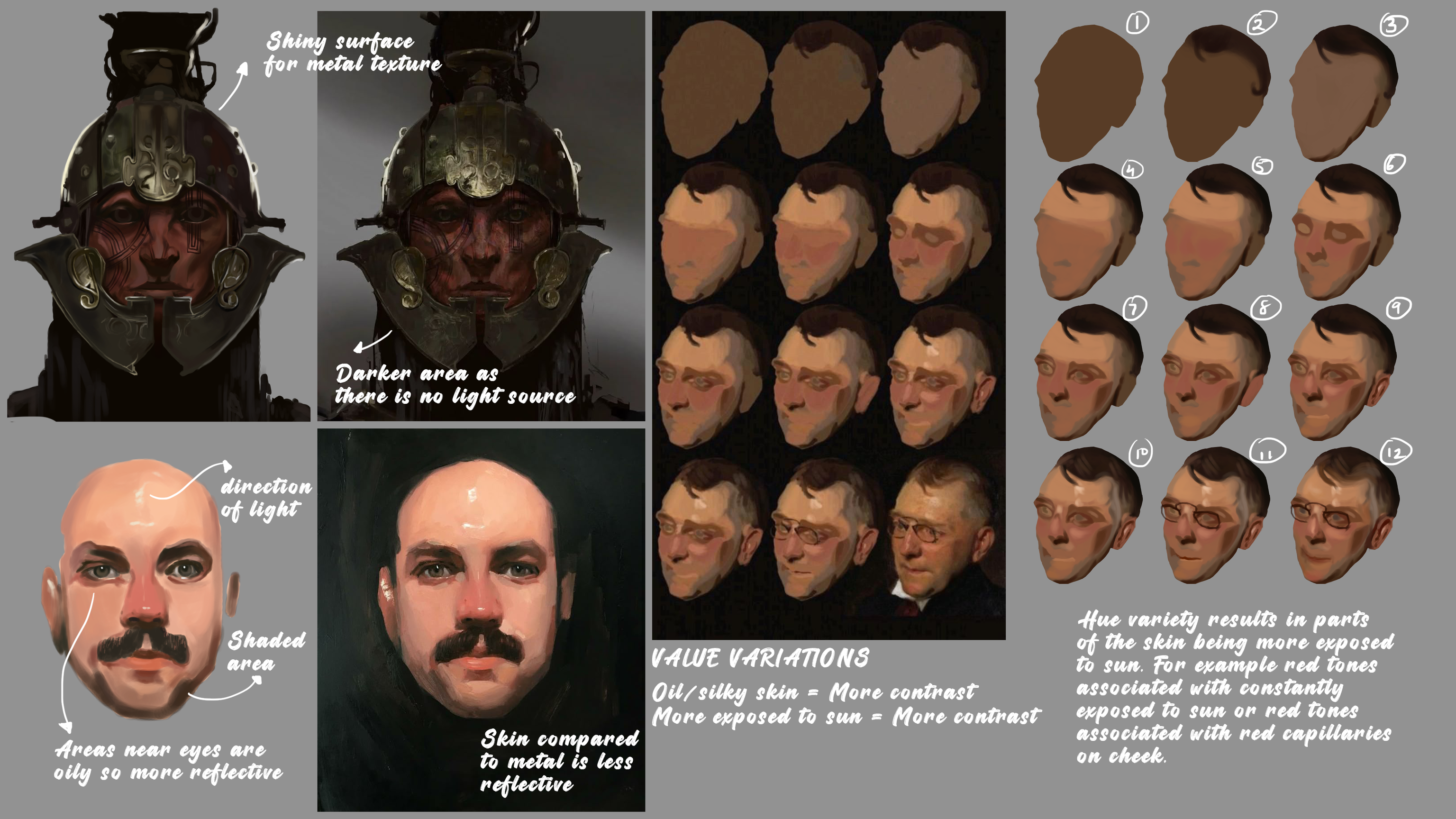
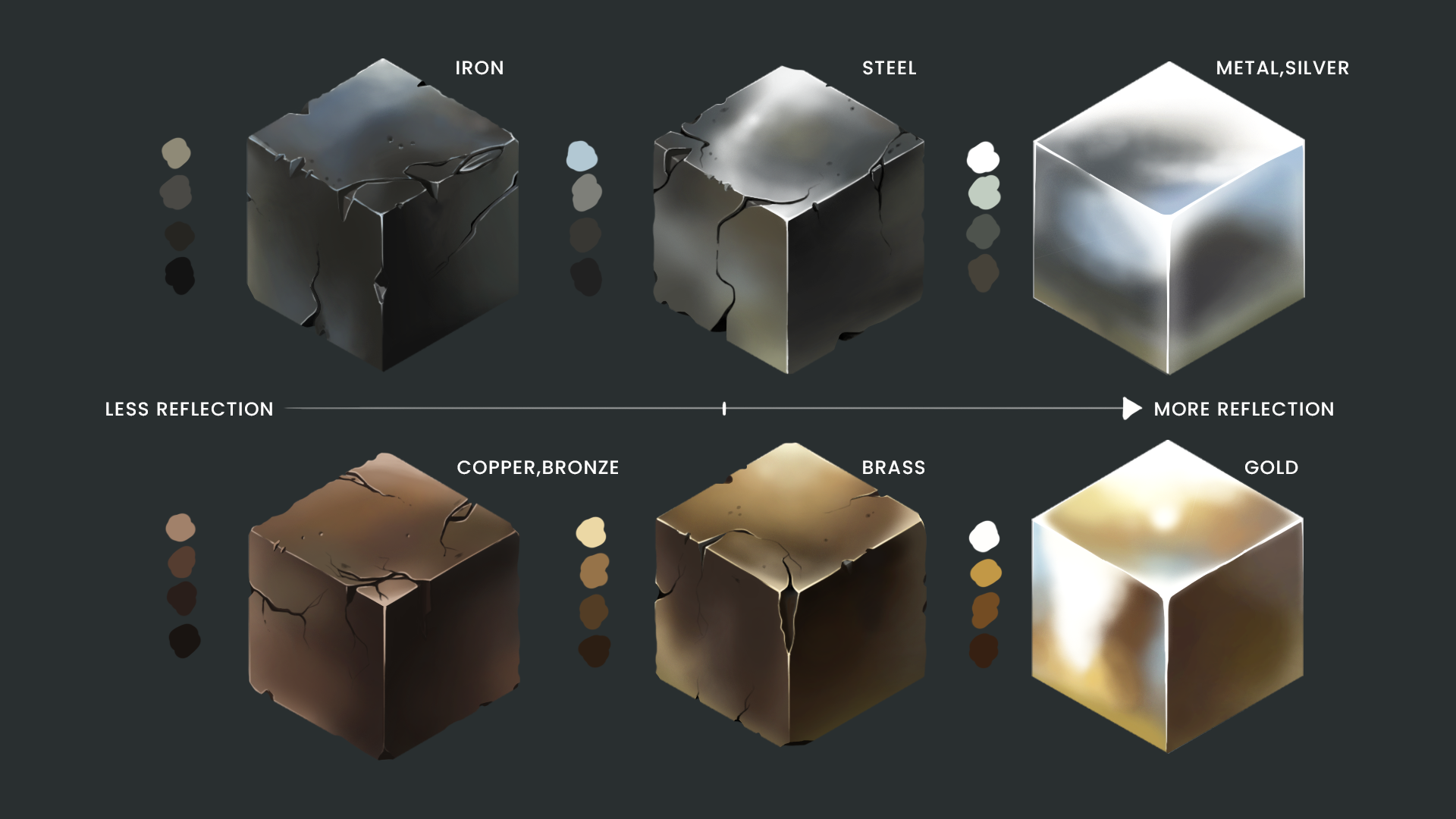
I explored oiliness, sun exposure, and surface materials (like skin vs. metal) to better understand how to represent different kinds of textures. For example, oily areas like the forehead and around the eyes catch sharper highlights, while more matte regions like the cheeks absorb more light. I also paid close attention to value variations how skin with more oil or sun exposure tends to have higher contrast, especially in regions like the nose and cheekbones.
My process usually starts with blocking in large color masses and gradually refining planes using a combination of reference studies and stylized anatomy. I build up the form by thinking in terms of light direction, sub-surface scattering (especially in areas like the nose and ears), and color temperature shifts from cool shadows to warm mid tones. Observing how red tones appear in capillary-rich zones or how cool tones settle in shadowed areas has been essential in creating believable skin.
These pieces (see attached studies) were all about experimenting and pushing the boundaries of painterly rendering. I tried to balance realism with stylization, borrowing cues from traditional oil painting techniques while still maintaining digital efficiency. I’ve also been exploring how small details like pores, wrinkles, and scars can add so much storytelling depth to a character.
Would love to hear your thoughts or techniques you use when studying skin in your work!