Thank you @LesleyCarol for your feedback, I can't agree on the waist cause it is just in game artstyle but thanks to you I have adjusted a breast, it was definitely too high and too puffy
Some solid progress and official game art for ref:
Thank you @LesleyCarol for your feedback, I can't agree on the waist cause it is just in game artstyle but thanks to you I have adjusted a breast, it was definitely too high and too puffy
Some solid progress and official game art for ref:
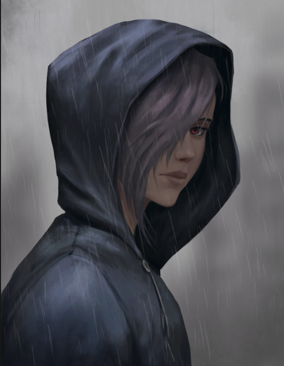
one think i’m noticing is that the figure feels very “airbrushed” for lack of a better word. especially at the edges and the outline of the character it just sort of bristles off. try making sure you have a hard edge — here’s what i mean
(it doesn’t really work as well because i zoomed in a lot but if you look at the work of any famous “semi realistic” painterly artist like ruan jia, huangjian guang, guweiz, wlop, etc you can see what i mean)
now, obviously you can have soft edges (there’s a marco bucci video talking about soft and hard edges), but you need to be very conscious of where you’re putting them and honestly you only really do that if you have a super heavy painterly style (in which case ur mimicking a canvas so it’s not really applicable here)
also, remember cast shadows will have a much more abrupt edge than the gradient one you incorporated. here’s an image from color and light by james gurney. if you haven’t read the book please do
@Julia_J thank you for thinking so! I see I am still lacking but for now it is close enough!
@ziggydas you mean stuff like this:
Nice catch with it, I have forgotten to crank up my lineart to 100% as I paint with lower opacity to have a better grasp on edges + I finish cleaning edges only at the very end as I often change things during painting so it would be a double work to do this otherwise. I think an arm shows that I am constantly things about hard and soft edges, isn't it?
I have this book on thje shelf and read every page of it, I am thinking about core shadows and reflected light all the time but I am trying to mimic the style of original artwork sotrying to not get overboard with reality
I really like the way you are rendering the ice, looks awesome! And biiig congratulations on your second commission, thats super exciting to hear!
The design is cool (is it your own or a fan art?).
You went for a really dramatic pose with his right hand, which looks cool.
I dont know what the terms of your commission were, but next time, I'd focus more on the composition to really define a fore-, mid- and background to create more sense of depth.
You did some of that with the foreshortening of the right arm, but I am sure you could push it a little further.
I really liked the first sketch you shared with us because the ice shards around the character gave the scene more depth
Regardless of what I said above, awesome work, Frygidal!
This looks epic! I think you did a great job capturing the ice texture and the overall scene looks like something is about to happen.
One thing I'd say is the lighting is a little off. I think with the clouds and coldness the scene would be a little more desaturated and the shadows would be a little darker.
Let me know what you think!
thank you for this in-depth feedback! It is the fanart of Khazard from afk arena, he looks in game something like that:
my first idea was to use ice blocks, but client definitely anted to add his dragon so I needed to get him there and ice blocks + dragon were far too much. Final version looks like that:
Totally agree that composition is an issue there, I gave some smoke and blur but didn't want to get too far with it because it was supposed to be kind of splash art so tried to stay vibrant, need to work on this on my next works.
@LesleyCarol thank you very much! It definitely looks more real this way which is also cool, but the client wanted a splash art so my main inspiration were works like that:
But still a long way ahead to achieve this level
Glad to see you got it finished!
I think you added in everything I was going to say. In your inspiration there's a bright light source in the background so the artist was able to add saturation and a lot light to the character. I see that you added some light-rays to make it a little brighter.
Hope your client liked it!
Topic | Category | Replies | Views | Activity |
---|---|---|---|---|
Adjusted_Otaku - Art School Journey | Art School | 27 | 2.9k | Mar '23 |
Nimas - ArtSchool Journey | Art School | 23 | 5.1k | Nov '21 |
Term 1 - Aria | Art School | 18 | 4.5k | May '18 |
Hpevil - Art School Journey | Art School | 8 | 803 | Jun '23 |
Term 1-3 Journey | Art School | 15 | 3.5k | Jan '22 |